| Image |
Comment |
| 05/02/2008 09:07:58 AM |
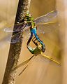
SPRINGby riderComment: The shallow DOF has just pushed some important areas of this image out of focus, so perhaps a smaller aperture would have helped. Still, a very nice shot. |
 Photographer found comment helpful. Photographer found comment helpful. |
| 05/02/2008 09:06:34 AM |
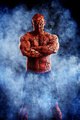
The Thingby LalliSigComment: Ha ha. Hi Larus. As usual, great work. My constructively nit-picking criticisms are - his shorts just look slightly too much like boxer shorts, which doesn't quite fit his character, the bricks are too square around his belly button, and maybe too many thick lines obscuring his face. But hey, it's still fantastic work, and a great addition to your comic-book series. |
| Photographer found comment helpful. |
| 05/02/2008 08:59:47 AM |
|
| Photographer found comment helpful. |
| 05/02/2008 08:55:20 AM |
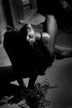
Trappedby ProjectMComment: Would be improved if her face could fill more of the frame, and less wasted space. |
| Photographer found comment helpful. |
| 05/02/2008 08:54:07 AM |
|
| Photographer found comment helpful. |
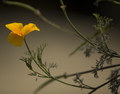
| 05/02/2008 08:52:58 AM |
Blowing in the windby jnenvirComment: Nice and simple. Would be nice to see the flower more front on, and not quite so close to the edge of the frame. |
| Photographer found comment helpful. |
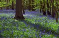
| 05/02/2008 08:49:49 AM |
Bluebell Woodby marboComment: Lovely flowers. I can't help wanting to see more at the top of the image though. |
| Photographer found comment helpful. |
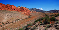
| 05/02/2008 08:49:02 AM |
Red Rockby maynerd12Comment: This has that slightly oversaturated, too-sharp, postcard look about it. But as a saturated sharp postcard, it's not bad. :) A more prominent foreground subject would help. Crouch down and go closer to one of those red bushes, and use that as foreground interest with the mountain backdrop. |
| Photographer found comment helpful. |
| 05/02/2008 08:46:39 AM |
Glintby SnapperLComment: Nice colours in this high-key portrait. The editing is a little rough on the background though. Her eye whites are also a little bluish. I would also crop just a little off the top of the image to hide the bump in her hair. Then print it out and give her a copy. She'll love it. |
| Photographer found comment helpful. |
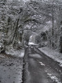
| 05/02/2008 08:43:28 AM |
Snowby ingridblueComment: Nice shadows! This has a very interesting, slightly HDR look about it, while still looking very natural. If you know how to do dodging and burning, do it to this photo. If you don't know, learn, so you can do it. If you already did, then it looks good, but do more. :) This image would also benefit from a slightly bolder border. A few pixels of black would really help it stand out. |
| Photographer found comment helpful. |
Home -
Challenges -
Community -
League -
Photos -
Cameras -
Lenses -
Learn -
Help -
Terms of Use -
Privacy -
Top ^
DPChallenge, and website content and design, Copyright © 2001-2025 Challenging Technologies, LLC.
All digital photo copyrights belong to the photographers and may not be used without permission.
Current Server Time: 08/05/2025 08:44:45 AM EDT.