|
|
|
Showing 1161 - 1170 of ~1240 |
| Image |
Comment |
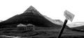
| 01/21/2003 09:39:10 PM | Place of stillnessby vjozComment: Critique Club Review
It would appear that the foreground is in the shadow of a cloud or possibly another mountain. I see that the background of the picture is brighter. I see three things fighting for attention here. The sign, the buildings and the mountain. The eye wants to go to the brighter area in the background, but the sign is in the way. I would have recommended that the photographer waited until either all the area was in sunlight, or all in shadow, for a more even photo. The sky has essentially become negative space. If you take the sign out of the photo, it loses something, but the sign is a bit distracting the way it just pops up in the picture. Perhaps standing further back, so that you can see the base of the sign would help. I would also recommend having waited for better or different lighting if possible.
As it is, your exposure control was very good for the wide range of light you were trying to capture. Focus is very good as well. I believe you were right in choosing not to do color. |  Photographer found comment helpful. Photographer found comment helpful. |
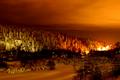
| 01/20/2003 08:42:53 PM | Winter Landscape at Nightby SharQComment: Review Club Critique
Very interesting photo, to say the least.
I think the coloring really makes this image.
The focus does seem a bit soft, but not fatal. The trees are not as well defined as they could be. The lights in the hot spot to the right center of the image are blown out, and are the only real downside to anotherwise excellent image. Had you been able to move your location such that the hotspot was shielded from view, this could really help. I think that simple cropping alone wouldn't do it as you would lose a lot of the bright sky above those lights. Perhaps if you could have chosen an angle where they were hidden by trees/bushes/rocks etc.
The hillside to the left is brighter than the surrounding area, though there is not much to be done about that. Were it more orange like the rest of the picture, it would be better. But that would require editing that is illegal for the challenge. About the only other thing you could do is to play around with the overall exposure to see if that could help. However, when it is that cold you only want to spend so long taking pictures.
-alex | | Photographer found comment helpful. |
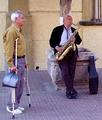
| 01/16/2003 01:16:08 AM | Blowing In The Windby JEMComment: Critique Club review
Interesting composition. The musician seems lost in his music, while the listener, if he is even listening, seems displeased, and looks like he waiting for someone off camera. The biggest fault I see with this photo is the position of the tree behind the musician. It appears to be growing out of his head. A different camera angle would have helped here, or if it was a posed shot, repositioning the models.
Considering the title, I think positioning the camera more to the right, so as to avoid the intrusion of the window and the tree behind the head, and possibly elminating the passerby would lead to a stronger photo. This would have put more focus on the musician, which is the strongest element here.
In this photo, the over all exposure is good. The colors are a little bit cool. The bricks have almost a blue cast to them. However, saturation is good. Contrast is very good. Depth of field and sharpness are excellent. | | Photographer found comment helpful. |
| 01/13/2003 10:50:51 PM | From Immigrant to Citizenby magnetic9999Comment: The overall picture is very well done. Good overall lighting, nice and sharp, great color.
The forehead is about as bright as ou want to go, any lighter and you would be getting burnout. While I like the overall lighting, and the angle of the lighting, The hotspot on the background, combined with the shadow to the left, are distracting and draw the eye away from the subject. I would recommend cropping to exclude the shadowed area, and toning down the light just a bit on the background.
One last tiny nitpick... Perhaps covering more of the hair might be in order. The model just doesn't look like an immigrant. Guess there are too many red heads here alreay. As I said, a very very minor detail as overall this is a very good picture. | | Photographer found comment helpful. |
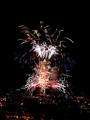
| 01/13/2003 10:04:00 PM | Seattle Space Needle - AKA The New Years Biggest Roman Candle.by dltruexComment: Critique Club Review
Composition/Content: Overall this is a really good photo. The Space needle leans a bit, but you can really get a sense of the size of this display.
Lighting: You did a very good job here. So often these kinds of pictures wind up with burned out fireworks. The time exposure coupled with a wide aperature often leave the pictures with white or very pale firework trails. The reds and blues came out very well.
Background: You might have a bit of extra negative space at the top and sides of the frame, but nothing fatal here.
The smoke adds interest, but at the same time, I would like to see a picture from earlier in the display. I think a cleaner picture might have worked better. As it is, the restaurant is obscured a bit, and unless you knew the Space Needle, (I do), it might not be quite so obvious.
In summary, a straighter Space Needle, a bit tighter cropping to reduce just a little of the extra space, and maybe a bit of the lights at the bottom of the scene, are about all I can add. You've already done a very good job to start with.
| | Photographer found comment helpful. |
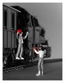
| 01/12/2003 01:35:14 AM | Keep My Heartby Harz_JoergComment: Critique Club by Photographer Request
I like the overall effect. However, I think you might benefit from playing with the angle of the lighting. The sharp reflection of the ties along the rail, at the bottom left of the picture, tend to intrude on the scene. They almost look like little daggers. Since this is macro, there is only so much depth of field to be had. Still the front of the train tends to blend into the gray backgound. Could you have gone to a smaller (higher number) f stop to get a little more depth? Or once again, different lighting? Or on second thought, a larger f stop to make them a little more isolated in the scene, by softening the foreground as well?
As the effect was achieved by desaturating everything but the red, there is a bit of a red reflection or cast at the wheel of the engine where the driving arm attaches, that catches the eye. Lighting angles and placement of figures could work here too. I guess the biggest thing I see here, can be traced back to lighting. It is so bright aimed at the figures. Almost too harsh for my taste.
I do like the overall scene. The engine is suitably large and powerful, signaling a journey that cannot be denied. The mood is such that it seems more than just a journey around the table-top. The placement of the figures is well done, they seem to be communicating rather than just placed haphazardly around the scene. They do not appear to be poseable figures, yet you did a good job making it look like she is really talking to him. | | Photographer found comment helpful. |
| 01/11/2003 03:20:52 AM | watchingby FranziskaLangComment: Critique Club Review by Request.
I think this photo would have been stronger with more light on the subject and a different background. The bright white of the lines on the wall make the subject look like she is in the shadows. The highlite along the raised right forearm adds to the effect.
I might have cropped a tiny bit more loosely to not cut off the sweater on the right arm near the elbow.
Good detail, contrast, and depth of field. The pose works well. You can catch a glimpse of the subject's personality here. It's also nice the way you managed to include the glasses, without glare from the lighting reflecting from them. So often you either see bright reflections from the glasses, or a squinty subject who can't see without them. Overall a nice photo. | | Photographer found comment helpful. |
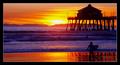
| 01/10/2003 02:29:55 PM | Beach Boys - Surfin' USA by byetkoComment: The surfer is almost lost in the shadows of the pier. Wish you had caught him/her when (s)he was lined up with the bright part of the reflection of the sun. The sky around the sun is burnt out a bit, but not a fatal problem. I like the colors of the sky and they way they are mirrored on the beach and are cast over the water. 7 | | Photographer found comment helpful. |
| 01/10/2003 02:26:17 PM | En El Mar La Vida Es Más Sabrosaby amonteforteComment: I really wish I could speak/read Spanish here. An english translation would have really helped. My guess, from what little (and I mean very little) Spanish I know, is that this translates roughly as.. (I hope) In the (sea?) (life?) is more (delicious? flavorful? tasty?) This picture certainly seems to communicate that. The biggest thing I see is that fill flash, or more fill flash, or reflector would have been helpful here. As it is the girls faces are in shadow and it takes a bit away from the bright surroundings. 7 | | Photographer found comment helpful. |
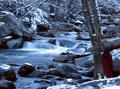
| 01/10/2003 01:35:09 PM | WINTER by Tori Amosby indigo997Comment: I'm a sucker for long exposure flowing water shots. However, this is certainly a beautiful, welll done exposure. I can feel the gentle stillness of the cold winter day in this one. 9 | | Photographer found comment helpful. |
|
Showing 1161 - 1170 of ~1240 |
Home -
Challenges -
Community -
League -
Photos -
Cameras -
Lenses -
Learn -
Help -
Terms of Use -
Privacy -
Top ^
DPChallenge, and website content and design, Copyright © 2001-2025 Challenging Technologies, LLC.
All digital photo copyrights belong to the photographers and may not be used without permission.
Current Server Time: 09/05/2025 03:02:45 AM EDT.
|