| Image |
Comment |
| 07/21/2005 01:49:40 PM |
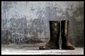
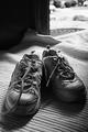
Faithful Servantsby NazgulComment: Fit Challenge Criteria: 2/2
Color/Contrast: 2/2
Composition: 2/2
Photo Quality: 2/2
My Subjective Affinity: 2/2
Really nice work. The lighting is awesome. The subject and background fit perfectly together. Great photo! |
 Photographer found comment helpful. Photographer found comment helpful. |
| 07/21/2005 01:48:32 PM |
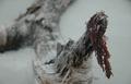
Bark & Grassby snellslawComment: Fit Challenge Criteria: 2/2
Color/Contrast: 1/2
Composition: 1/2
Photo Quality: 1/2
My Subjective Affinity: 1/2
Nice work on the composition. Lighting is OK, but could be a little more dynamic, particularly on the close tree. There is not enough of a distinction between the tree in the background and the foreground tree. |
| Photographer found comment helpful. |
| 07/20/2005 09:00:11 PM |
Edgyby ACheltonComment: Fit Challenge Criteria: 1/2
Contrast/Color: 0/2
Composition: 1/2
Photo Quality: 1/2
My Subjective Affinity: 0/2
The idea is good, but DOF is too limited, and the main subject is under exposed so there is not enough detail in it. |
| Photographer found comment helpful. |
| 07/20/2005 08:58:32 PM |
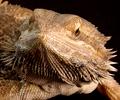
Spikesby idnicComment: Fit Challenge Criteria: 2/2
Color/Contrast: 2/2
Composition: 2/2
Photo Quality: 2/2
My Subjective Affinity: 2/2
Really nice work on this horned toad. It is a very crisp photo and the lighting is so well done. The toad is also well done against an absolute black background. Nice work. |
| Photographer found comment helpful. |
| 07/20/2005 08:56:50 PM |
Texture of a roseby gisliComment: Fit Challenge Criteria: 2/2
Color/Contrast: 2/2
Composition: 2/2
Photo Quality: 2/2
My Subjective Affinity: 2/2
Very nice photo and excellent use of lighting! The composition is really appealing. Great job! |
| Photographer found comment helpful. |
| 07/20/2005 08:55:22 PM |
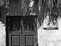
Wall in Mexicoby BAMartinComment: Fit Challenge Criteria: 1/2
Color/Contrast: 1/2
Composition: 2/2
Photo Quality: 1/2
My Subjective Affinity: 0/2
The shadows are exposed really well on this, but while sacrificing the highlights. The composition is appealing, but the coke sign distracting. Also, perhaps a little more straw from the roof might have helped a bit. |
| Photographer found comment helpful. |
| 07/20/2005 08:53:34 PM |
Waiting to go outby jurassicComment: Fit Challenge Criteria: 1/2
Color/Contrast: 1/2
Composition: 1/2
Photo Quality: 1/2
My Subjective Affinity: 0/2
It is kind of a bland photo. I'm not drawn anywhere in it. |
| Photographer found comment helpful. |
| 07/20/2005 08:52:15 PM |
Mecateby Netwalker100Comment: Fit Challenge Criteria: 2/2
Color/Contrast: 2/2
Composition: 2/2
Photo Quality: 2/2
My Subjective Affinity: 2/2
Perfect 10! Very hard to achieve on my first vote, but you did it. There is a really good balance of shadows and highlights throught the photo, and the irregular cropping dimensions really add to the photo. Nice work. |
| Photographer found comment helpful. |
| 07/20/2005 08:41:48 PM |
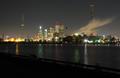
Extraordinary City of Torontoby notonlineComment: This is a great night shot. I really like the smoke. It adds a nice touch to the photo. I wish the water would have reflected more of the city, or that it was cropped off and came out more of a panoramic shot. |
| Photographer found comment helpful. |
| 07/20/2005 08:15:18 PM |
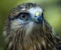
Hawk On The Look Outby fplouffeComment: Fit Challenge Criteria: 2/2
Color/Contrast: 2/2
Composition: 2/2
Photo Quality: 1/2
My Subjective Affinity: 2/2
Really nice job. My favorite so far. His head, however, does appear to have a double edge on top? |
| Photographer found comment helpful. |
Home -
Challenges -
Community -
League -
Photos -
Cameras -
Lenses -
Learn -
Help -
Terms of Use -
Privacy -
Top ^
DPChallenge, and website content and design, Copyright © 2001-2025 Challenging Technologies, LLC.
All digital photo copyrights belong to the photographers and may not be used without permission.
Current Server Time: 08/21/2025 02:57:35 PM EDT.