| Image |
Comment |
| 06/05/2007 08:44:22 PM |
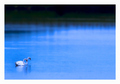
together...by shamerComment: Fit Challenge Criteria: 2/2
Contrast/Color: 2/2
Composition: 2/2
Photo Quality: 2/2
My Subjective Affinity: 2/2
Excellent image. |
 Photographer found comment helpful. Photographer found comment helpful. |
| 06/05/2007 08:43:56 PM |
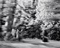
Death Is Two Steps Behindby jaysonmcComment: Fit Challenge Criteria: 1/2
Contrast/Color: 2/2
Composition: 1/2
Photo Quality: 0/2
My Subjective Affinity: 0/2
Way too blurry. Whatever your intended purpose, I do not think it came out very well. The contrast is good, making use of the full tonal range, but the rest of the photo needs some work. Actually, just a reshoot. It looks like it was an attempt for a motion panning, but the subjects are blurred as much as the background. |
| Photographer found comment helpful. |
| 06/05/2007 08:41:43 PM |
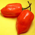
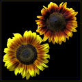
Twice As Hotby birdyblueComment: Fit Challenge Criteria: 2/2
Contrast/Color: 1/2
Composition: 1/2
Photo Quality: 1/2
My Subjective Affinity: 1/2
I really like the color combination for this shot, but think that it is a bit too contrasty, with a few blown-out highlights. The placement of the peppers is good, but the crop is a bit too tight for my liking. This gives off the appearance of a stock photo, and to really make that work well I think some of the shadows need to be eliminated also. Maybe a more diffused light source or two would help out with that. |
| Photographer found comment helpful. |
| 06/05/2007 08:39:35 PM |
Double Headby sudhiComment: Fit Challenge Criteria: 1/2
Contrast/Color: 1/2
Composition: 2/2
Photo Quality: 1/2
My Subjective Affinity: 0/2
Although you end up with two ends, I feel that the inclusion of the stem takes away from this photo. The colors are very nice, but the contrast seems a bit dull. The symmetrical composition works well for this subject, but the overall photo seems a bit soft of the sharpness factor. |
| Photographer found comment helpful. |
| 06/05/2007 08:37:34 PM |
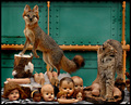
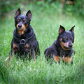
Keepers At The Gateby pawdrixComment: Fit Challenge Criteria: 1/2
Contrast/Color: 1/2
Composition: 2/2
Photo Quality: 2/2
My Subjective Affinity: 0/2
Freaky picture. I don't see as much of a relation between your two animals as I would expect for this challenge. The inclusion of all severed body parts is way freaky. It reminds me of Sid in The Toy Story movie. |
| Photographer found comment helpful. |
| 06/05/2007 08:35:15 PM |
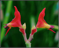
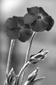
Father and Daughterby jasonlpriceComment: Fit Challenge Criteria: 2/2
Contrast/Color: 1/2
Composition: 2/2
Photo Quality: 1/2
My Subjective Affinity: 1/2
I really like the subjects, and the placement of them in the frame. My only major dislike is that the petals of the lower flower, on the upper-left, seem blown out. I can't see the detail all the way to the end like I can on the majority of the petals. The upper flower is also just a tad bit too dark in the center IMO. |
| Photographer found comment helpful. |
| 06/05/2007 08:32:29 PM |
An old coupleby TUBORGComment: Fit Challenge Criteria: 2/2
Contrast/Color: 2/2
Composition: 2/2
Photo Quality: 1/2
My Subjective Affinity: 1/2
I'll have to admit, my initial impression of this photo was "Brown ribbon all the way!" But the more I study it, the more I like it. It is a well-done abstract image. Do I think it would improve with more DOF? Perhaps. However, I also like the image as it is too. |
| Photographer found comment helpful. |
| 06/05/2007 08:30:08 PM |
Aspiring to beby aliquiComment: Fit Challenge Criteria: 2/2
Contrast/Color: 1/2
Composition: 1/2
Photo Quality: 1/2
My Subjective Affinity: 0/2
I think the bud in front takes away from the punch of the image, and also feel that both flowers should be in focus, as that is the subject of the photo. The isolation from the background is good but the tones are a bit bland. |
| Photographer found comment helpful. |
| 06/05/2007 08:28:31 PM |
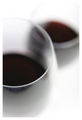
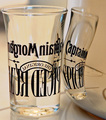
Attractionby cpanaiotiComment: Fit Challenge Criteria: 1/2
Contrast/Color: 2/2
Composition: 1/2
Photo Quality: 2/2
My Subjective Affinity: 0/2
The focus seems dead on for this image for me, as my attention is immediately drawn to the reflection of the glass. Sharpness overall is good, as is overall contrast. The subject itself does not present itself as very interesting to me. |
| Photographer found comment helpful. |
| 06/05/2007 08:26:25 PM |
BlackJack & Skylerby laserComment: Fit Challenge Criteria: 2/2
Contrast/Color: 2/2
Composition: 1/2
Photo Quality: 2/2
My Subjective Affinity: 0/2
I really like how crisp the detail is on this image. There is no evidence of oversharpening or anything either. The colors are also well saturated for this subject. I just find it a bit too plain, especially with the centered composition. |
| Photographer found comment helpful. |
Home -
Challenges -
Community -
League -
Photos -
Cameras -
Lenses -
Learn -
Help -
Terms of Use -
Privacy -
Top ^
DPChallenge, and website content and design, Copyright © 2001-2025 Challenging Technologies, LLC.
All digital photo copyrights belong to the photographers and may not be used without permission.
Current Server Time: 08/21/2025 02:18:32 AM EDT.