| Image |
Comment |
| 06/08/2007 12:09:12 AM |
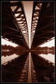
Twin Bridgesby NeilComment: Fit Challenge Criteria: 2/2
Contrast/Color: 1/2
Composition: 1/2
Photo Quality: 2/2
My Subjective Affinity: 1/2
When I look at this photo, two things come to mind: why am I tilting my head to the right? (The balance of off with the symmetry to the right a bit) and Wow! This would have been great for that perspective challenge. The detail is wonderful. I'm not a big fan of the duotone shade that was used. |
 Photographer found comment helpful. Photographer found comment helpful. |
| 06/07/2007 11:59:59 PM |
waiting to surpriseby bvlindalouComment: Fit Challenge Criteria: 2/2
Contrast/Color: 1/2
Composition: 0/2
Photo Quality: 1/2
My Subjective Affinity: 0/2
The first thing that stands out to me are the converging lines. In order to make straight lines appear straight in a photo, the plane of the back of the camera must be parallel to the plane of the subject being photographed. |
| Photographer found comment helpful. |
| 06/07/2007 11:58:34 PM |
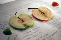
Comparing Apples to Applesby losemeComment: Fit Challenge Criteria: 2/2
Contrast/Color: 1/2
Composition: 2/2
Photo Quality: 1/2
My Subjective Affinity: 2/2
I love this idea. Excellent representation of an old saying. The DOF is a bit too shallow, and the colors a bit dull, but the idea is awesome. Nice job. |
| Photographer found comment helpful. |
| 06/07/2007 11:56:47 PM |
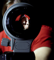
Eye of the photographerby GeocideComment: Fit Challenge Criteria: 1/2
Contrast/Color: 1/2
Composition: 1/2
Photo Quality: 1/2
My Subjective Affinity: 0/2
The lighting is good for the highlights and midtones, but some of the lens is still lost to complete darkness. |
| Photographer found comment helpful. |
| 06/07/2007 11:54:55 PM |
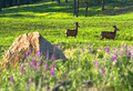
Morning Grazingby optionComment: Fit Challenge Criteria: 2/2
Contrast/Color: 2/2
Composition: 1/2
Photo Quality: 1/2
My Subjective Affinity: 1/2
I love wildlife photos. I think this one would have done better entirely in focus. The lighting and colors are very rich. |
| Photographer found comment helpful. |
| 06/07/2007 11:49:45 PM |
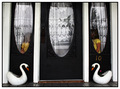
Candleholdersby gg3rdComment: Fit Challenge Criteria: 2/2
Contrast/Color: 1/2
Composition: 1/2
Photo Quality: 1/2
My Subjective Affinity: 0/2
The DOF is a bit too shallow to keep the left candleholder completely in focus. The colors are nice, but not complementary. The highlight on the right candleholder is very distracting. |
| Photographer found comment helpful. |
| 06/07/2007 11:48:03 PM |
Double Diamondsby Delta_6Comment: Fit Challenge Criteria: 2/2
Contrast/Color: 1/2
Composition: 0/2
Photo Quality: 1/2
My Subjective Affinity: 0/2
The subject is too plain. The colors are dull. With the attempted symmetrical composition, the tree really throws things out of whack. Everything appears to be tilted to the left. |
| Photographer found comment helpful. |
| 06/07/2007 11:46:25 PM |
Rainbow Lorikeets Times Twoby bigfellaComment: Fit Challenge Criteria: 2/2
Contrast/Color: 2/2
Composition: 2/2
Photo Quality: 2/2
My Subjective Affinity: 1/2
Nice image overall. |
| Photographer found comment helpful. |
| 06/06/2007 01:07:28 PM |
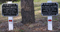
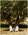
Memories Shared Hereby ericwooComment: Fit Challenge Criteria: 2/2
Contrast/Color: 1/2
Composition: 1/2
Photo Quality: 1/2
My Subjective Affinity: 1/2
I like the iea of two chairs under a shade tree. It makes me think of a lazy summer afternoon, sitting out sipping lemonade with my wife or something. The house in the background is very distracting, and the chairs seem to have lost most of their detail to the highlights of the photo. I think it could have been more effective stepping back a bit, moving the chairs away from the trunk, and then recomposing and shooting. It's hard to say for sure. |
| Photographer found comment helpful. |
| 06/06/2007 01:05:01 PM |
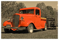
Because they're classics, That's why (1934 & 1936 Chevrolets)by DJWoodwardComment: Fit Challenge Criteria: 2/2
Contrast/Color: 1/2
Composition: 1/2
Photo Quality: 1/2
My Subjective Affinity: 1/2
I like the setup of the two trucks but feel that the cropping was a bit too tight on the left and right. The red in the front truck seems way too saturated, and the desaturation of the rest of the image is fairly flat, leaving an almost muddy feel to it. That lack of contrast really hurt the image overall I feel. |
| Photographer found comment helpful. |
Home -
Challenges -
Community -
League -
Photos -
Cameras -
Lenses -
Learn -
Help -
Terms of Use -
Privacy -
Top ^
DPChallenge, and website content and design, Copyright © 2001-2025 Challenging Technologies, LLC.
All digital photo copyrights belong to the photographers and may not be used without permission.
Current Server Time: 08/20/2025 10:32:51 PM EDT.