| Image |
Comment |
| 01/02/2013 07:42:16 PM |
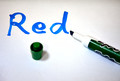
dissonanceby mitalapoComment: Red, Blue, Green. Reminds me of some of those things they do to trick people! Very nice concept. Everything is laid out and is simple. 6 |
 Photographer found comment helpful. Photographer found comment helpful. |
| 01/02/2013 07:40:48 PM |
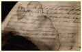
First Draftby skewsmeComment: hmmmmmm... This is very interesting and visually makes you think. With the lack of color you are using it makes it feel like and old photograph, however the pen is not and the paper is not and that throws me for a loop and makes the photo feel off to me. 5 |
| Photographer found comment helpful. |
| 01/02/2013 07:38:44 PM |
Still Primative in the New Yearby colorcarnivalComment: Snow is very hard to photograph correctly. All I see here is a stick laying on the ground that most likely was not used to write 2013 as the numbers are thick and precise and most likely made with a finger and gone over to make it look readable. Maybe using the tree branch in action would have worked better? 3 |
| Photographer found comment helpful. |
| 01/02/2013 07:35:14 PM |
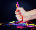
Under Pressureby Samantha_TComment: I really like this photo. the melting cranyons in the hand and driping to the table is great. You used a good color so it is bright and inviting! You also made the crayons in the background look good without them being too distracting. Good Job. 9 |
| Photographer found comment helpful. |
| 01/02/2013 06:53:14 PM |
The Art of Pencil Shavingsby rockyrajanComment: very cute, fun, colorful!!! Your hand must be tired from using one of those little tiny pencil sharpers! My thoughts for composition only - I might have made it cleaner and cleaned off the little tiny shavings and left the white (table) clean. Also made sure all the pencils were sharp. 7 |
| Photographer found comment helpful. |
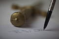
| 01/02/2013 06:49:49 PM |
if so, why do actions speak louder than words then?.....by GilesComment: I did not know what the gold think was at first but was able to make out the words and it tied it together. It does look like a toy sword though. Maybe you could have worked on it a bit to make it look real? The pen is okay. I LOVE the concept. 6 |
| Photographer found comment helpful. |
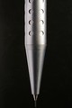
| 01/02/2013 06:48:08 PM |
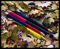
Carbon and Steelby JanjaComment: Very interesting. My only negative thoughts are that you could have brushed up the pencil steel a bit. It looks dirty and I think the look you are going for is meant to look clean and out there! Also I would put a little more room for the pencil lead at the bottom. The background is slight distracting. It would have been cool to have it all nice and sharp! Overall 6 |
| Photographer found comment helpful. |
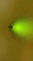
| 01/02/2013 06:45:08 PM |
pencilby mrbig65Comment: Don't see anything except a dot, maybe water and a pear? 1 |
| Photographer found comment helpful. |
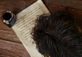
| 01/02/2013 06:44:19 PM |
Feather Inkedby giantmikeComment: I do like your photograph. Each person does have their own composition style. With that being said I'm a little off with the subject being focused on just part of the feather. I, and this is just myself, Would have included a subject matter of the tip and maybe the ink well with the feather fading out of focus as well as the letter. My thoughts but good exposure! |
| Photographer found comment helpful. |
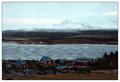
| 11/12/2005 04:40:31 PM |
Best served coldby marvinComment: Very nice photo. however the snowcapped mountains seem to blend with the sky. |
| Photographer found comment helpful. |
Home -
Challenges -
Community -
League -
Photos -
Cameras -
Lenses -
Learn -
Help -
Terms of Use -
Privacy -
Top ^
DPChallenge, and website content and design, Copyright © 2001-2025 Challenging Technologies, LLC.
All digital photo copyrights belong to the photographers and may not be used without permission.
Current Server Time: 08/17/2025 10:12:17 AM EDT.