|
|
|
Showing 351 - 360 of ~986 |
| Image |
Comment |
| 05/19/2006 04:58:35 AM | Weatheredby JutildaComment: Your cracking??? You cracked long ago missus:))
This is excellent...when can we buy the whole collection? |  Photographer found comment helpful. Photographer found comment helpful. |
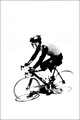
| 05/19/2006 04:46:52 AM | Direct Pursuit a Cycling storyby fotodudeComment: Hi from the Critique Club!
Your image is totally over processed and doesn't qualify as a photograph at all......nah...just kidding:))
Your title does not meet the criteria of the challenge and should have been disqualified.....nah...just kidding:)
You really shot yourself in the foot with the title, what were you thinking?:)) That said, I've sat here for five minutes trying to think of an alternative, and it ain't easy: Deadly Peruvian Cyclist? Doppelganger President Cycles? You knew the DNMCers would hound you down and beat you with celery for that title, didn't you, but you did it anyway.
And I'm glad you did, as it's a breath of fresh air in a room full of smokers. Many of us I'm sure vote in a trance like state, automatically hitting the five button as if it were a form of therapy. But now and again we get woken up by an image that dares to challenge the status quo and says 'stuff it' to the safe route, I'm going to be ME! Hell, even your commenters are worried FOR you about how this would go down with voters!!! Did you die a horrible death? Did you develop leprosy? Did your world collapse? Noooooooooo! You took at risk at being creative and in my book you came out a winner inspite of the votes. Well done you!
There are lovely tones and contrast in this image; pure whites, pure blacks and that wonderful shade of grey.
There is plenty of detail despite the high key and those shadows are fantastic.
His expression shows committment and effort. The expanse of white around him gives him space to move in and out of and plenty of room for text (The Lance Armstrong Story?)
A wonderful, fresh, graphic image. Message edited by author 2006-05-19 14:15:18. | | Photographer found comment helpful. |
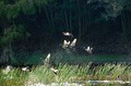
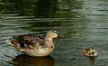
| 05/19/2006 04:14:11 AM | Duck Pond Chaosby trainComment: Hi from the Critique Club!
Is there a conspiracy to give me all the duck entries?:))
As I said on my last but one critique:A difficult one for me; personally ducks do nothing for me, so for a duck image to get me excited it has to be really special. Critique images are given out randomly so I wish you could have had someone who loves the little darlings, but those are the breaks;)
That said, I find myself smiling at this image.I think if you had chosen the word 'carnage' instead of 'chaos' it might have been more dramatic or sinister:)You have caught the ducks in various stages of flight and fright, and if it was the opening of duck season then it makes sense. But you must be mad braving a duck shoot just to get an image:))
I wish you had got closer, but I'm glad you didn't if it was gunfire creating the chaos! There is a lovley triangular/pyramid composition going on with the ducks, which is pleasing to the eye. This along with the capture of the water droplets and the various stages of flight does give movement to the image.
The bottom of the image, around the water and grass does seem over exposed or over sharpened, but it doesn't detract that much from those hilarious ducks.And for some reason I can hear the 'Jaws' music playing in my head:))
I have warmed to this image, it's one of those one off moments and feel the score was a little harsh;) | | Photographer found comment helpful. |
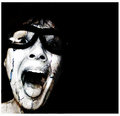
| 05/18/2006 11:12:11 PM | Dead Photographers Cultby ClubJuggleComment: Hi from the Critique Club!
This is indeed a low-key image in every sense; its colour,lighting and mood.
The facial expression intrigues me; I don't know if it is challenging or menancing or simply irritated.
As a viewer I feel like he is watching me rather than the other way round, especially with that camera, I feel like I am the subject. But the camera is dead, isn't it? A relic? Dead and buried like those men and women that once created their view of their world through it? A view and past that now only lives on through the images they left behind. They have become immortal through their photography.
Those eyes hold all the clues,and I love the white highlight in the right eye. But I wish the hood would have covered the hair and forehead, to create even more emphasis and drama around the eye area.
I love the creased detail in the cloth, it adds a contrasting texture to the smooth black background. As does the beard.
The use of lighting had made it appear that the man is coming out of the darkness or shadows towards the viewer, creating tension and movement.
A very moody, intriguing, low-key image.
| | Photographer found comment helpful. |
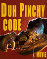
| 05/18/2006 10:32:55 PM | Duh Pinchy Codeby LevTComment: Hi from the Critique Club!
A very timely image!
One of the best things about challenges here on DPC, is that they give us an excellent and rare opportunity to allow our more creative and humourous side free reign. And when we choose to do that look at how much effort we are prepared to put into it! That creativity, humour and effort has been justly rewarded here as evidenced by your score.
I can't find fault with this image. Except that you have managed to make the poor creature look human - look at those eyes! Are you sure that isn't a self portrait by Da Vinci?:)) And that enigmatic smile!! And then you ate him/her?!!!!
Technically, everything is spot on, as well you know;)
An inspired and highly creative image. | | Photographer found comment helpful. |
| 05/18/2006 06:44:02 AM | Duck Proliferation Celebrationby kenskidComment: Hi from the Critique Club!
A difficult one for me; personally ducks do nothing for me, so for a duck image to get me excited it has to be really special. Critique images are given out randomly so I wish you could have had someone who loves the little darlings, but those are the breaks;) That said, I do love your conDUCKtor image.
It is a sweet, inoffensive image, that would look nice on a greetings card. But, the eye of the adult duck is almost at the dead center of the image.The viewer's eye is drawn to this and then tends to stay there, creating a static image. This static element also gives the impression that the two ducks are disconnected, having little to do with each other - as if each one accidently swam into the passport photo of the other. Also their both being in the bottom half of the image, seems to cut the image in half, creating nothing in the top half for the eye to focus on.
More ducks (am I really asking for more ducks?) would have fitted the celebration aspect of your title better, but you go with what you have, when the ducks don't cooperate with our photographic vision;)
The focus is spot on: I can see the lovely colour and detail of the feathers and the texture of the soft down on the duckling's back. Message edited by author 2006-05-18 06:49:12. | | Photographer found comment helpful. |
| 05/18/2006 06:13:53 AM | DeVille Prison Cityby tonyvComment: Hi from the Critique Club!
Two things immediately stand out in this image. The first is the contrast in colour between the subject and the background. The second is the man's expression.
I have no idea what the title refers too, but I presume it is a real prison, and that your subject is supposedly one of its guests. If that is the case, the background is perfect in that it looks like an old sepia image from a time gone by. And if you think about it, prisons are places that mess with the idea of time: Time inside drags for the inmates, but time outside stops for them. Often they come out to a world that they no longer recognise. So the sepia representing the archaic, time bending institution of prison is a perfect choice. The man on the other hand is in glorious technicolour, representing his individuality inspite of his being incarcerated.
The man's expression to me could suggest fear or menace - both of which are appropriate in this context, and it was well captured.
Your post processing steps in acheiving your overall image might as well have been written in Greek, as I am PS challenged, so I can only bow to your expertise and say well done;) | | Photographer found comment helpful. |
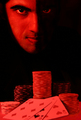
| 05/17/2006 11:16:27 PM | Devil's Poker Clubby Mr_BondComment: Hi from the Critique Club!
One of the benefits of giving critiques is that you are 'forced' to spend longer than the usual 5 seconds looking at an image before passing judgement. The longer I look at this image, the more hypnotised I become by those eyes! They demand that I look into them and then dare me to look away. The menace is enhanced by the strong facial expression.
I think the effect you have created with the lighting on the face is very clever:It seems to hint at the two sides of man's nature - light and dark, reminding us that we are not always 100% good and not always 100% bad. Rather we are somewhere in between and fight a life long battle with ourselves and temptation.
Just having the white of the eye showing in the right side is so effective, so menancing, so dramatic.And the fact that the highlight in each eye appears in a different place adds to the effect of duality.
The poker chips and cards are symbolic of our obsession with materialistic gain even to the detrement of our spiritual nature, and that we often gain one at the expense of the other.
I personally love the red tones against the black, for a poster it is eyecatching and dramatic. I would also love to see what a black and white version looks like.
Whilst the focus does seem a little soft on the cards, I think it does not take anything away from the rest of the image.
A bold, dramatic, well executed image, that perhaps should have scored higher;) | | Photographer found comment helpful. |
| 05/16/2006 11:51:06 AM | Colors in Rhythm!by kbhatia1967Comment: Hi from the Critique Club!
There is something about coloured straws that evokes a pavlovian response in adults: they instantly bring memories of childhood, and the feelings that go with that, to mind. These feelings are, 9 times out of 10, pleasurable. Pastel colours, too, often have the same effect, because as babies they are what our rooms, furniture, clothes...etc are decorated with.
Compostionally this is appealing as there is a suggestion of a spiral, both in the overall arrangement and the way you arranged the colours, particularly the red ones (well done!) The balance between postive and negative space is also good.
The focus does seem a little on the soft side, but this adds to the calm, comforting feeling the image promotes.
The background seems white enough on my screen, and whilst the border initially bothered me, the more I looked at the image, the more it seemed right. It balances the red and echos the green and blue straws.
A really appealing image.
| | Photographer found comment helpful. |
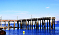
| 05/16/2006 11:28:32 AM | Sereneby efrenComment: Hi from the Critique Club!
Sometimes when we look at a scene in real life we feel something, or it moves us. Often when we take a photograph of that moment, it can fail to convey or capture that feeling or emotion, no matter how accurate the exposure, depth of field or shutter speed. The camera cannot sense what we sense.
Sometimes, we find that by experimenting with photoshop we can create an image that whilst it isn't 'true to life' strictly speaking, it can convey something of what we saw with our 'other' vision.
I think that perhaps you have done that here; the over saturation does convey a sense of one of those days, when the blue of the sky, and it's reflection in the water are almost too blue and wonderful.It's all down to personal choice and taste and depends on who you are trying to please - yourself or others.
That said: The rhythm created by the pier is irregular but interesting, but the fact that it tilts upwards on the right-hand side distracts the eye of the viewer and disturbs the balance.
The yellow buoy is a nice contrast to the blue, but the boat? in the bottom left-hand corner is very distracting. Had you cropped the left hand side of the image to get rid of this, it would not have harmed your image much. In fact you could have cropped up to the clearer water reflections and made a cleaner image perhaps, focusing even more on the pier and the clean reflections on the water.
| | Photographer found comment helpful. |
|
Showing 351 - 360 of ~986 |
Home -
Challenges -
Community -
League -
Photos -
Cameras -
Lenses -
Learn -
Help -
Terms of Use -
Privacy -
Top ^
DPChallenge, and website content and design, Copyright © 2001-2025 Challenging Technologies, LLC.
All digital photo copyrights belong to the photographers and may not be used without permission.
Current Server Time: 08/06/2025 10:24:31 AM EDT.
|