| Image |
Comment |
| 08/06/2005 10:05:20 PM |
Old Shackby JeremyFleuryComment: ** Greetings from the Critique Club **
Composition: Would have liked to see this not centered so much, and a little less foreground.
Technically: The sky does not look natural in color - perhaps you adjusted the color range a little too much? It really looks odd against the green of the trees leaves. The greens are nice. Best bet would have been to convert thisto black and white, or sepia tones.
- Linda |
 Photographer found comment helpful. Photographer found comment helpful. |
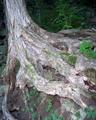
| 08/06/2005 10:01:08 PM |
A Place for Moss to Growby dwolffComment: ** Greetings from the Critique Club **
Kinda cool - but would have liked to see more of the tree as a whole as you mentioned it is sitting on the edge of a cliff - would have added interest to it. The flash really hurts this image, as the artificial light really blows out the highlights of the wood.
- Linda |
| Photographer found comment helpful. |
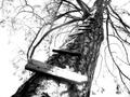
| 08/06/2005 09:16:49 PM |
Wooden Dreamsby ShannonLeeComment: ** Greetings from the Critique Club **
Composition is nicely executed, but saturation might have been bumped up a bit too much as this looks over-processed and the sky totally blown out. I like the soft focus which gives it the dreamy feel. Not all bad for a "dinky little camera"
- Linda |
| Photographer found comment helpful. |
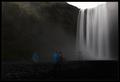
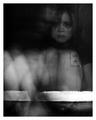
| 08/06/2005 07:27:11 AM |
Dreamingby PippiComment: might have been even better if the people were more visible while apart from each other and gazing towards the other...then shown more transparent together as this would be their dream. Does that make any sense to you...I hope I conveyed my though clearly. |
| Photographer found comment helpful. |
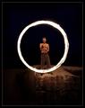
| 08/06/2005 05:35:28 AM |
Ring of Fire by NazgulComment: pretty cool - I like the idea of having the man on a cliff as it gives depth. |
| Photographer found comment helpful. |
| 08/06/2005 05:33:59 AM |
|
| Photographer found comment helpful. |
| 08/06/2005 05:32:58 AM |
|
| Photographer found comment helpful. |
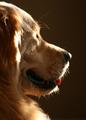
| 08/06/2005 05:23:24 AM |
Who's Thereby 2hooComment: I would have liked to see more of the dogs eye. Eyes are the window to the soul. |
| Photographer found comment helpful. |
| 08/06/2005 05:21:03 AM |
|
| Photographer found comment helpful. |
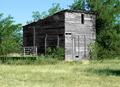
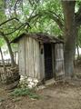
| 08/06/2005 04:47:05 AM |
Outhouseby RN PattiComment: ** Greetings from the critique club **
An interesting capture in my opinion, but has some technical flaws.
The sky coming through the trees appears blown out, as does the area behind the fence and tree. The stones at the base of the outhouse are also too strongly lit.
Dead center is not the best composition, but works here due to the wooden fence and tree. I like the amount of foreground you left here - it gives it a feeling of depth. You may want to consider cropping more of the top off for your own save of this image. If for no other reason but to correct the white edge from your rotated crop in the upper right corner. |
| Photographer found comment helpful. |
Home -
Challenges -
Community -
League -
Photos -
Cameras -
Lenses -
Learn -
Help -
Terms of Use -
Privacy -
Top ^
DPChallenge, and website content and design, Copyright © 2001-2025 Challenging Technologies, LLC.
All digital photo copyrights belong to the photographers and may not be used without permission.
Current Server Time: 06/20/2025 05:20:36 PM EDT.