| Image |
Comment |
| 08/02/2005 10:07:36 PM |
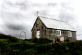
. . . To Breathby JeileenComment: I like the shot. The aspect ratio really sends the message. The border is a little unusual, whch isn't bad, but maybe a bit heavy. |
 Photographer found comment helpful. Photographer found comment helpful. |
| 08/02/2005 10:05:56 PM |
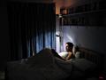
Insomniaby tazzaComment: I like the reading light, does a nice job spotting the reader. I could do without the clock, but the title wouldn't fit as well, then. |
| Photographer found comment helpful. |
| 08/02/2005 07:34:10 PM |
|
| Photographer found comment helpful. |
| 08/01/2005 05:39:09 PM |
|
| Photographer found comment helpful. |
| 08/01/2005 04:38:27 PM |
Nothingsby PedroComment: What's he saying to her??? First question that comes to mind. Great shot, love the fun and emotion captured!! I'd clone out the background stuff in the upper right. Love it!!! |
| Photographer found comment helpful. |
| 08/01/2005 04:35:24 PM |
davis.jpgby PedroComment: Damn, Pedro! You really woke up the ladies with this one, did't you!! ;-)
Very nice shot! Two post processing items...there are two little blue spots to the left of his cheek, and unless it's just the DOF, maybe exclude his neck from the soft focus/blur effect.
Again, beautiful shot! |
| Photographer found comment helpful. |
| 08/01/2005 01:16:11 PM |
|
| Photographer found comment helpful. |
| 07/29/2005 08:43:54 PM |
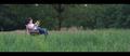
mourningby biggisComment: I like this shot quite a bit. I may edit it a bit more...burn the door/window a bit to take the edge off, drop the saturation a slight bit in the grass (but still keep some color), and maybe bump the saturation in the girl's shirt just a bit. Compositionally, I like it. |
| Photographer found comment helpful. |
| 07/28/2005 12:02:01 AM |
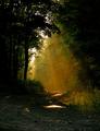
In Time's Pastby ladyhawk22Comment: This is a really nice piece. I love the coloring. It really says 'antique'. I agree with Carter, a little more DOF and the bright spot in the upper right are the only things that take away from this image. If you get the chance to re-shoot with those things in mind, it would make a nice print. |
| Photographer found comment helpful. |
| 07/27/2005 11:57:37 PM |
Postsby ladyhawk22Comment: wow! What can I say that hasn't already been said? The colors are amazing! I think it's a great shot. At least all the flat land is good for something. :-) |
| Photographer found comment helpful. |
Home -
Challenges -
Community -
League -
Photos -
Cameras -
Lenses -
Learn -
Help -
Terms of Use -
Privacy -
Top ^
DPChallenge, and website content and design, Copyright © 2001-2025 Challenging Technologies, LLC.
All digital photo copyrights belong to the photographers and may not be used without permission.
Current Server Time: 08/26/2025 04:56:08 PM EDT.