| Image |
Comment |
| 07/15/2006 11:53:01 PM |
10 flagsby sarsonukComment: what I like:
this is a nice clean shot with vivid reds and I like the lushness of the trees.
What I don't like:
the picture appears slightly crooked which I think throws off a bit. I do count 10 flags however four of them are hard to see. Everything seems so far away it's hard to make out a lot of the detail. |
 Photographer found comment helpful. Photographer found comment helpful. |
| 07/15/2006 03:17:47 AM |
Smiling Eyesby librodoComment: what I like:
Their expressions of course! Handsome young men having what looks to be the time of their lives - the sign of a very talented photographer. The lighting is gorgeous.
What I don't like:
I wish I could see more of the boy on the left behind the closest boy. Actually if the closest boy wasn't in the shot I think it would have been better. It does add a certain amount of frenzied mayhem to the photo (which is good in a shot like this) but in this case I think it detracts a bit too much from the boys in the background. The other thing (and I know it's a style and a matter of personal preference) is the desat grunge look. On many photos it works great and I really like it - but I've been seeing it on similar kids to these a lot lately. These kids are so alive and full of energy - I want to see the life! Which means I want some color! They are almost bronze statues here - break 'em out of the shell :) |
| Photographer found comment helpful. |
| 07/15/2006 03:03:26 AM |
Poins of lightby KivetComment: what I like:
first thing I thought when this image waws "POP! WOW!" The color really jumped out at me - definately the strongest part of the photo. The flowers are beautiful and the lighting is good. good overall range of contrast.
what I don't like:
The depth of field. The center leaf leads me up but the further I get up the softer the pic gets.
I'm very curious to see how you shot this (almost looks like UV photography, but I'm too new at that sort of stuff to know) |
| Photographer found comment helpful. |
| 07/15/2006 02:58:05 AM |
Hang Tenby Tap10Comment: what I like:
Great action shot - good moment of capture, right at the moment of lost control. Tonal range seems good, nice detail even in the white of the surf.
what I don't like:
the first thing that hits me is the use of noise reduction software or what ever that fried a lot of the detail. Personally I'd rather see a shot with more grain than less detail. His face, hand and the water on the right really loast a lot. The water on the right almost looks surreal and painterly. I think the pic could use a little more sturation as well just to make it pop a bit more. Maybe a bit looser crop as well (mainly on the left so he "has room to fall") |
| Photographer found comment helpful. |
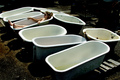
| 07/15/2006 02:47:00 AM |
Sun Bathingby ShermyComment: what I like:
the tubs make an interesting subject. I like the fact that they are all old an just sort of precariously thrown out (makes me wonder about their history as odd as that may seem). The girl in the tub - obviuosly there for humorous effect conveys that message fairly well.
what I don't like:
the girl is too far away and too small in the picture. It would work a lot better if the light was reflected more on her face than so bright on her shoulder. As it is my eye keeps gettign drawn to her shoulder. the feet could use a little better light too. The ground is really grungy (good) but the girls is a little too clean then. I think it would be better if she had been processed a bit grungier as well. Last thing is I'm not fond of the pony tail - just doesn't seem to fit for some reason. |
| Photographer found comment helpful. |
| 07/15/2006 02:37:47 AM |
10 Minutes 'till Nightfallby lkn4truthComment: what I like:
Beautiful view and wonderful colors. the gradation in the sky is awesome. I very much like the fog rolling around the canyons.
what I don't like:
the line of the back mountain seems just a tad sharp. The thin dark line on the edge of the centermost mountain takes away from it just a bit. While it is a beautiful view I'd like to see a bit more of a subject - something I could point to in the mountains or sky that stood out a bit more. As it is I'm just not sure it would hold the viewers attention very long. |
| Photographer found comment helpful. |
| 07/15/2006 02:32:10 AM |
10 Butterfliesby PanoComment: what I like:
Creative concept. from the thumbnail I was thinking tattoos - but I actually like the 3D butterflies better ;) They were well placed I think this is a good model for the shot.
What I don't like:
the lighting seems a bit hard. For something like this with delicate butterflies it would have been better to use more delicate lighting. It has a nice warm glow but is a little too bright on the right and dark on the left. I also would like it better if it was cropped a little lower. We can't really see her face anyway so if you cropped it right about where the shadow line is at her jaw I think it would have made a better study of form. |
| Photographer found comment helpful. |
| 07/15/2006 02:21:01 AM |
The Modern Day Negativeby otisXmikeComment: what I like:
good idea, well executed. I hadn't really thought of binary for this challenge but it fits perfectly. clever.
What I don't like:
it would be nice to have a bit more depth of field so the top drive was more in focus. Are the numbers a reflection? In anycase the way they get smaller and seem to "curve" towards the bottom of the disk gives it a rather odd perspective making it seem as though the disk isn't flat. I also think the crop was a little tight. |
| Photographer found comment helpful. |
| 07/15/2006 12:53:10 AM |
He Loves Me / He Loves Me Notby SJCarterComment: what I like:
I like the flower and the set up - leaving the single petal was a good choice. The colors are vibrant and it seems well exposed. While the depth of feild is shallow I think it works well.
what I don't like:
I'm not fond of the mirror. while you have 10 petals the mirror confuses the image a bit. I also would have prefered a different colored base. With the yellow being nearly the same color as the flower it just doesn't seem to pop as well as it could. |
| Photographer found comment helpful. |
| 07/15/2006 12:45:33 AM |
Fun in the Sunby whiteroomComment: What I like:
this is a fun shot that looks like you and the "models" enjoyed taking. It's a neat idea and I like the setting.
What I don't like:
I think the contrast is too high in the picture. The sand is blown out in some parts and you're losing detail in some of the darker areas. Overall while I like the concept I think they could have been arranged a little differently to make use of the light and make it so their rear ends aren't quite so prominant. |
| Photographer found comment helpful. |
Home -
Challenges -
Community -
League -
Photos -
Cameras -
Lenses -
Learn -
Help -
Terms of Use -
Privacy -
Top ^
DPChallenge, and website content and design, Copyright © 2001-2025 Challenging Technologies, LLC.
All digital photo copyrights belong to the photographers and may not be used without permission.
Current Server Time: 09/04/2025 12:30:22 PM EDT.