| Image |
Comment |
| 10/22/2006 01:45:45 AM |
Demarcation - M01by alfrescoComment: This is a really good shot, I don't think it quite has the "pop" as much as your second photo though (M02). |
 Photographer found comment helpful. Photographer found comment helpful. |
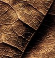
| 10/22/2006 01:44:30 AM |
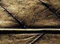
Runoff - M01bby alfrescoComment: I love the way the light is raking across the veins. almost looks metallic. |
| Photographer found comment helpful. |
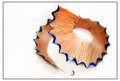
| 10/22/2006 01:41:43 AM |
pencil shavingby Jaded_HousewifeComment: Impressive. I love it when ordinary things become "Art" with an appealing shape or an unusual placement. Nice idea.
The only thing I'd maybe change is the little hook at the end, it messes with the flow a bit. |
| Photographer found comment helpful. |
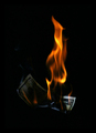
| 07/16/2006 12:26:39 AM |
Money to burnby amandaloreComment: what I like:
I think you captured this at just the right moment with the corner of the bill well lit. The fire is well exposed.
What I don't like:
I would have preferred a more interesting background. |
| Photographer found comment helpful. |
| 07/16/2006 12:22:34 AM |
Not what it used to be...by RasaiComment: what I like:
the picture is nice and sharp and the lighting doesn't seem too bad.
What I don't like:
overall the picture seems a bit too bland for me. Some of the details on the coin are hard to make out and the way the bill is folded makes it a little bit confusing. |
| Photographer found comment helpful. |
| 07/16/2006 12:19:05 AM |
|
| Photographer found comment helpful. |
| 07/16/2006 12:16:39 AM |
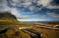
Driftwoodby StructorComment: what I like:
the beautiful landscape, wonderful clouds. This really is a great location. The colors look good and it's all nice and sharp.
What I don't like:
the vignetting draws my eye to the center of the photo and away from the logs. Since the challenges 10 I think that takes away from the picture a bit.
still a wonderful picture though. |
| Photographer found comment helpful. |
| 07/16/2006 12:13:04 AM |
Sleeping Inby levyj413Comment: what I like:
fun idea well executed. I think the card really makes the picture.
What I don't like:
too dark in the background. While I like the card I think it takes up too much of the picture. The person sleeping doesn't seem like they're in a very natural position which makes it seem a bit staged. |
| Photographer found comment helpful. |
| 07/16/2006 12:07:56 AM |
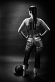
# 10by LalliSigComment: what I like:
this is a sexy pic of a lowly model of course. Very creative to put the 10 on her back. I like the lighting overall it gives a good feel.
What I don't like:
it looks little heavy in the burning in spots especially around her legs. The main focus seems to be on her butt whereas it would make more sense to be on her back. |
| Photographer found comment helpful. |
| 07/16/2006 12:03:00 AM |
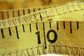
10 Inchesby ElaineComment: what I do like:
I think the texture is great in this picture. I like the colors in the antique feel. This is a fairly creative use of the number 10.
What I don't like:
compositionaly I don't like the upper left-hand corner of the picture. The extreme out of focusness of it looks like a big blob.
You also appear to have a little bit of sensor dust but I won't mark you down for that. |
| Photographer found comment helpful. |
Home -
Challenges -
Community -
League -
Photos -
Cameras -
Lenses -
Learn -
Help -
Terms of Use -
Privacy -
Top ^
DPChallenge, and website content and design, Copyright © 2001-2025 Challenging Technologies, LLC.
All digital photo copyrights belong to the photographers and may not be used without permission.
Current Server Time: 09/04/2025 12:30:23 PM EDT.


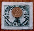
![schweizerische nationalbank zehn franken [found in a loaner corolla]](https://images.dpchallenge.com/images_challenge/0-999/520/120/Copyrighted_Image_Reuse_Prohibited_359186.jpg)