| Image |
Comment |
| 04/28/2003 12:42:07 AM |
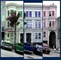
What color do you like?by Pep VentosaComment: I really like your take on the challenge. The only thing that I think would be better is to have the seperate pictures put together in a way where the building is it's actual size. Because of the tree and the vehicles parked in front, it becomes distorted. If they were not there, you wouldn't be able to tell a difference. Otherwise, this was a very good idea. I like the differing colors. |
 Photographer found comment helpful. Photographer found comment helpful. |
| 04/28/2003 12:36:00 AM |
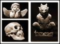
Mortal Coilby moodvilleComment: I really like your set of pictures, especially the smaller ones. The larger photo isn't cropped as close and is also a little fuzzy and grainy. Alone, it would be okay, but since the other two are nearly perfect, it's imperfections really stand out. I like how you grouped your pictures together. |
| Photographer found comment helpful. |
| 04/28/2003 12:30:06 AM |
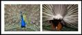
Front and backby robbiehComment: LOL...love the humor and your take on the challenge. There is quite a difference between the front and back of a peacock...that I didn't realize. Anyway, I think I would have liked to see the front of the bird as close up as the back of it. I think you still could have gotten in plenty of the lovely feathers. Plus, the colors don't seem to stand out as well. I really like your idea, though. Nice set. |
| Photographer found comment helpful. |
| 04/25/2003 02:03:59 AM |
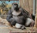
Mighty Joe Young (or Mightier Josephine?) - at restby STEINRComment: Very distinquished guy or gal, but very sad. With the exception of the annoying stick in the foreground, which I know couldn't be helped, this well composed. He/she is framed nicely in the picture. The lighting is good. It's just over-sharpened. Good luck in the challenge. |
| Photographer found comment helpful. |
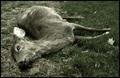
| 04/25/2003 01:51:54 AM |
Fallenby bgmorrisComment: I really don't find this photo very pleasing as I'm sure many have commented on. You were very brave in submitting a photo like this in the challenge. It definately emits an emotion of the "poor Bambi" effect. It was fitting to desaturate the colors and it works well. There is absolutely nothing wrong with the technical aspects of this photo from what I can see....it's just an icky subject and one that most people will vote down because of it. I'll be interested in finding out where you place. |
| Photographer found comment helpful. |
| 04/25/2003 01:38:22 AM |
Species: homo suburbium commuterus, Length: 4'10-7'0 ft, Social Unit: bar car, Brain Size: uncertainby tomzinhoComment: Very cool picture. A bit overexposed. Could use some adjustment in the brightness/contrast area to allow the people, objects and color stand out more. The bright light coming in the window is a little too bright and distracting, but maybe the adjustments would fix that some...or could crop it out. This picture really shows a lot of activity and you portrayed it well. I love your title, even though it's a little long. I really like this picture, but, although humans are mammals, I have a hard time fitting them into fauna. Picture-wise, it scores high, in my opinion. |
| Photographer found comment helpful. |
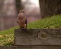
| 04/25/2003 01:29:10 AM |
NJ Mourning Doveby WildpurpleComment: You did really good on this photo. I'm learning and practicing on improving my DOF when I take pictures and I believe that this is a good example of proper DOF. The bird is nicely in focus and stands out from the background. I like how you were able to bring out the texture of the wood plank that he's sitting on. The perfectionist in me also notices that the bottom board is even when you cropped. My only suggestion is that it's a tad on the dark side and maybe a little adjustment would brighten it up some and help the bird stand out more in the picture. Good luck in the challenge. |
| Photographer found comment helpful. |
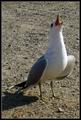
| 04/25/2003 01:23:10 AM |
Can You Hear Meby AlexanderComment: I love this bird in this picture and how it relates to the title that you gave it. The picture itself is in good focus, but one thing I'm learning about right now is DOF. This is another good example, I believe, where a narrower DOF would blurr out the background and bring out the bird better. I'm getting slammed for that in my photo and I'm still trying to figure it all out myself. If you're like me, I only can control 2 f-stop settings on my camera and I always seem to forget which is which...LOL. I guess we all gotta learn. Anyway, the only other thing that I see is that it's a little dark. Unfortunately more than half the bird is in shadow, but a little adjustment to brightness/contrast in post-process will help brighten it up some. Good capture and good luck in this challenge and those in the future. |
| Photographer found comment helpful. |
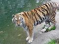
| 04/25/2003 01:08:35 AM |
YOU want ME to do WHAT?!?!by gpflmanComment: I could be wrong, but this looks like a picture taken with a low resolution camera. When I had my first digital camera, I had problems getting good images that were in nice focus if they were taken at a distance. Only thing I could do was always take pictures outside in natural light and get close to my objects so they filled the whole picture and I didn't have to do any cropping in post-process. Also, I found the zoom to be practically worthless in obtaining clear shots. This is a beautiful tiger, but the blurriness distracts from seeing the details in his face. I don't know if you cropped in post-processing, but his hind end or rather his tail is cut off. He needs just a little more space. It's neat how he seems to be looking at you, so good capture. Good luck and keep working. |
| Photographer found comment helpful. |
| 04/25/2003 12:56:23 AM |
Mutual Curiosityby elliottwhitleyComment: I'm having a tough time trying to decide what the creature is in the water. My first thought is a sea turtle, but they don't have long legs like this creature seems to have. Could be water distortion...hmmm. Other than a turtle, I don't have any other guesses. Okay, onto the voting...I feel that this is a good photo and that it meets the challenge, assuming that what I'm seeing is actually an animal..LOL It is well framed...no wasted space. The subjects are in good position. I like how you were able to capture the water coming off the human. Although maybe just a tad on the bright side and washed out, I like the colors and the glare off the water drops. Good luck in the challenge. |
| Photographer found comment helpful. |
Home -
Challenges -
Community -
League -
Photos -
Cameras -
Lenses -
Learn -
Help -
Terms of Use -
Privacy -
Top ^
DPChallenge, and website content and design, Copyright © 2001-2025 Challenging Technologies, LLC.
All digital photo copyrights belong to the photographers and may not be used without permission.
Current Server Time: 08/04/2025 05:42:11 AM EDT.