| Image |
Comment |
| 08/08/2005 06:08:57 PM |
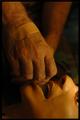
combat lifesaverby militarygirl10Comment: Image is really too small.
I like the tones, allthough maybe a bit too saturated. Don't like the plaster on the hand. |
 Photographer found comment helpful. Photographer found comment helpful. |
| 08/08/2005 05:59:22 PM |
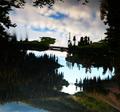
Not Quite What It Seems... Look Hard :)by ShannonLeeComment: A bit too contrasty imo, and tilted to the right. Be carefull with shots containing water and bridges and such with the tilting.
Nice concept too! The riiples in the water and mountains on the bottom give it away. |
| Photographer found comment helpful. |
| 08/08/2005 05:56:31 PM |
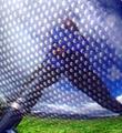
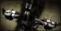
Reflection from a clubheadby marvinComment: That looks like a dangerous shot hehe. Nice with the grass at the bottom (where yo'd expect it). The lighter dots hijack the image a bit though.. |
| Photographer found comment helpful. |
| 08/08/2005 05:53:48 PM |
|
| Photographer found comment helpful. |
| 08/08/2005 05:51:27 PM |
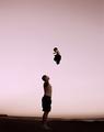
Sent with Love, from Aboveby roadrunnerComment: Beautifull image! Youd probably get arrested for doing that in some parts of the US though!
Great emotive shot. One of my favourites of the challenge! |
| Photographer found comment helpful. |
| 08/08/2005 05:48:35 PM |
The Underworldby CutterComment: Very Cool shot! The bottom right figures feel a bit uncomfortably close to the frame, but that's a nitpick. Good one! |
| Photographer found comment helpful. |
| 08/08/2005 05:46:07 PM |
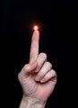
Spontaneous Combustionby barbaraanneComment: Very good! Nice light on the top of the fingetip as well. A bigger flame maybe, and emitting from the center of the fingertip. The hand looks a little pixelated on the wrist? |
| Photographer found comment helpful. |
| 08/08/2005 05:43:29 PM |
The Chessmasterby madhatterComment: Nice one. A lot of noise though that does not really contribute. If you look at the chess eices. Especially the bishop, youll see the direction of the key light. On the model the key light is from the opposite direction and what should have been in the highlight is in shadow. |
| Photographer found comment helpful. |
| 08/08/2005 05:40:39 PM |
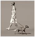
delusionby whiteroomComment: Very good movement implied by the leading foot/paw in the air. This balances it beautifully too. Nice tones and good idea on the desat. I hope this ribbons! |
| Photographer found comment helpful. |
| 08/08/2005 05:35:42 PM |
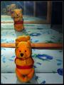
me, myself and ....by FyzarlComment: First Impression: Many Pooh Bears make for fun Image! The reflected light on the top is a bit distracting, and the mirrors could be cleaner, but still very nice!
|
| Photographer found comment helpful. |
Home -
Challenges -
Community -
League -
Photos -
Cameras -
Lenses -
Learn -
Help -
Terms of Use -
Privacy -
Top ^
DPChallenge, and website content and design, Copyright © 2001-2025 Challenging Technologies, LLC.
All digital photo copyrights belong to the photographers and may not be used without permission.
Current Server Time: 08/21/2025 08:47:48 PM EDT.