| Image |
Comment |
| 01/20/2003 02:20:37 PM |
Through a Kids Eyes.by vtruanComment: sorry - i didn't find this a compelling photo. the title helps make it work (although the title might work better with a photo taken of a real sign from a low POV), and i'm having problems saying why i don't like it - the quality is fine, there is a sign in the picture, and on an originality scale it is okay. maybe its because signs tend to be part of outdoor environments and you expect space and scale, and this portrays the opposite of that. also your sign is just sitting there - there is not context/purpose to it in your composition. |
 Photographer found comment helpful. Photographer found comment helpful. |
| 01/20/2003 02:13:57 PM |
Breaking the rulesby zadoreComment: very nice. many of the sign photos come out with the sign darker than the background. you did a great job of having the sign stand out and still constructing a dramatic composition. would increased saturation have brought out the blue a little more? |
| Photographer found comment helpful. |
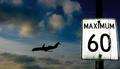
| 01/20/2003 02:11:04 PM |
forty-fiveby johnny_justjohnnyComment: its great how the clouds and sky reflect off the sign, but i feel the sign was pictured at perhaps too sharp of an angle. that said, excellent shot. |
| Photographer found comment helpful. |
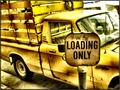
| 01/20/2003 02:07:56 PM |
Loading Onlyby GotchaComment: i love the color in this photo. great shot. one of my highest votes this week. |
| Photographer found comment helpful. |
| 01/20/2003 02:07:33 PM |
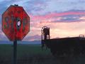
Drew's Stop Sign Revisited by autoolComment: this photo says it all. the beauty and vastness of nature against the efforts of humanity to create order on this earth, only to ultimately fail. also, a portrait of the nature of rural life - great beauty mixed with isolation and decay. even our monuments, like us, eventually return to where they came from. 10. |
| Photographer found comment helpful. |
| 01/20/2003 11:25:52 AM |
Paved with good intentions.by RuchartComment: i like the angle you choose for the shot. i might have increased the color saturation to further differentiate the sign from the grey background. |
| Photographer found comment helpful. |
| 01/20/2003 11:10:39 AM |
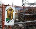
OMG!! Caution: Above!!!by AntithesisComment: it doesn't look like the construction has reached the height where this sign is necessary yet - which makes the photo even more funny ;-)
if there is nothing 'up' then i would have added more sky to the photo to highlight this humorous aspect of the composition. |
| Photographer found comment helpful. |
| 01/20/2003 11:04:00 AM |
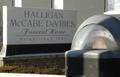
Ironicby teachme53Comment: very original. too bad the focus on the funeral home is a little soft (although i don't know if it could have been done better given the DOF challenge inherent with the shot). |
| Photographer found comment helpful. |
| 01/20/2003 10:57:38 AM |
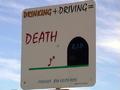
You do the Math...by terik65Comment: i would have liked to have seen more sky in the photo. as it is, the sign is underexposed - your flash might have helped with this. |
| Photographer found comment helpful. |
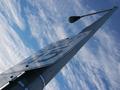
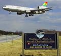
| 01/20/2003 10:45:23 AM |
Look Up Before Passingby GolferDDSComment: i think you have all the right elements here but for some reason they don't seem to be framed right - maybe too tight/busy. looks like a cool place to watch the planes land from. ghana airways - excellent! |
| Photographer found comment helpful. |
Home -
Challenges -
Community -
League -
Photos -
Cameras -
Lenses -
Learn -
Help -
Terms of Use -
Privacy -
Top ^
DPChallenge, and website content and design, Copyright © 2001-2025 Challenging Technologies, LLC.
All digital photo copyrights belong to the photographers and may not be used without permission.
Current Server Time: 12/20/2025 06:36:04 PM EST.