| Image |
Comment |
| 05/15/2003 02:51:29 PM |
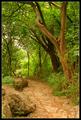
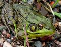
Path Through the Greensby paganiniComment: you've got a lot of green here! i find the big rocks on the left very distracting to the eye. i like how the trees on the right lean over the path. |
 Photographer found comment helpful. Photographer found comment helpful. |
| 05/15/2003 02:50:07 PM |
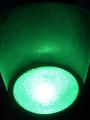
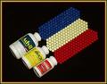
Go!by pesinnComment: cool idea. the symmetry is off slightly. you might have made the green come out even more by reducing the gamma in post processing. |
| Photographer found comment helpful. |
| 05/15/2003 02:47:43 PM |
|
| Photographer found comment helpful. |
| 05/15/2003 02:45:30 PM |
|
| Photographer found comment helpful. |
| 05/15/2003 02:44:39 PM |
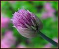
Nature's Colorsby TerryGeeComment: this is a great shot, with the bulb being framed by the (presumably) other bulbs in the background outside of the focus range. only nit would have been the have it lit a little better, but the detail and the composition are wonderful. |
| Photographer found comment helpful. |
| 05/15/2003 02:43:29 PM |
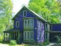
Circa 1861by tuzik02Comment: that would be lots of green and blue. kind of a conventional composition and image. it could have been made a little more powerful if you had taken the photo with the sun behind you so the trees and the house would have been equally lit (and therefore the trees in the background wouldn't be blown out in light). |
| Photographer found comment helpful. |
| 05/15/2003 02:40:07 PM |
|
| Photographer found comment helpful. |
| 05/15/2003 02:39:33 PM |
Green Livingby GinaRothfelsComment: the rotation seems a bit off, but the larger issue is that the way the light falls its hard to discern the green color of the clothing and i have no idea what color the roof is, the plants and most of the trees aren't showing much green either (unless of course you are indicating that this is an energy efficient house and therefore 'green') |
| Photographer found comment helpful. |
| 05/15/2003 02:36:29 PM |
Poinsettia Inversionby peter_kComment: nice composition and interesting choice of frame. the focus seems a little soft, which might have more to do with the way you lit it/post processed it to erase the background. i think you are allowed to submit a bigger picture and you would have benefited from doing that. |
| Photographer found comment helpful. |
| 05/12/2003 10:52:16 AM |
Confusion. Which Shall I Choose?by GolferDDSComment: just don't do them all at once. very creative idea and nice frame. the lighting is just okay and the colors look a little dull, however, and could have benefitted from a boost in saturation to give them more zing. a lower angle might have made the perspective more interesting as well. |
| Photographer found comment helpful. |
Home -
Challenges -
Community -
League -
Photos -
Cameras -
Lenses -
Learn -
Help -
Terms of Use -
Privacy -
Top ^
DPChallenge, and website content and design, Copyright © 2001-2025 Challenging Technologies, LLC.
All digital photo copyrights belong to the photographers and may not be used without permission.
Current Server Time: 08/04/2025 08:11:19 PM EDT.