|
|
|
Showing 801 - 810 of ~1005 |
| Image |
Comment |
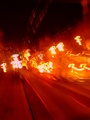
| 05/21/2006 11:57:07 PM | Cable Car Conflagrationby MeGoobieComment: Hey there from the Critique Club
Interesting photograph, but this one is very difficult to critique. I disagree with rick13601. It does NOT suck. It is a photo that typically doesn't do well in challenges here, but it doesn't suck. I do like the leading lines, and the light shapes that closely mimic each other do work to draw the viewer into and around the frame. To do well in these challenges, you need crisply-focused subjects with vibrant colors. Also, Neat Image seems to help out a lot. Don't be discouraged by lower scores and crappy comments. Some day that's the way the ball rolls. I read your posting in the forum earlier, and I agree that every comment is helpful. Welcome to DPC, I like your attitude, and I look forward to many more entries from you. |  Photographer found comment helpful. Photographer found comment helpful. |
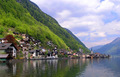
| 05/21/2006 11:38:21 PM | Peacefulby smr78Comment: Hey there from the Critique Club
First off, always try to include some info about the shot in the Photographer's Comments section. It really helps out when we know what the photographer was thinking and what equipment/lighting/etc. were used, especially when you request a critique.
Camera Work/Technical: The super-crisp focus on the from 3/4 of this capture is one of the first things that I noticed. Excellent exposure and great choice of settings to produce a very nice image. Perhaps a CP filter would have gotten rid of some of that haze in the distance, but that is a minor point.
Lighting: The sky is a hair overexposed, and you lost just a little detail in the clouds. A CP would have probably helped with this as well. Other than that, this was a great time of day for this capture.
Composition/Content: Excellent, excellent, excellent leading lines. The coast line, the city and the mountain all converge beautifully to draw the viewer DEEEEEEEEEEPPPP into the frame. You also put the rule of thirds into play nicely.
My Opinion: I bet many of the viewer's struggled with this being a holy place, per-se. Reading through the comments, some mentioned it, but none really beat you up over it. I feel the holiness in this one, and more so than any of the churches, shrines, synagogues, etc that were in the challenge. If the beauty of this scene can't produce a thought or two on some sort of master plan, what will? Nicely seen and nicely captured. I think the score only suffered based on the holy challenge title. Voting, it would have been one of my 8s or 9s.
| | Photographer found comment helpful. |
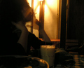
| 05/20/2006 08:35:53 PM | Smokeby Herblacklist12Comment: Hey there from the Critique Club
Camera Work/Technical: This one is very hard to critique in the normal sense of a photograph critique. Nothing is very focused outside the glass, but I am sure that it was the effect that you intended when you captured the image. I cannot tell you that I think it is wrong, it's jut very difficult to offer any suggestions.
Lighting: I like the lighting. It adds to the overall feel of the image, and works very nicely with the scene you captured.
Composition/Content: You created a very interesting feel in this capture, but not one that many voters identified with.
My Opinion: I like it in one sense, but I don't think that I would have scored it very highly. It is often difficult to merge the photographs that we like to take with the photographs that we enter into challenges here. I am assuming that by entering it, you wanted to score highly with it. That is where the balance and compromise comes into play. Voters here like vivid colors, nice composition, and super-crisp images. For a challenge entry, this one really had none of those elements. For a collection, this one would work nicely.
| | Photographer found comment helpful. |
| 05/20/2006 08:13:09 PM | Untitledby TejComment: Hey there from the Critique Club
First off, always try to include some info about the shot in the Photographer's Comments section. It really helps out when we know what the photographer was thinking and what equipment/lighting/etc. were used, especially when you request a critique.
Camera Work/Technical: This image is very nicely focused, but you have areas of both under and over exposure. Reading the comments, most liked the framing that you used here, but it really hurt your overall exposure.
Lighting: This looks like a very harsh lit time of day. That also contributed to the overexposed sky in the capture. Perhaps an early morning or late afternoon capture of this same scene would yield better results.
Composition/Content: While the natural framing you used is very interesting, the composition is almost too centered for me. I also think that I would have cropped that shadow off from the bottom that is falling on the street.
My Opinion: This fits the challenge very well, and I think that it met its full scoring potential. With some different lighting and a little cropping, this one would have probably scored in the low 6 range. Nice capture. | | Photographer found comment helpful. |
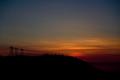
| 05/20/2006 08:03:21 PM | Strange things Happen at Sundownby h0bbelComment: Hey there from the Critique Club
First off, congrats on your growing scores. Your last two are on an upward trend. Second, welcome to DPC. I hope to see those scores keep on growing.
Camera Work/Technical: Nice choice of settings to give this shot the slight underexposure that it needed. The tree line, as well as the power lines are nicely focused.
Lighting: Really cool lighting. This gives are great moodiness to the capture, and gives the viewer a sense of anticipation that all daylight is about to fade away.
Composition/Content: Beautiful sunset, and I like the composition. You are correct that the title threw the voters off. I imagine that it did cost you more than you think. Lots of voters are tough on titles, a lesson I learned the hard way. While I usually ignore the title all together, most around here do not. I do not think that there is too much sky included. I think that it serves well in providing a greater tonal range.
My Opinion: I think that you would have approached a score or 5.8-6.0 with a more clever title. Again, voters will tear you apart for a title they think is off or wrong. Nice capture that fits the challenge well. Congrats on your best score to date, and we look forward to more of the upward trend. | | Photographer found comment helpful. |
| 05/20/2006 07:51:40 PM | St. Phillipsby shneal13Comment: Hey there from the Critique Club
Again I plead, always try to include some info about the shot in the Photographer's Comments section. It really helps out when we know what the photographer was thinking and what equipment/lighting/etc. were used, especially when you request a critique.
Camera Work/Technical: Nice exposure and great depth of field use, ensuring that everything in the frame was focused. Your coloring is very nice and the WB seems to be right on target.
Lighting: I think that you picked the right time of day for this shot, but the lighting looks just a bit flat. While the building contrasts nicely with the sky, the building itself looks like it could use some contrast of its own. A slight s-curve adjustment in curves should remedy this easily.
Composition/Content: I like the use of a centered composition here. It breaks the "rules" of photography and still yields a very nice photograph. I'd like to see a bit more of the building's bottom, perhaps without chopping off the window that's in the frame. The steeple serves nicely to carry the viewer up and into the frame.
My Opinion: This one fits into the challenge nicely, but is lacking that unique feature that distinguishes it from the rest of the entries. Perhaps a slightly different vantage point or m a touch more contrast, but something is just slightly lacking. | | Photographer found comment helpful. |
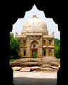
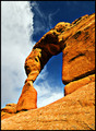
| 05/20/2006 03:52:33 PM | Desert Paradise Callingby rjksteschComment: Hey there from the Critique Club
First off, always try to include some info about the shot in the Photographer's Comments section. It really helps out when we know what the photographer was thinking and what equipment/lighting/etc. were used, especially when you request a critique.
Camera Work/Technical: Wonderful exposure, crisp focus and great depth of field, ensuring that everything in the frame was in focus. The coloring a and WB seems spot on from the photos of this park I have seen in the past.
Lighting: Almost perfect. The only complaint that I have with the lighting is the shadow inside the top of the arch, but I don't think you would have achieved such a dramatic feel with the lighting any other way. The time of day you picked really makes the colors in this image come to life.
Composition/Content: I really like your chosen point of view here. You have a nice foreground that subtly leads the viewer into the frame, giving us the feeling of scaling up the arch. Then the arch itself takes over, leading us through the rest of the image. Very nice contrasting complementary colors between the arch and the sky. Great rule of thirds use, especially in the division of the sky.
My Opinion: It just doesn't fit into the DPC Cinema cahllenge like most voters expected. In complementary colors, this one would have been an easy top ten, I believe, as well in many other challenges. While I rarely even look at titles, this title just doesn't pull the entry into the challenge. I believe that this was one of the rare challenges wehre the title was actually significant. OVerall, I like the image. If scoreing, this one would have been in the 8+ range for me despite the title. You ahve a very powerful image that lacks very little from a technical viewpoint. Well-done. | | Photographer found comment helpful. |
| 05/19/2006 08:13:23 PM | Don't Press Chargesby JudiComment: Hey there from the Critique Club
Camera Work/Technical: Great high key type shot. Nice exposure without losing any detail. Perfect choice of settings to produce a perfectly focused photograph.
Lighting: Very well done. Nice studio setup that exposed everything just right.
Composition/Content: Great composition that leads the viewer's eyes to each element in the frame. The positioning of each and the detail of the shot keeps the viewer's eye moving throughout the frame.
My Opinion: I have to admit, I have no ideas what the title means, but that would not have affected my vote in this one. Nice job meeting the challenge and producing yet another great Judi image. | | Photographer found comment helpful. |
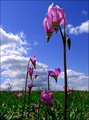
| 05/19/2006 07:58:46 PM | Dodecatheon Planetary Creaturesby aberrationComment: Hey there from the Critique Club
First off, always try to include some info about the shot in the Photographer's Comments section. It really helps out when we know what the photographer was thinking and what equipment/lighting/etc. were used, especially when you request a critique.
Camera Work/Technical: Great positioning and excellent point of view. You subject seems nicely focused, while your background tapers nicely off into a blur. You did lose some detail in your darks due to the camera doing all it could not to overexpose the brights.
Lighting: Your choice of lighting is why this photo didn't do better in the challenge. Your lighting is a bit too harsh, and choosing a different time of day would have produced better lighting results.
Composition/Content: Very interesting flower, and it makes a great subject. Your point of view also provides a very interesting composition. Great rule of thirds use that keeps the viewer's eye roaming all through the frame.
My Opinion: I like the idea, but I think that is scored appropriately. You probably would have picked up another half point or so with a lighting change. As is, I would have voted in the 5 range. | | Photographer found comment helpful. |
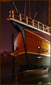
| 05/17/2006 06:02:17 AM | The Santa Mariaby timfythetooComment: Hey there from the Critique Club
Alright...how the heck does this keep happening. I make a Trading Post comment, then I pull yours from the CC. Well, her goes...
Camera Work/Technical: Great focus. Everything is very crisp and crystal clear. Nice choice of the high ISO to keep the shutter speed as quick as possible. That ocean can be tricky, even in calm water. I also like the depth of field choice here. Everything that the eye can see appears to be focused. The background is a little too noisy. If you shoot in RAW, upping the shadows would help out a lot. As far as PP, I have no idea.
Lighting: Excellent, excellent lighting. The available lights give this shot a really nice, peaceful feeling. No area is overexposed and no area is underexposed.
Composition/Content: Stupid kids, but you still put together a great composition. Your leading lines are near flawless here. Starting with the skiff line, the eyes are pulled into the frame and all around to the various elements. Your texturing and coloring here is terrific. My only critique for the composition would be to remove just a little bit off of the top to get rid of that object in the upper right corner.
My Opinion: Excellent capture! I really don't think that this one ended up with the score it deserved. This is especially cool since it was your first night shoot. You got a great eye. | | Photographer found comment helpful. |
|
Showing 801 - 810 of ~1005 |
Home -
Challenges -
Community -
League -
Photos -
Cameras -
Lenses -
Learn -
Help -
Terms of Use -
Privacy -
Top ^
DPChallenge, and website content and design, Copyright © 2001-2025 Challenging Technologies, LLC.
All digital photo copyrights belong to the photographers and may not be used without permission.
Current Server Time: 08/04/2025 08:53:54 PM EDT.
|