|
|
|
Showing 651 - 660 of ~1006 |
| Image |
Comment |
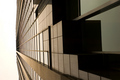
| 06/06/2006 04:35:02 PM | Vanishing Pointby fotodudeComment: Hey there from the Critique Club
Camera Work/Technical: Crisp focus and very nice depth of field. The crop is nice, and the angle you chose for presentation makes the image nicely dramatic.
Lighting: The sky is too much here. Perhaps a graduated natural density filter would have you maintain some of the sky's detail. As it is, you're left with a blown out white area that is fairly distracting.
Composition/Content: The composition is strong. You left just enough sky to really draw the eye up and into the frame.
My Opinion: I think that you met the challenge very well. With a more detailed and less exposed sky, this one would have pulled a better mark from most voters.
Eric
|  Photographer found comment helpful. Photographer found comment helpful. |
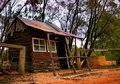
| 06/06/2006 03:21:56 PM | Buckingham Palace it is!by JudiComment: Hey there from the Critique Club
Camera Work/Technical: Nice focus, but I think that I'd like to see the background blur a bit. The reds look a little over-saturated, but easily remedied with a bit of post-processing.
Lighting: You picked a perfect time of day. The lighting is nice and even, with no harsh shadows. I think that the sky would have benefited from a graduated natural density filter, as it lost a little detail.
Composition/Content: Great choice for the challenge and very humorous. I think it would have fared better with a slightly tighter crop.
My Opinion: I like it, and I think you went outside the envelope to meet the challenge very well. I think it scored pretty close to its potential, but with some slight changes, would have done even better.
Eric
| | Photographer found comment helpful. |
| 06/06/2006 02:43:52 PM | Ray of Hope?by GeneralEComment: Hey there from the Critique Club
Camera Work/Technical: As far as I can tel everything looks nicely focused. This reminds me of the negative image challenge, as well as the hope that I would never again have to look at negative images. Your post-processing provides a very interesting effect, only rendering part of the image as a negative. I like it, and its much easier to look at.
Lighting: Wonderful use of natural light to produce a great foreground, and a background that is very interesting despite a little of overexposure. The time of day that you chose worked very well for this image.
Composition/Content: The composition feels a little crowded. I do like the perfectly centered composition, but I think I;d rather see a bit more of the building. Perhaps this exact setup, but turning the camera to landscape rather than portrait.
My Opinion: What you produced here is not something that I normally prefer, but I strongly disagree with the score. There is no way that this is a sub-5 photo. Nicely seen and interestingly processed.
Eric
| | Photographer found comment helpful. |
| 06/06/2006 09:44:39 AM | Athlete\'s Acheivementsby meganoComment: Hey there from the Critique Club
Camera Work/Technical: As you mentioned and everyone that commented noticed, the medals are not focused. Keep in mind that the Photographer's Comments are not visible during voting. Without those, it just looks like the focus problem was an accident rather than a design.
Lighting: The lighting is nice and even, but has a flat feel to it. I think that this one could have used a slight curves adjustment to give it some needed contrast.
Composition/Content: I like the composition that you created here. The ribbons and medals work very well together to draw the viewer's eye in and around the frame. Starting with the medals, everything flows very well deep into the image.
My Opinion: Most of the time voters here like vivid colors, crisp focus, or images from a third world country. As it is, I think that this one scored pretty close to is potential. With better focus and a bit more contrast, your score would have greatly improved. You did a nice job with composition, as well as meeting the challenge.
Eric
| | Photographer found comment helpful. |
| 06/05/2006 07:34:53 PM | I lostby chugginrailComment: Hey there from the Critique Club
Camera Work/Technical: Nice depth of field use and great focus on the main portion of the image. I think a touch of neat image or noise ninja would have helped out a great deal.
Lighting: Excellent, moody lighting that really adds to the sense of failure that you nicely portrayed. I think that it is just a little too dark, which also magnifies some of the noise.
Composition/Content: Your composition in addition to your lighting provide several leading elements that pull the viewer all around the frame. From the foreground pieces to the small highlights on the background pieces, all elements flow very nicely together.
My Opinion: I think this one should have done a bit better, but the voters need vibrancy or a portrait from a third world country to give high scores. I like the idea, and I think that it was the most well-executed of those with similar ideas.
Eric
| | Photographer found comment helpful. |
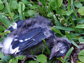
| 06/05/2006 03:16:06 PM | DeNestedby Bernard_MarxComment: Hey there from the Critique Club
Camera Work/Technical: As I mentioned in my comment during the challenge, the focus seems to be off just a little. It looks like the grass is more in focus that the dead bird. Closing that aperture and using just a little fill flash would have helped this even where the camera focused.
Lighting: The lighting is pretty nice. The white down feathers at the bird's butt lost a little detail. That adds a small distraction, but the remainder of the image seems nicely lit.
Composition/Content: I like the basic composition, but it has a slight crowded feeling to it. The feather touching the bottom left corner is the sole reason for this. Opening up the crop just a slight amount would easily remedy this.
My Opinion: As is, the image score pretty close to its potential. With better focus and just a slight adjustment in the cropping, this would be well above a 5.
Eric | | Photographer found comment helpful. |
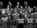
| 06/05/2006 02:51:05 PM | On Top of "Swing"by rayg544Comment: Hey there from the Critique Club
Camera Work/Technical: Very nice exposure, and a great depth of field, ensuring that all levels of the band were in crisp focus. Something, however, is making this one a bit pixelated. I am not sure if it was the conversion or some neat image, but my eye is seeing something that is a bit distracting.
Lighting: Very nice and a very strong element of this image. There are no harsh shadows or blown out highlights. This is a terrifically lit capture in an area that I imagine had lighting that was difficult to work with. Very nice work.
Composition/Content: This is the area that is most distracting to me. Looking through the image, my eye finds some terrific leading lines. The top two rows with their instruments pointing in different directions work very well to keep the image flowing. However, my eye is led right out of the frame by the top left and middle right musicians being cropped off. I am sure that you were limited by what you could capture at the event, but I think shifting a bit to the right would have been helpful.
My Opinion: It is difficulty for the voter to see success without reading your description, Eric Clapton or not. I know absolutely nothing about swing, so it wasn't immediately obvious to me where the success was. Even an shot of someone I recognize doesn't instantly scream success. Images 1, 2, 6, and 9 of this challenge seemed to emit a feeling of success in my little mind. You have a fine image that is very appealing. I think with just a little different crop, this one would have gotten up toward the 6 mark.
Eric | | Photographer found comment helpful. |
| 06/05/2006 02:37:17 PM | Nature's Sweet Smell of Successby obsidianComment: Hey there from the Critique Club
Camera Work/Technical: Fantastic exposure (read perfect) and one of the best depth of field uses I have seen in a while. Every piece of each flower is in crisp focus, while the background blurs quickly and very nicely. Great white balance to produce very appealing colors.
Lighting: I'd say even and flawless. I read the doc's comment, and I cannot seem to find the area that is overexposed. I think that the lighting is wonderfully even and no detail was lost in any part of the image. I also think that the coloring is spot on. I am looking at it on a True Color notebook that was calibrated last week, and it looks dead on.
Composition/Content: I do agree with the good doctor on the composition. It is a little tight, and backing out just a hair would give the eye some room to roam in the frame.
My Opinion: While you have an image that is technically beautiful, it would be hard for the voter to see success without reading your description, even with the title. Great coloring and very well seen. I think that this one would have pushed the top ten for some other challenge. | | Photographer found comment helpful. |
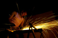
| 06/03/2006 05:09:37 PM | Some like it hot (and some sweat when the heat is on)by Ragga2000Comment: Hey there from the Critique Club
Camera Work/Technical: Excellent! You did a fantastic job, especially considering the 1 second exposure, keeping the worker in focus while he was grinding metal. I like your choice of white balance here, giving the photograph a very moody, warm feel.
Lighting: Also very well done. Your setup works very well here, keeping just enough detail to make this a very interesting photograph. The sparks provide great light of their own, while the worker and background have just enough light to keep the eye moving around the frame.
Composition/Content: This is the only area where I'd like to see just a little bit of improvement. I think that the sparks trail too much off the right side of the frame. It provides for a very strong leading line that leads the viewer right out of the image. Allowing us to see more of the terminal ends of the sparks would have added some to your score, in my opinion.
My Opinion: I believe that you met the challenge very well. Between the flying sparks and the sweating worker, there is no doubt that this represents heat. Nicely envisioned and terrifically executed. With a slight composition change, this would could have broken the top ten. Congrats on a strong, top thirty finish.
| | Photographer found comment helpful. |
| 06/03/2006 04:55:37 PM | Hot Handby timfythetooComment: Hey there from the Critique Club
Well, it happened again. I added a critique from the Trading Post, and pulled yours to critique from the Critique Clube cue. So, I will echo what I have already said earlier.
Camera Work/Technical: Great focus on the hand while still showing the motion of the fire. The colors are also very nice, adding a nice warmth beyond the obvious heat of the capture.
Lighting: Also very well captured. Your use of flash is terrific to the point that I can't even tell that the flash was used. This is a very strong element in this particular photograph. You did a tremendous job just filling in enought to capture the detail of the hand without losing anything from the flame.
Composition/Content: The centered composition works very well for this capture. The hand position in great and just enough of the arm is viewable to keep the eye moving up the entire frame.
My Opinion: Wee envisioned and well captured. While a 6.1 is nothing to scoff at, I think that this one should have scored much better.
| | Photographer found comment helpful. |
|
Showing 651 - 660 of ~1006 |
Home -
Challenges -
Community -
League -
Photos -
Cameras -
Lenses -
Learn -
Help -
Terms of Use -
Privacy -
Top ^
DPChallenge, and website content and design, Copyright © 2001-2025 Challenging Technologies, LLC.
All digital photo copyrights belong to the photographers and may not be used without permission.
Current Server Time: 08/06/2025 08:48:02 PM EDT.
|