| Image |
Comment |
| 06/06/2006 05:20:14 PM |
|
 Photographer found comment helpful. Photographer found comment helpful. |
| 06/06/2006 05:19:25 PM |
cityscale.jpgby saintaugustComment: Interesting, but it looks like there is a lot of work ahead for someone. Then again, a lot has already been done. |
| Photographer found comment helpful. |
| 06/06/2006 05:18:23 PM |
|
| Photographer found comment helpful. |
| 06/06/2006 05:17:15 PM |
divine freedomby saintaugustComment: I really like the lighting you produced here. Nude images are always my favorites, and you produced yet another that I like. Beautiful model and terrific post-processing work to yield a very nice image. Wonderful work. |
| Photographer found comment helpful. |
| 06/06/2006 05:12:03 PM |
Edith Cowan Universityby QikiComment: Hey there from the Critique Club
Camera Work/Technical: Terrific focus and nice depth of field. Everything in the frame is nicely seen and there is very little noise in the image.
Lighting: I don't think that the uneven lighting works very well with this image. The highlights produced on the right hand side of the frame pull the eye that way and compete with the nice composition.
Composition/Content: Very strong. Your cropping and leading lines work very well to move the eye through the frame. Without the competing highlights, the eye would flow nicely.
My Opinion: Very nice work in meeting the challenge very well. Very well seen. With a slight lighting change, this one would have been in the 6 range easily.
Eric
|
| Photographer found comment helpful. |
| 06/06/2006 05:07:56 PM |
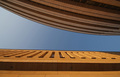
Weathered Columnby meyersComment: Hey there from the Critique Club
Camera Work/Technical: Nice focus, but I think a deeper depth of field would help. I'd like to clearly see the columns in the background as well.
Lighting: Your lighting is a little flat. The shadows in the column heads help out a bit, but this one needs a bit more contrast.
Composition/Content: The centered composition hurts this one. Perhaps standing a bit either side would have made this one even more appealing.
My Opinion: I think that you met the challenge well, and that this one scored close to its potential.
Eric
|
| Photographer found comment helpful. |
| 06/06/2006 05:04:52 PM |
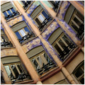
La Pedreraby AndrewTOComment: Hey there from the Critique Club
Camera Work/Technical: I like the tilt you chose here, and your focus is spot on. The white balance you chose yielded some very nice coloring and tones.
Lighting: The lighting looks a bit flat and uneven. A slight curves adjustment would have helped a great deal. There seems to be more light at the top of the frame than at the bottom. This is probably based more on the colors in the building than actual lighting.
Composition/Content: Your composition is this image's greatest strength. The angle paired with the repeating patterns provide the eye with lots to look at, thus keeping it flowing throughout the image.
My Opinion: This is a fine image that met the challenge very well. With slightly altered lighting or a crop that lost the bottom of the frame, I think you'd have jumped into the 6 range.
Eric
|
| Photographer found comment helpful. |
| 06/06/2006 05:00:17 PM |
Light & Shadow...by photoleonComment: Hey there from the Critique Club
Camera Work/Technical: Great focus and excellent depth of field use. Everything is nicely viewable with very little noise.
Lighting: Very nice. The shadows and highlights on similar colored objects play well together to provide wonderful contrast.
Composition/Content: Wonderful and dramatic composition. The shadow and highlight paired with the clue sky works very well to move the eye through the frame. My only change would be aligning the bottom portion of the image with the frame. This slight tilt looks more accidental than intentional.
My Opinion: I believe that you met the challenge very well, and you did it with a very strong image. I think that the voters were looking for more angles and a dramatic background. Still, I like this one better than many that finished ahead of it.
Eric
|
| Photographer found comment helpful. |
| 06/06/2006 04:54:51 PM |
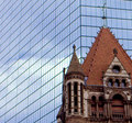
House of godby TheMegalomaniacComment: Hey there from the Critique Club
Camera Work/Technical: It is very difficult to determine if this image is focused or not. There is a great deal of noise in the capture, but the focus looks off to me.
Lighting: Very nice, very even lighting. Nothing is overexposed, and the shadows work nicely to provide contrast to the image.
Composition/Content: I like what you were after here. Old and new together and the tug or urban renewal v. history. I'd really like to see the rest of the church, so backing out from the tight crop would have looked a little better.
My Opinion: A nicely seen image, but the technical side needs some work. The good news is that technical aspects are the easiest to remedy. I think that this one scored pretty close to its potential.
Eric
|
| Photographer found comment helpful. |
| 06/06/2006 04:50:48 PM |
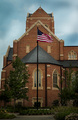
Old Glory...by ACheltonComment: Hey there from the Critique Club
Camera Work/Technical: Very sharp focus and nice settings to keep everything in the frame in crisp focus. Your burn tool was set too strong during post-processing. You started with a nicely exposed sky, but I can see your tool marks that were left with the burn.
Lighting: Very nice. The only issue is that the bottom is just a hair too dark.
Composition/Content: I think that the centered composition works very well for this particular image.
My Opinion: I think that you met the challenge, but the main subject is more the flag that the architecture around it. You still produced a fine image, but ease up with that burn tool.
Eric
|
| Photographer found comment helpful. |
Home -
Challenges -
Community -
League -
Photos -
Cameras -
Lenses -
Learn -
Help -
Terms of Use -
Privacy -
Top ^
DPChallenge, and website content and design, Copyright © 2001-2025 Challenging Technologies, LLC.
All digital photo copyrights belong to the photographers and may not be used without permission.
Current Server Time: 08/06/2025 10:46:25 PM EDT.