|
|
|
Showing 561 - 570 of ~1007 |
| Image |
Comment |
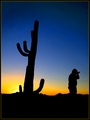
| 09/04/2006 07:13:44 PM | Searching the Superstition Mountains by cutlassdude70Comment: Hey there from the Critique Club
After a slight hiatus from critiquing (new house, big RN cert test, new job, blah, blah, blah), I have decided to pull a few from the queue. Yours is first, and just happens to be a ribbon winner. So with that, congrats on your first ribbon and your highest scoring image to date.
Camera Work/Technical: This is a terrific choice of settings to keep the terrific color of the sky while keeping the profiles of the photographer and the cactus solid.
Lighting: Again, near perfection. I can also see why Steve likes to shoot this area.
Composition/Content: I find this area to be my only viable area of critique for this image. It feels just a bit tight on the composition with the photographer shooting toward the outside of the frame. It almost leaves me longing to see what he's looking at. Perhaps just a bit more empty space on his right would have loosened it up a bit, but there really was no good reason to change anything. The voters were very pleased with your choice of composition. You did a fine job meeting the challenge, and did so with the types of images I had in mind for this challenge.
My Opinion: While I did not enjoy the challenge, nor many of its entries, I am glad to see that this one did as well as it did. Looking at it in voting, I would have guessed that it was also fit for a basic editing challenge. It wasn't far off. Again, congrats on a very fine image, and one well worthy of its final placement, especially considering the miles that you put on stepping out of the house to get it. Great work!
Eric
|  Photographer found comment helpful. Photographer found comment helpful. |
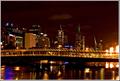
| 09/04/2006 06:55:27 PM | Flaming Bridge!by doctornickComment: I like this one a great deal, but I Do agree with Scott. The right side is a bit blown, but a slight crop would have remedied that easy enough. Nice work and a very nice challenge portfolio. | | Photographer found comment helpful. |
| 08/14/2006 12:15:21 PM | B (2)by elemessComment: This is my favorite of the series you have up here. I really like the toning that you came up with here, and the catch lights are very nice. I might throw a curves adjustment layer in there for some contrast, but that is just personal preference. Nice work with that fancy toy. | | Photographer found comment helpful. |
| 08/12/2006 10:44:55 PM | Rock Solidby syko_lanaComment: Amazing capture, and would have probably ben up there in ribbon territory! Keep 'em coming, just watch those rules. Still, beautiful work. | | Photographer found comment helpful. |
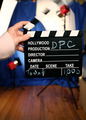
| 08/09/2006 06:50:38 AM | Lights, Camera, ACTION!by Jaded_HousewifeComment: Hey Crystal,
I gave this one a 5, so I'll approach your critique request as I do any others on here.
Camera Work/Technical: Excellent. This is what pulled all five points in my opinion. I like the colors you set up, as they all work well to make the image pop. I like the slower shutter speed to get movement in the clapboard, and the clapboard itself is tack sharp. Your chosen depth of field works nicely to isolate most of your subject off of the background. The only exception is the white stripes in the clapboard.
Lighting: The umbrella and softbox are difficult to make out, thus they just look overexposed without studying the image closely for a period of time.. In turn, these really compete for the eye's attention and work as a large distraction. Keep in mind that the voter only spends a few seconds on each image, especially when there are so many images in a challenge. In addition, the white lines of the clapboard itself just fade into the white of the lighting, and you lose more of the needed detail.
Composition/Content: I got a real fell of movement from the clapboard, but it just wasn't the "action" I had in mind. I do think that it is creative, but it came across more as a cute snapshot than a strong technical photograph. It also feels a little cramped into the frame. Perhaps just a bit wider view would have also helped out, but it already looks like you were losing the backdrop on the right side, as I see a doorway or something bright.
My Opinion: I do like the idea, but it just wasn't what my mind had imagined for an action shot. Even still, turning that softbox, using a dark umbrella and pulling back a hair would have probably pulled a 6 from me. I hope that this helps. | | Photographer found comment helpful. |
| 08/03/2006 02:30:21 AM | Golden Sunflowersby snafflesComment: Hey there from the Critique Club
Looking through your portfolio, this is your best capture to date. It is far better than 4.7, but the image size is too small. Always, always, always, always us the full size parameters that DPC allows.
Camera Work/Technical: Your focus is spot on crisp, and your chosen white balance yielded very nice, strongly contrasting colors. I can almost feel the warmth of the scene with such vivid colors.
Lighting: Your lighting is one of the main image strengths. You did a fantastic job keeping highlight details while also exposing the shadows nicely.
Composition/Content: I like the overall composition of the image, as well as the way you shot the flowers from a side-front view rather than a straight on shot. My only complaint with the composition is that it feels very crowded at the top of the frame. I'd like to have seen this one backed out just a bit so that those petals weren't touch the top.
My Opinion: Again, this is my favorite shot in your portfolio, but the size of the image killed your score.
Eric
| | Photographer found comment helpful. |
| 07/05/2006 09:09:56 PM | NEW: Lightning Trucksby KitaComment: Hey there from the Critique Club
Camera Work/Technical: I do agree with Rebecca that the highlights are a bit blown. However, I do like the movement that you created with the background. I think that this was a very creative idea.
Lighting: Just a touch too harsh. If this had been toned down just a little, I think that the voters would have been more fond of it.
Composition/Content: I also think that your composition needed some work. While I am no stickler for the 'rules of photography,' I think that the centering did not work very well for this one.
My Opinion: You absolutely met the challenge, and did so in a very creative manner. I just don't think that it was what the majority of the voters had in mind for the challenge. Even still, I like it, and with some minor lighting and composition changes, I think that it would have pulled a better score.
Eric
| | Photographer found comment helpful. |
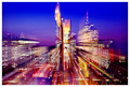
| 07/05/2006 04:51:05 AM | Shooting the Breezeby ArtanComment: Hey there from the Critique Club
Camera Work/Technical: These are always very difficult for me to critique, especially from a technical standpoint. The blur is a bit distracting to me, and it is difficult to find an area of crisp focus.
Lighting: Very nice lighting. This is the main strength of this image. You captured great coloring in every part of this image.
Composition/Content: I think that the tall parts of the skyline are a bit too centered for this type of capture.
My Opinion: While this is a very nice zoom blur, it really isn't what I think of when I hear motion blur. Still, I think that it met the challenge, and the voters liked it enough to place it in the top 25.
Eric
| | Photographer found comment helpful. |
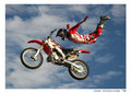
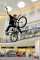
| 07/05/2006 04:45:28 AM | Look Folks - No Handsby michael_pComment: Hey there from the Critique Club
Camera Work/Technical: This is where a great idea lost some of its potential points. Your motion blur is terrific, but your focus is off on the rider. Your depth of field complements the blur very nicely, but it may have been one of the main reasons that you lost the crisp focus that this one needed.
Lighting: Your lighting is very nice. The bright background really helps isolate the rider in his dark clothing. You also did a terrific job with the exposure. No important detail was lost to highlights or shadows.
Composition/Content: Great choice of subject for this particular challenge.
My Opinion: As is, this one scored a little higher than I would have expected. You did a great job meeting the challenge, and with the rider in crisp focus, I'd expect to see this one well into the 6 range.
Eric
| | Photographer found comment helpful. |
| 07/05/2006 04:39:27 AM | get to the flowerby alpharichComment: Hey there from the Critique Club
Camera Work/Technical: Interesting, but the flower lost some of its crisp focus with the camera movement. I do like your choice of WB, as the colors are nicely captured.
Lighting: Great lighting for the effect you were after. The subject stands nicely off the background that you created.
Composition/Content: I think that this one is a bit too centered. While I am no stickler on the rules of photography, it often helps the image by pulling it out of the center.
My Opinion: I think that this one scored pretty close to its potential. Voters here like vivid colors and high contrast. I do like the idea, and I think that you pulled it off pretty well.
Eric
| | Photographer found comment helpful. |
|
Showing 561 - 570 of ~1007 |
Home -
Challenges -
Community -
League -
Photos -
Cameras -
Lenses -
Learn -
Help -
Terms of Use -
Privacy -
Top ^
DPChallenge, and website content and design, Copyright © 2001-2025 Challenging Technologies, LLC.
All digital photo copyrights belong to the photographers and may not be used without permission.
Current Server Time: 08/09/2025 10:38:09 AM EDT.
|