| Image |
Comment |
| 10/04/2006 10:02:53 AM |
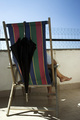
Waiting the rain for the challengeby Rino63Comment: Hey there from the Critique Club
Camera Work/Technical: I'd really like to see this image shot at a different time of day. I see a hint of terrific color on the back of this chair, but that portion of the image is a bit underexposed, even with the fill flash.
Lighting: In a word: harsh. Your time of day created some hard and contrasting areas that battle for the eye's attention. Unfortunately, the subject isn't strong enough to hold the eye. My eye is pulled directly to the lower, left-hand corner, and there is nothing else in the frame to pull it away from there. The shadow created from the fill flash also created some awkward shadows of the chair and the foot.
Composition/Content: The main problem with the content is that there is no rain in an image entered into the rain challenge. The composition isn't bad, but I'd like to see it loosened up just a bit. Cropping this tight gives a cramped, boxed-in feeling instead of the relaxing feeling that the subject matter warrants.
My Opinion: Considering the challenge subject and the harsh lighting of the image, I think that this one scored near where it should have. Even leaving the subject as-is and making the needed lighting changes would have bumped this one up considerably in score.
Eric
|
 Photographer found comment helpful. Photographer found comment helpful. |
| 10/04/2006 09:49:00 AM |
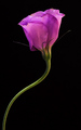
Une Petite Purpleby taljComment: Hey there from the Critique Club
Camera Work/Technical: Very nice, crisp focus, great choice of white balance, and a very nice job using the small aperture to really isolate the subject from the background.
Lighting: Your lighting, as I imagine was the intended design, is the main strength of this image. The subtle highlights and shadows work nicely to balance the image, as well as keep the eye moving back and forth through the image.
Composition/Content: Thought a hair too centered, I do like the composition, but I think the content could have been better. As you will notice, flowers are almost over used as subject matter. Their natural beauty makes this almost impossible to pass up, but subjects of commonplace frequently get lower scores despite their overall quality. Looking through the challenge results, I only see one flower shot in the top 20.
My Opinion: I think that your image is better than a few that finished better in the challenge, but I do feel that the score is appropriate. Considering the numbers of flowers that the voters see and rate on each challenge, I think the score is strong. Overall nice work, but try branching out a bit more with your challenge entries. You may be pleasantly surprised with the results, as well as the votes.
Eric
|
| Photographer found comment helpful. |
| 10/01/2006 10:27:08 AM |
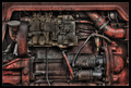
The Engineby Tom_RobbrechtComment: I really like this one. The only thing I'd change would be to give it just a hair of clockwise rotation to straighten that top l;ine up with the frame. Well-see, well-captured and well-displayed. 8. |
| Photographer found comment helpful. |
| 09/27/2006 12:54:59 PM |
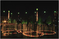
Electric Colorby rexComment: Personal best and a top 15...very nice and well-deserved. |
| Photographer found comment helpful. |
| 09/17/2006 10:23:57 PM |
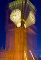
Broadcasting London Timeby ManicComment: I am not normally a big fan of zoom shots, but this one is very interesting and grabs my attention. Well-deserved score and very nice work. |
| Photographer found comment helpful. |
| 09/17/2006 10:22:49 PM |
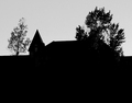
_Spire_by justineComment: You came up with a nice, solid silhouette, but the angle definitely hurt your score. Also, I'd like to see a bit more interesting sky. Still, much better than than many of the others in the challenge. Very nice silhouettes. |
| Photographer found comment helpful. |
| 09/17/2006 10:20:45 PM |
|
| Photographer found comment helpful. |
| 09/17/2006 09:21:22 PM |
|
| Photographer found comment helpful. |
| 09/08/2006 02:10:10 PM |
golfing with daddyby irishempressComment: Nicely done. I am not a big fan of tilt, as a matter of fact, I usually hate it. However, there are certain images that it works very well in. This is one of those images. The tilt adds the fell of action and movement for this one. Perhaps it is a bit over exposed, but it works well with the overall feel of the image. The only thing that bothers me is the shadow around the edge. I'd like to see a version without it before I made a final decision on whether it should be there or not. Either way, I like the image and I think the post-processing is also well-done. |
| Photographer found comment helpful. |
| 09/04/2006 09:09:44 PM |
Then Out Came the Sun...by yakatmeComment: Hey there from the Critique Club
Camera Work/Technical: Great color and very nice focus. While I can see the effects of the diffuser in comparison, the image looks pretty sharp as a stand alone.
Lighting: Very nice and very even lighting. There are no overpowering highlights and no deep shadows to compete for attention. With a flower this color, achieving a balance like this is not always easy.
Composition/Content: I like your choice of composition for this image. Off-centering and loosely following the rule of thirds adds interest and allows the eye to wander through the frame.
My Opinion: I think that you have a fabulous image that is technically well done. I also think that it is a bit too crisp to compete in a soft focus challenge. I do see a very distinct difference in the two different versions, and that would have been helpful in voting. Unfortunately, we can only see the single image. Still, very nice work and a strong, well-deserved score.
Eric
|
| Photographer found comment helpful. |
Home -
Challenges -
Community -
League -
Photos -
Cameras -
Lenses -
Learn -
Help -
Terms of Use -
Privacy -
Top ^
DPChallenge, and website content and design, Copyright © 2001-2025 Challenging Technologies, LLC.
All digital photo copyrights belong to the photographers and may not be used without permission.
Current Server Time: 08/09/2025 04:54:54 AM EDT.