|
|
|
Showing 541 - 550 of ~1007 |
| Image |
Comment |
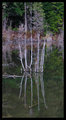
| 11/19/2006 07:09:08 AM | reflectby optionComment: I actually like the vertical composition here, as it works well to draw the eye up and down and up again over your subject. The capture is a bit flat, but that is easily remedied with a curves adjustment layer is PS. I see in your profile that you are fairly new to PP. Using a curves adjustment layer is one of my favorite tools, and I believe that it still withholds the purity of the image. To add one, Layer-->New Adjustment Layer-->Curves. Play around with the adjustments, but an S shaped curve usually works nicely for most images. Here is a small screen shot of what I think it needs...

Outside of that, your background is a bit too busy. Using a more shallow depth of field may help isolate the subject by blurring the background, but you have already shot at f/3.5, and I am not sure how much more your aperture opens up. Perhaps a different angle of view would also help. The best tip I have ever gotten for shooting was to be aware of everything in your frame. Is there something distracting in the BG, is there a big, blue line running through some one's head, etc, etc. I think if you got up a bit higher, thus taking the busy trees out of the image, this one would have been much nicer. Also, while I am not at all a stickler for the 'rules' of photography, using the rule of thirds and getting this one a bit off centered would have also added greatly to the composition strength.
Sorry for the novel, but hopefully is helps some. I like you r work from the Canadian back country, and I hope to see a great deal more. I think I'd enjoy a nice helicopter ride to work every morning. It'd sure beat the hell out of Atlanta traffic jams.
Blue Skies,
Eric |  Photographer found comment helpful. Photographer found comment helpful. |
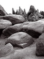
| 11/14/2006 04:57:47 AM | Garden of the Godsby smellyfish1002Comment: Hey there from the Critique Club
Camera Work/Technical: Excellent focus, bringing out tremendous texture in the scree and rocks. I respectfully disagree with the comments on too much noise. I don't see the noise, rather great texture captured in terrific detail.
Lighting: The lighting is a little harsh, but, oddly enough, I'd like to see this one with even deeper shadows and a hair more contrast in the rocks. I do find issue with the sky here. It is a bit overpowering for this particular capture. I think composing it out of the frame would have looked better to me, but I am not sure it would have pulled better votes from DPCland.
Composition/Content: The composition feels a little tight, but I do like the placement of the large stones in your frame. It gives the eye areas to almost bounce around, both to and from. While the border debate is sure to rage for years to come, I think adding a simple white border with a little black stroke would really relax the feeling of this image. Even still, you created a very nice flow with this one.
My Opinion: While a technically fine image, I think you missed the DPC voters with the WOW factor. I am sure that the scale of the stones are grand, even breath-taking, but that is missed by looking at 640px capture of what is there. As-is, I think 5.5 is a little low, but this is a pretty tough crowd.
Eric Message edited by author 2006-12-30 00:57:33. | | Photographer found comment helpful. |
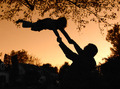
| 11/06/2006 03:09:19 PM | Don't Let Go!by levyj413Comment: This is an interesting capture, but I do see why it didn't do well in the challenge. Voters here, for the most part, like to see the challenge met without having to think to much. I can also see why you'd enter it in this challenge. As far as improving it, I agree with the previous posters that wanted to see a cleaner background. Shooting this without that tree in the top of the frame would have improved it tremendously. I'd also like to see the shadows a bit deeper with more of the details lost in darkness. I see that is what you were going for, and making the subjects darker, along with the background elements would make for a much stronger silhouette image. I do like your rule of thirds use, but it also gets lost with the tree cluttering the top pf the frame. Just composing without the tree alone, in my opinion, would have boosted this one well above the 5 mark. I hope this helps. | | Photographer found comment helpful. |
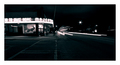
| 11/06/2006 12:09:25 AM | The Majesticby elemessComment: Nice. I would really like to see this one exposed for a couple more seconds. The headlie trails need to continue on. Funny, but I was considering this spot for my neon entry. I don't think I hve ever been in there sober. | | Photographer found comment helpful. |
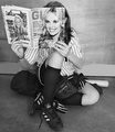
| 10/21/2006 02:03:43 AM | Tomboy? by JulieGComment: Hey there from the Critique Club
First of all, congrats on yet another ribbon, as well as your second highest scoring photo to date. I'll also provide a bit of clarification, as least as I understand it, for chispa. As long as the "artwork" is not the subject of the image, it is allowed. In this example, it is not the subject, rather it is a small portion of the overall composition.
Camera Work/Technical: Everything looks nicely focused and very crisp. The tonal range is also very nice, thus making this image particularly appealing.
Lighting: Great, even lighting here with no losses in blown highlights or dark shadows. The reflection on the top right of the magazine cover is mildly distracting, but not nearly enough to detract from the overall scoring of the image.
Composition/Content: Absolutely wonderful for this challenge. You hit the challenge on the nose, meanwhile presenting a issue that faces young girls climbing into maturity. I like it! The placement of the magazine is spot on, as is the placement of your "props." Very nice work.
My Opinion: Personally, I think this one deserved second. While the first two shots in the challenge are nice, my favorite is 5th place, submitted by jaded_youth, followed very closely by this one. Another well-deserved ribbon and top score.
Eric
| | Photographer found comment helpful. |
| 10/04/2006 09:36:31 PM | A fairytale casualtyby liltritterComment: Hey there from the Critique Club
Camera Work/Technical: Now knowing the dimensions of the image, the focus is obviously on, but the image looks overall noisy to me. The color is strong, but the contrast is a bit too harsh for this particular image. Your settings and setup did a very nice job at yielding some tremendous detail.
Lighting: While you lost no detail on the subject, the background gives the appearance of being washed out. I imagine that you were intentionally using a white background to separate it from the subject, but it provides more distraction than a warmer background would have.
Composition/Content: You hit the challenge with the macro part, though it was not readily apparent during voting, but the abstract was missed. This one looks more like an accidental snapshot than an attempt at abstract. Looking through your portfolio, it is obvious that you are a very strong photographer, and you know what it takes to pull higher votes from DPCers.
My Opinion: karmabreeze hit this one straight on. It isn't abstract, and we have no way of knowing that it is macro. I had similar results with the last abstract macro challenge, and I was also upset. The good news, my scores have been climbing steadily, for the most part, since then. Your work is strong, but this one missed the mark. Keep shooting, and thanks for giving the critique club a chance to look at your work.
Eric
| | Photographer found comment helpful. |
| 10/04/2006 11:17:43 AM | Iceberg.by kevinkingComment: Hey there from the Critique Club
Camera Work/Technical: Great focus and a terrific job isolating the subject from the background. I also like your chosen white balance and color balance adjustment.
Lighting: Very nice, even lighting. This one would have been easy to lose detail in highlights, but you did not. Very nice exposure and lighting.
Composition/Content: I believe the the centered composition really detracts from this image's potential. I agree with ifwolpert in the fact that I'd like to see more of the ice. Also, the blue color you chose for the border is too bright. It competes with the subject for the eye's attention.
My Opinion: I think by simply removing the border and giving the voter more of the ice to look at would have vaulted this score up considerably.
Eric
| | Photographer found comment helpful. |
| 10/04/2006 11:03:13 AM | Blueby marvinComment: Hey there from the Critique Club
Camera Work/Technical: Great focus and your choice of settings yielded very nice textures and a depth of field that is very strong for your chosen subject matter. I also like your white balance choice that produced these cool, blue tones.
Lighting: The backlighting does a very nice job of isolating your subject from the background, but the flash highlights are distracting to the eye. The subject, while strong, isn't strong enough to compete with those highlights.
Composition/Content: Nice content that is well-presented. The composition creates nice lines that draw the eye up and into the image.
My Opinion: I think that this one scored a little lower than it should have. Removing, or at least lessening those distracting highlights would have certainly drawn some better votes.
Eric
| | Photographer found comment helpful. |
| 10/04/2006 10:54:33 AM | Sippy Cup Lids on Camera Flash!by 777STANComment: Hey there from the Critique Club
Camera Work/Technical: I'd like to see the original to see what was erased and cloned. It looks like you cloned around the rim, thus leaving a harsh edge around it. The color is spectacular, as is the contrast you created.
Lighting: The lighting is a bit too harsh, as you lost a little too much detail on the left side. The idea is very creative, and I think that toning the flash down just a bit would have improved this one tremendously.
Composition/Content: Again, very creative content that very nicely met the challenge. The tilt also nicely adds to the abstract value of the image.
My Opinion: I think that the harsh edge left from post-processing really took this one down in score. With a few slight adjustments, this one could have been up near the 6 range. Great idea and awesome contrast.
Eric
| | Photographer found comment helpful. |
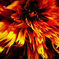
| 10/04/2006 10:13:53 AM | Gloriosaby xianartComment: Hey there from the Critique Club
Camera Work/Technical: The lack of focus makes this one hard to enjoy, as well as difficult to fairly critique.
Lighting: The lighting is a bit harsh, leaving some harsh highlights and shadows that lose valuable detail. Also, the highlights and shadows, while seemingly balanced, create a very uneven feel to the image.
Composition/Content: Nice content, and I like the tight composition. This composition really helps the image fit the challenge well.
My Opinion: I agree with your evaluation. I think that it id pretty well overall considering the focus and the subject matter.
Eric
| | Photographer found comment helpful. |
|
Showing 541 - 550 of ~1007 |
Home -
Challenges -
Community -
League -
Photos -
Cameras -
Lenses -
Learn -
Help -
Terms of Use -
Privacy -
Top ^
DPChallenge, and website content and design, Copyright © 2001-2025 Challenging Technologies, LLC.
All digital photo copyrights belong to the photographers and may not be used without permission.
Current Server Time: 08/09/2025 04:52:03 AM EDT.
|