|
|
|
Showing 391 - 400 of ~1007 |
| Image |
Comment |
| 05/21/2007 01:31:41 AM | Dead Poet Laureatesby dannyleeComment: Hey there from the Critique Club
First of all, congrats on your second highest scoring entry to date. Strong work!
Camera Work/Technical: Very nice job with your minimalism approach. Your focus on the human skull is very crisp and an obvious strength of this image.
Lighting: Your lighting on the skull is also very nice. You did a terrific job with you shadows and highlights here, and I cannot see anyway that I could offer to improve you lighting.
Composition/Content: I think that the text and layout could have benefited from a little more creativity. While it fits nicely into the minimalistic approach, I think a bit better layout would have grown your score.
My Opinion: Overall I like it and I think it earned a strong score, just as it deserved. Nice work, and congrats again on getting a new image up there on your profile page.
Thank you for the opportunity to provide a critique on your entry,
Eric
|  Photographer found comment helpful. Photographer found comment helpful. |
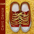
| 05/21/2007 01:25:19 AM | Devoted Pasta Lovers by De SousaComment: Alright, this is unfair! Not only did I pull this one for critique, but I also snagged librido's entry. I apologize that I have nothing to offer in the form of a thoughtful critique. You obviously have your hand on the pulse of the voters, and your work is well above my ability to provide feedback. I had a strong feeling that this would blue the second that it popped up on my monitor. Truly amazing. | | Photographer found comment helpful. |
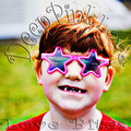
| 05/21/2007 01:21:17 AM | Deep Pink Love - Love Bitesby xianartComment: Hey there from the Critique Club
I'll echo some of what your previous commenters have already said. This one is so nice because it is so over the top. I agree that the over-saturation and the boldness of this capture would make it a perfect album cover. I like your depth of filed, as well as the grain you created with the over saturation. Nice work, and I agree that you were robbed on this one. This would absolutely make a terrific album cover!
Thank you for the opportunity to provide a critique on your entry,
Eric
| | Photographer found comment helpful. |
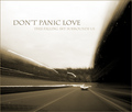
| 05/21/2007 01:15:20 AM | Don't Panic Loveby JoshuaRaineyPhotographyComment: Hey there from the Critique Club
First of all, congrats on a new personal best, as well as cracking your way into the 6's with only your third entry. A well-deserved score and top 15 finish!
Camera Work/Technical: While the photograph is technically poor, it was the perfect creation for this challenge. Nicely seen and very, very well-executed.
Lighting: Also excellent for this capture. You created a very somber mood with the lighting and toning that you offer us.
Composition/Content: I'd like to see those two short light trails on the left of the image longer, but that's about all I'd change.
My Opinion: This is one of my favorites in the challenge. I think that increasing your exposure by 3 or 4 more seconds, thus making those two short light trails on the left longer, this one would have cracked the top 10.
Thank you for the opportunity to provide a critique on your entry,
Eric
| | Photographer found comment helpful. |
| 05/21/2007 01:00:10 AM | Detailed Photo's Leagueby Rino63Comment: Hey there from the Critique Club
Camera Work/Technical: Terrific depth of field use. I completely disagree with Tygerr. I think that the shallow depth of field is one of this one's strengths. I would like to see just a little deeper depth of field, but I do like the bokeh-esque feel that you created.
Lighting: Pretty nice, but that large, white area at the top of the frame is very distracting.
Composition/Content: Nice rules of thirds use, and that works nicely to pull the eye onto the subject.
My Opinion: I think that this one could have been executed better, but even with that, 4.6 is a bit low.
Thank you for the opportunity to provide a critique on your entry,
Eric
| | Photographer found comment helpful. |
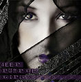
| 05/21/2007 12:48:37 AM | Deep Purple Lipsby librodoComment: Hey there from the Critique Club
So, 6.7742 and yet another top 10 finish, what could I possibly offer to improve this one? I like the idea, and I like the execution, but I am not a very beg fan of your text. Even still, a very nice score. I wish that in my inferiority I could offer you more in the form of a critique. Nice work, as usual.
Thank you for the opportunity to provide a critique on your entry,
Eric
| | Photographer found comment helpful. |
| 05/21/2007 12:45:37 AM | Dreaming of a Placid Lakeby orvaratliComment: Hey there from the Critique Club
Camera Work/Technical: Very nice, strong image with some great near-silhouettes. I like your coloring, but that 13 seconds produced some pretty strong ghosting.
Lighting: Overall, the lighting looks a little flat. I guess that it was pretty dark out there, huh? I think a little curves adjustment would have helped out your lighting a bit.
Composition/Content: Your test placement is a bit awkward, but I really like your composition. You have leading lines all over that work to draw the eye in and around the entire image.
My Opinion: This is definitely a stronger image that the score reflected. With better text placement and a little more contrast, I think that this would have scored much better. Even with it as it is, 5.2 is far too low. Darn voters.
Thank you for the opportunity to provide a critique on your entry,
Eric
| | Photographer found comment helpful. |
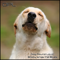
| 05/21/2007 12:41:00 AM | Dog Pound Lovin'by jeroweComment: Hey there from the Critique Club
Camera Work/Technical: I like your choice of apertures here to create a great depth of field. Your focal point is on the perfect area of the image, and you did a nice job isolating your subject.
Lighting: Also very nice. Everything is nicely and evenly lit. Your lighting also helps isolate the subject, with the background being just a touch darker.
Composition/Content: While I'm no stickler on the 'rules' of photography, I think your subject is a bit too centered for this capture. I am also not a big fan the text you chose.
My Opinion: Nice work meeting the challenge, and a pretty well-done image. A little too centered, but still pretty strong.
Thank you for the opportunity to provide a critique on your entry,
Eric
| | Photographer found comment helpful. |
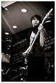
| 05/19/2007 11:42:40 AM | twelve.by xantangummiComment: Great duotone image. This is one of the better band shots that I have seen in a while. Nice. | | Photographer found comment helpful. |
| 05/19/2007 11:41:26 AM | Churchby MarioAngelComment: Nice, centered composition, but I think the contrast needs a little tweaking. Perhaps a little curves adjustment would help out. I like the way your composition starts pulling the eye up and in from the sidewalk and continuing uninterrupted all the way up to the peaks on the building. Good eye! | | Photographer found comment helpful. |
|
Showing 391 - 400 of ~1007 |
Home -
Challenges -
Community -
League -
Photos -
Cameras -
Lenses -
Learn -
Help -
Terms of Use -
Privacy -
Top ^
DPChallenge, and website content and design, Copyright © 2001-2025 Challenging Technologies, LLC.
All digital photo copyrights belong to the photographers and may not be used without permission.
Current Server Time: 08/07/2025 04:24:53 PM EDT.
|