|
|
|
Showing 371 - 380 of ~1007 |
| Image |
Comment |
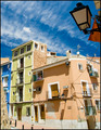
| 06/07/2007 03:44:51 AM | Colourful lifeby imagine74Comment: Great sky and nice contrast in the colors you captured. The light is mildly distracting, especially being lit differently from the rest of the scene. |  Photographer found comment helpful. Photographer found comment helpful. |
| 06/07/2007 03:44:04 AM | | | Photographer found comment helpful. |
| 06/07/2007 03:43:23 AM | A Stolen Momentby toddheadComment: Very nice everyday life, candid-type shot. Your background is just a hair distracting with the split light and dark. I do like the depth you created with the shadows on her face. Nice | | Photographer found comment helpful. |
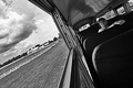
| 05/26/2007 03:15:19 PM | moving picturesby SkipComment: Hey there from the Critique Club
Camera Work/Technical: Nice focus and great tonal range. You did lose some interest with the pixelated sky. Other than that, I like what you achieved here.
Lighting: Your lighting is strong. While there is a bit of a hot spot up in the sky, the remainder of the frame is nicely lit.
Composition/Content: I like the tilt you added here. While tilts aren't normally my preference, it really adds a feeling of movement to this capture.
My Opinion: Not bad, but the sky needed some work. Nice use of tilt and composition to make an interesting image.
Thank you for the opportunity to provide a critique on your entry,
Eric
| | Photographer found comment helpful. |
| 05/24/2007 02:19:48 AM | Not a Baby's Buttby EfergohComment: Hey there from the Critique Club
I think that I'll forgo critiquing this image and offer you some friendly advice. Value every comment you receive, every one of them. Firing back at those that take time to comment on your images only serves to dissuade the rest of us from offering our opinions. I looked through each of the comments offered here, and I really can't see what pissed you off so much. Looking at the comments and the photo together, I am even more lost. You said yourself that you felt rushed while shooting, and it really shows. You entered an image below your capabilities, and you paid the price. We all do it. If you don't feel that you can subject yourself to comments, critiques and even criticisms, maybe you shouldn't submit any more. Sorry to be blunt, but I try to speak the truth. Good luck with future entries, and I hope that you continue to offer entries.
Thank you for the opportunity to provide a critique on your entry,
Eric
| | Photographer found comment helpful. |
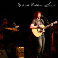
| 05/21/2007 04:32:25 AM | Distinct Positive Lovin'by UbersteinyComment: Hey there from the Critique Club
Camera Work/Technical: Band shots are tough to do, but you managed to do a fantastic job with this one. Nice focus and terrific colors throughout the entire image.
Lighting: You portray a very nice, warm feeling with the lighting that you captured. While the shadow on the singer's bottom lip is a little distracting, it is about what you'd expect to find at a live show. If he were back just a few more inches from the mic, that would have dropped right away.
Composition/Content: Nice composition, and great depth. Including the member on the keys did a great job adding depth to the image. I would like to see the image with a little less zoom, thus trying to include the singer's feet, a little more space at the head of the guitar and a little more space behind the keyboardist. As it is here, it feels a bit too crowded.
My Opinion: Even with the tight composition, I think that this one is far better than the 5.68 that it pulled. Maybe it was too much like a band for some of the voters...hmmm? Anyway, nice work and pretty strong execution.
Thank you for the opportunity to provide a critique on your entry,
Eric
| | Photographer found comment helpful. |
| 05/21/2007 03:46:07 AM | Deep Purple Lullabiesby xtianComment: Hey there from the Critique Club
Camera Work/Technical: With the post-processing you chose, this one is almost impossible to offer any technical critique advice on. However, your base image does appear to be very crisp and well captured.
Lighting: Very interesting effect that you chose. It plays nicely with the title you chose, and the voters seemed to agree.
Composition/Content: Great font and very nice composition. Your chosen elements allow the eye to flow through the frame nicely.
My Opinion: Nice idea that was well-executed. Congrats on very nice, well-deserved score.
Thank you for the opportunity to provide a critique on your entry,
Eric
edited because I can't spell some nights Message edited by author 2007-05-21 03:51:01. | | Photographer found comment helpful. |
| 05/21/2007 03:45:30 AM | Dreaming of a perfect loverby BoltiComment: Hey there from the Critique Club
Camera Work/Technical: This is definitely one of my top 10s. may be even top 5s for this challenge. I can just see this shot fitting right into today's pop culture. You focus is superb and your depth of field is perfect for this idea.
Lighting: Wow!I love the catch lights that you created, and the high key feel is just right for this one.
Composition/Content: I can't think of one think that would improve your composition or content. The font works perfectly and the bubbles and an awesome touch. Terrific pose, and beautiful model.
My Opinion: 6.4 is too low. This one should have been up much closer to the top. Even still, very nice work.
Thank you for the opportunity to provide a critique on your entry,
Eric
| | Photographer found comment helpful. |
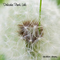
| 05/21/2007 03:37:42 AM | Delicate Plant Lifeby LoreneComment: Hey there from the Critique Club
Camera Work/Technical: This is one of the better dandelion captures that I have seen in some time now. This one is nicely focused, yet very comfortably sharp at the same time. Great colors and wonderful detail.
Lighting: You did a fantastic job lighting a fairly difficult subject. The whites seem near-perfectly exposed, while you also captured nice detail in the dark center of the bloom.
Composition/Content: While this would not have been a personal choice for an album cover, you did a very nice job putting this image together with a clever title.
My Opinion: Nice work meeting the challenge, and congrats on yet another top 20 finish.
Thank you for the opportunity to provide a critique on your entry,
Eric
| | Photographer found comment helpful. |
| 05/21/2007 03:03:32 AM | Deep Pleasure Lab's debut album, COSMIC FORCE.by Car54Comment: Hey there from the Critique Club
Camera Work/Technical: Great focus that makes every single element in this capture look crisp and clean. The vivid colors you captured suggest a proper white balance setting, as well as add some terrific elements into the frame.
Lighting: Your lighting is also very strong. Your shadows add some great texture and depth to the image.
Composition/Content: Overall, I'd have to say I like it. It is very clean and very busy all at the same time. I think that your titles, while made with very appealing fonts, need a little work to stand out more. Both get lost in the image, but just a little
My Opinion: I think that this one scored about where it should have. Nice work on a well-deserved 6+.
Thank you for the opportunity to provide a critique on your entry,
Eric
| | Photographer found comment helpful. |
|
Showing 371 - 380 of ~1007 |
Home -
Challenges -
Community -
League -
Photos -
Cameras -
Lenses -
Learn -
Help -
Terms of Use -
Privacy -
Top ^
DPChallenge, and website content and design, Copyright © 2001-2025 Challenging Technologies, LLC.
All digital photo copyrights belong to the photographers and may not be used without permission.
Current Server Time: 08/07/2025 04:25:07 PM EDT.
|