| Image |
Comment |
| 01/23/2008 01:50:58 AM |
|
 Photographer found comment helpful. Photographer found comment helpful. |
| 12/31/2007 05:41:03 AM |
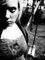
The Shunnedby RKTComment: This was one of my highest rated captures in the challenge, and it is one of the most underrated images in the final results. Great work, and nice job offering up something that required some thought. I think that you were voted down because the average voter does not take time to really look at the images in challenges. You probably get about 10 seconds of their life, if that. I really like everything about this one. I like the composition, the way the hallway drags your eye to the distant group of chairs. I like the toning and the tense emotion that it seems to invoke. I like the depth of field you chose. It also adds to the emotion of the image, making the foreground chairs standout from the 'popular' crowd that stares in the distance. You came up with a great entry here, and your score failed to reflect that. This was a 9 for me, and I think that I gave two 10s, five 9s, and 3 8s. |
| Photographer found comment helpful. |
| 11/14/2007 05:22:50 AM |
Playground.by HollyLayComment: I like it. A well-deserved posthumous ribbon. I look forward to seeing more challenge entries from you. |
| Photographer found comment helpful. |
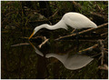
| 11/14/2007 02:11:56 AM |
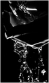
Waterby booboo_goonComment: Hey Luana,
It is nice to see you entering challenges on a regular basis. This makes me even happier about the membership. This is a very cool shot, and I think that it would do very well in a low-key challenge. I also think that it should have done better here, but these voters are tough to figure out some days. Overall, I do not think that the image is too dark, but the dark spot on the hand that is near the middle of the frame really grabs the eye and holds onto it. It also looks like that thumb is just a little too close to the camera. I think that lengthening your depth of field, thus bringing that thumb into focus, would have helped your score a little. Looking through the challenge, I am really baffled that this didn't finish higher. Nice work, and keep shooting. What matters is that YOU like the end product. High scores are just a nice bonus sometimes.
E |
| Photographer found comment helpful. |
| 11/03/2007 09:09:30 AM |
The Lighthouse Keeper's Walk by jrtoddComment: Well-seen and well-captured. See, you really can't shoot TOO much with that fisheye. Glad you like it. I wouldn't trade mine for anything...except maybe a D3.
E |
| Photographer found comment helpful. |
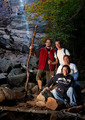
| 10/17/2007 03:19:49 AM |
Take a Hikeby Pipe_DreamComment: Hey there from the Critique Club
First of all, congrats on a new personal, as well as a top 20 finish.
Camera Work/Technical: Terrific. Your technical wok is one of the main strengths of the image. Your focus is crisp, and your f/7 aperture kept the entire scene nicely focused.
Lighting: I really like these types of shots, using flash to light your subject while relying on ambient light to light the scene. I think that you had points deducted for the harsh shadows that were created on the right side of your group. Adding a second flash would have remedied this easily. I do like that the background is a bit less exposed than your subjects.
Composition/Content: Great content for the challenge, and you put together a nicely composed image. Your placement of the group works nicely to draw the eye into the frame and right up the waterfall.
My Opinion: This image is appropriately scored. While I like the lighting, I think that bringing up the exposure on the background would have worked to balance the image more, thus taking away the urge to think that this one was shot in studio, and may have even brought another tenth or two. Nice work.
Thank you for the opportunity to provide a critique on your entry,
Eric
|
| Photographer found comment helpful. |
| 10/15/2007 07:37:41 PM |
|
| Photographer found comment helpful. |
| 10/08/2007 09:59:21 PM |
|
| Photographer found comment helpful. |
| 09/26/2007 06:58:16 PM |
|
| Photographer found comment helpful. |
| 09/01/2007 02:55:02 PM |
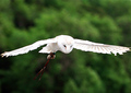
Silent Wingsby SaswaaComment: Hey there from the Critique Club
Camera Work/Technical: Great depth of field use. I really like the way your subject is isolated from the background. Even still, I think the bid itself needs a bit more focus.
Lighting: Again, nicely used lighting to isolate your subject.
Composition/Content: The composition is lacking. I agree with Trinity_12_12 in that the crop is far too tight on the bird's wings. Beyond that, the overall composition is too centered for my liking.
My Opinion: Not a bad score, but with better composition a a little better focus, I think your score might have pushed up near 6.
Thank you for the opportunity to provide a critique on your entry,
Eric
|
| Photographer found comment helpful. |
Home -
Challenges -
Community -
League -
Photos -
Cameras -
Lenses -
Learn -
Help -
Terms of Use -
Privacy -
Top ^
DPChallenge, and website content and design, Copyright © 2001-2025 Challenging Technologies, LLC.
All digital photo copyrights belong to the photographers and may not be used without permission.
Current Server Time: 08/06/2025 06:12:34 PM EDT.