| Image |
Comment |
| 03/12/2009 06:07:51 PM |
My Sonby ridvanerkanComment: Interesting concept, but too much darkness. The shadows you captured give an uneasy deformity to the child's face. |
 Photographer found comment helpful. Photographer found comment helpful. |
| 03/12/2009 06:07:06 PM |
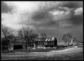
Southern Farm Landby ace flymanComment: This instantly reminds me of a painting. I like this, and I think you dud a nice job with the BW conversion. I'd have this one on the wall at home somewhere if it were a shot of mine. |
| Photographer found comment helpful. |
| 03/12/2009 06:06:00 PM |
|
| Photographer found comment helpful. |
| 03/12/2009 06:05:36 PM |
Disciplineby danderson107Comment: Very creative. I think this capture's vote would grow greatly with some added contrast. |
| Photographer found comment helpful. |
| 03/12/2009 06:04:48 PM |
Aerial Danceby gingerninjaComment: This image holds the potential for a great deal of interest. The colors are phenomenal, though I do see a good deal of banding on my monitor. The image especially suffers from its small size. Always try to use the largest allowance that DPC offers. I'd like to see this one really large, and I'd at least like to see it at the full challenge allowance of 720px. |
| Photographer found comment helpful. |
| 03/12/2009 06:02:28 PM |
Street Vendorby LanndonKaneComment: I think that this one had a good deal of potential, especially with DPCs apparent insatiable hunger for third world images. The darkness of the image, unfortunately, leaves my hanging and only going back to the super-bright fingernails of the subject. I'd like to see this one with some lighting that was a good deal less harsh. |
| Photographer found comment helpful. |
| 03/12/2009 06:00:34 PM |
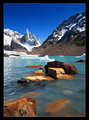
Glacial Watersby mazlimComment: Beautiful. I like your use of composition to draw my eye into the frame. Great color capture to provide a wonderful feel to a sky that I would normally find uninteresting. Well seen, very well captured. |
| Photographer found comment helpful. |
| 03/12/2009 05:57:17 PM |
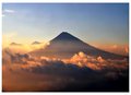
Hiking in Guatemala by JamesLeBlancComment: Interesting peak, but the centered composition leaves this one lacking in my opinion. I like the pastel coloring that you achieved. With a different composition, I think the score for this one would grow. |
| Photographer found comment helpful. |
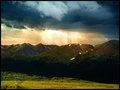
| 03/12/2009 05:55:56 PM |
Awake!by JustinMComment: Very nice landscape capture. I like the contrasting moods than you captured from the sunny, green foreground, to the storm rolling into the mountains, then back to sunny rays of hope. Well seen and well captured. |
| Photographer found comment helpful. |
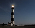
| 03/12/2009 05:50:43 PM |
A light in troubled timesby MaverickComment: Nice composition. I'd like to see the light a little less blown, and I am seeing a good deal of pixelation on my screen. Did you push the saturation on this one? |
| Photographer found comment helpful. |
Home -
Challenges -
Community -
League -
Photos -
Cameras -
Lenses -
Learn -
Help -
Terms of Use -
Privacy -
Top ^
DPChallenge, and website content and design, Copyright © 2001-2025 Challenging Technologies, LLC.
All digital photo copyrights belong to the photographers and may not be used without permission.
Current Server Time: 08/05/2025 04:52:55 AM EDT.