|
|
|
Showing 181 - 190 of ~1290 |
| Image |
Comment |
| 05/09/2007 10:18:55 PM | Lunch Breakby samanwarComment: comp good, dof in sport photography should be shallower as to be able to focus just on the athlete. The fan in the middle bg is unwanted as is the cars.
The tonal value sucks. The blacks are way too deep, and the whites are blown out.
Light good, movement good, rule of 6 observed, over all could be a great image if just only..... |  Photographer found comment helpful. Photographer found comment helpful. |
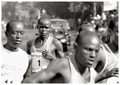
| 05/09/2007 10:15:40 PM | Julius Rop, last years Rhine-Marathon winner, disappointedby h2Comment: I just critiqued a similar image to this one, and this one is way better.
Here you have focused on one athlete do to your shallow dof.
The rule of 6 is observed, and the crop is tight.
comp great, movement great, whites a blown, blacks a bit deep, excellent light, tonal value great, emotional value excellent, over all I predict a ribbon. | | Photographer found comment helpful. |
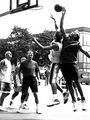
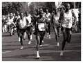
| 05/09/2007 10:12:27 PM | Marathonby bubeltrubelComment: this is an ok image.
There is this guideline for photography, and one of the guides states the "rule of six".
The rule simply is this...don't have more than 6 athletes in the same image because it starts to get crowded.
Not only is the rule of 6 ignored in this image, but, a sports photograph should be about the athlete meaning tight crops, shallow depth of field, blah, blah.
Comp could be tighter, light good, texture good, blacks just a bit deep, whites just a bit blown, too busy, eye movement poor, over all just an ok image. | | Photographer found comment helpful. |
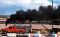
| 05/09/2007 08:03:28 PM | Tractor pullby seeComment: Ok, it's a tractor pull. I get it.
But, what I am always seeing first is those advertisements.
theres this guideline to sports photography, and one of the big NO NO's is just what you have done.
This image should be about the truck, the horse power, and the tork it is using to pull that damn tractor.
Through this image, I should be hearing the growl of the engine.
But, the advertisements are keeping me from doing so. They are highly distracting. Also, the bg with the truck wheels and the legs chopped off from smoke is unwanted as well.
Again, it is about the truck and not about the fans.
comp could be better, light ok, color excellent, barely can see the stop action, blacks and whites on the edge of bad and ok, nice texture, dof too sharp for what I just explained to you. | | Photographer found comment helpful. |
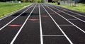
| 05/09/2007 07:49:59 PM | Ready to Goby Perfect-CalamityComment: Ok, I get it, it is a track.
Why should I care? You are giving me nothing.
comp ok, color ok, great lines, ok dof, light flat, shadow distracting, great texture, overall boring | | Photographer found comment helpful. |
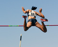
| 05/09/2007 07:48:16 PM | Flightby mpetersComment: there is this guideline for sports photography, and you did almost everything correctly except one very important feature...the emotional value.
I don't want to see her back side. I want to see the face. What she is going through. I want you the photographer to have me share her emotion, not the crack in her ass.
Comp could be tighter, color excellent, light excellent, capture great, emotional value poor, texture good, skin tones excellent, the pole either needs to go, or give me more, right now it is kind of distracting and almost erotic. Overall, keep trying | | Photographer found comment helpful. |
| 05/09/2007 07:43:06 PM | Two Knights Defense (56) -White to Moveby whiterookComment: I guess in some other countries, chess is a sport.
Too me however, a sport needs humans, not just props.
With that in mind, why should I care for this image? I don't play chess, so it is confusing, and cluttered.
Comp could be better, color yuck, too much to look at and figure out, some texture, light flat, blacks too deep, whites not there, overall a boring image | | Photographer found comment helpful. |
| 05/09/2007 07:34:43 PM | roller-bladeby clictacameraComment: Tell me, why should I care for these two roller bladers?
There is nothing for me to care about. It's just a portraiture.
Comp ok, colors bland, light flat, grainy, blacks too deep, whites ok, overall boring | | Photographer found comment helpful. |
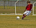
| 05/09/2007 07:30:49 PM | The Big Kickby BeckyTComment: I like this picture even though it does not run with conventional guidelines.
I would of gave you a higher vote if his hand was not in front of his face. As it is, it diminished the emotional value a bit.
Usually, a tight crop is used in sports photography, however, I think personally, unless you are selling the image to a paper or magazine, other photogrpahy rules can be applied such as this image.
Great comp, nice use of thirds, great capture, excellent color, great light, excellent dof, excellent bg, great texture, overall a great image. | | Photographer found comment helpful. |
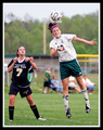
| 05/09/2007 07:26:56 PM | Headerby MattOComment: Everything that I know about sports photography tells me that this is almost a flawless image.
The only thing is the bg fence line that cuts through your player.
Great comp, great color, great capture, great emotional value, dirt blood texture nice, light a bit flat but what are ya going to do?, It's not bad however, great shallow dof focusing on the players only, just excellent over all. | | Photographer found comment helpful. |
|
Showing 181 - 190 of ~1290 |
Home -
Challenges -
Community -
League -
Photos -
Cameras -
Lenses -
Learn -
Help -
Terms of Use -
Privacy -
Top ^
DPChallenge, and website content and design, Copyright © 2001-2025 Challenging Technologies, LLC.
All digital photo copyrights belong to the photographers and may not be used without permission.
Current Server Time: 08/20/2025 01:05:18 PM EDT.
|