| Image |
Comment |
| 10/21/2008 12:45:43 PM |
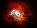
Firebirdby hihosilverComment: IMO the editing is a little harsh, I think there's just a little too much contrast between the white bird & the background. You did a nice job of not blowing out the highlights though. Again, just my 2 cents. |
 Photographer found comment helpful. Photographer found comment helpful. |
| 10/19/2008 12:26:16 PM |
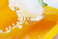
Yellow pepperby hajekaComment: What a great macro! The "placement" of the seeds is really neat, really draws your attention. |
| Photographer found comment helpful. |
| 10/01/2008 01:21:32 PM |
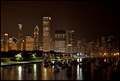
Lakeside Parkingby meyersComment: Great night cityscape, I like the reflections of all the lights in the water. |
| Photographer found comment helpful. |
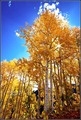
| 10/01/2008 01:02:37 PM |
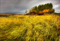
Colors of Fallby artvetComment: I really like the softness of this, & the way all the grass is coming right at you. Perfect fall scene. |
| Photographer found comment helpful. |
| 10/01/2008 01:02:12 PM |
Dragonflyby kristat123Comment: I love the detail in his body & his wings, too bad the bark he was on wasn't a bit lighter, I know that wasn't an option I'm sure! Great timing with that shutter finger, those buggers don't hang around long! |
| Photographer found comment helpful. |
| 10/01/2008 12:53:05 PM |
Cultural Genocideby grigrigirlComment: OOh! I think I might've seen a few others like this before the free study, I can't put my finger on who you are, but I know I was looking at your profile earlier this week! Very neat message, the b&w works perfectly. |
| Photographer found comment helpful. |
| 10/01/2008 12:52:09 PM |
|
| Photographer found comment helpful. |
| 10/01/2008 12:38:08 PM |
Fall sun "Peak-A-Boo".by stowell48Comment: I really like the color of the leaves against the bright blue sky. Off to the left near the tops of the trees the highlights look a little blownout, but not enough to take away from the image IMO. Very pretty :) |
| Photographer found comment helpful. |
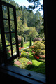
| 10/01/2008 12:23:04 PM |
Through the Windowby GeeeComment: What a nice view! Love the burst of color compared to the black bordering window. |
| Photographer found comment helpful. |
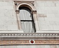
| 10/01/2008 12:22:33 PM |
Sheerby chromeydomeComment: The window doesn't really draw my attention, my eye seems to focus on the orange/red design along the bottom. IMO I would've tried to crop so the bottom bold line was more horizontal. Just my 2 cents though. |
| Photographer found comment helpful. |
Home -
Challenges -
Community -
League -
Photos -
Cameras -
Lenses -
Learn -
Help -
Terms of Use -
Privacy -
Top ^
DPChallenge, and website content and design, Copyright © 2001-2025 Challenging Technologies, LLC.
All digital photo copyrights belong to the photographers and may not be used without permission.
Current Server Time: 08/29/2025 01:58:06 PM EDT.