| Image |
Comment |
| 04/30/2003 12:35:21 PM |
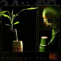
circle of zen by magnetic9999Comment: Nice feeling to this image. composition wise, I feel the elements are a little too compartimented. perhaps your subject on the left could have filled the space more generously without being enclosed in a frame. The two "cartouches" on the right are nice but the different widths of framing could have been avoided. if you created these borders using the "increase canvas size method", remember not to use uneven numbers of pixels to do so. 8 |
 Photographer found comment helpful. Photographer found comment helpful. |
| 04/30/2003 10:11:00 AM |
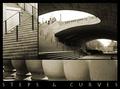
Downtownby ursulaComment: Very nice way to document a place, well cropped set of shapes. There is something that bothers me with the framing, perhaps the inner strips are too thin or the outer ones are to thick (?) The caption seems a little redundant, what we are seeing, you've made it pretty clear; the name of the city or bridge would have been an added value. 9 |
| Photographer found comment helpful. |
| 04/30/2003 10:03:48 AM |
|
| Photographer found comment helpful. |
| 04/30/2003 09:52:35 AM |
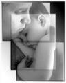
Joy, Comfort, and Loveby dacrazyrnComment: not enough people have had the good idea to to work with transparancies. the bevelling though, could have been more discrete. 7 |
| Photographer found comment helpful. |
| 04/30/2003 09:48:19 AM |
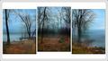
Three Views Around the Lakeby mariomelComment: Very nice sceen, i woulld have suggested to overlaped (not neessarly leveled) the shots with a bit with tranparency and gotten wrid of the two external frames. You could then have shown more of your pictures sizewise. 7 |
| Photographer found comment helpful. |
| 04/30/2003 09:41:33 AM |
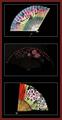
Oriental Breezeby bruster54Comment: This was a good choice for a subject. Somewhat there is to much empty space in the composition. Could have perhaps tried to have used frames of different sizes, close up views of the fans or have the fans overlap. |
| Photographer found comment helpful. |
| 04/30/2003 09:35:39 AM |
Afternoonby jimmythefishComment: Nice combinnation of texture and clean ccomposition. One of the only ones this week with appropriate framing. 9 |
| Photographer found comment helpful. |
| 04/30/2003 09:16:02 AM |
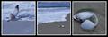
Ebb and Flowby KarenBComment: Nice series. I would suggest two things: showing some sky in the first image with the gull to offer the complete set of elements involved in this story and to reduce the white borders to a 1 pixel width. 7 |
| Photographer found comment helpful. |
| 04/30/2003 09:11:38 AM |
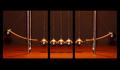
Newtonianby pinbackComment: Graphically pleasing. would try to move the images to the top, leaving a larger band of black at the bottom, to break the overload of symetry in the composition. 8 |
| Photographer found comment helpful. |
| 04/30/2003 09:07:49 AM |
|
| Photographer found comment helpful. |
Home -
Challenges -
Community -
League -
Photos -
Cameras -
Lenses -
Learn -
Help -
Terms of Use -
Privacy -
Top ^
DPChallenge, and website content and design, Copyright © 2001-2025 Challenging Technologies, LLC.
All digital photo copyrights belong to the photographers and may not be used without permission.
Current Server Time: 08/04/2025 05:37:18 PM EDT.