| Image |
Comment |
| 08/08/2006 09:49:55 PM |
On The Huntby LalliSigComment: Very nice shot. Tweak the colors a little for a more vibrant color and it would be top notch. Heck, it is still awesome like this! |
 Photographer found comment helpful. Photographer found comment helpful. |
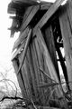
| 02/09/2006 02:16:55 PM |
Broken Homeby PrincessLolaComment: Too tight of frame... good shot - just back up a little next time. Just my opinion of course. |
| Photographer found comment helpful. |
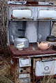
| 02/09/2006 01:38:31 PM |
The Monarchby linda12201Comment: Ill pass on the tea, thanks. :) Zoom out a little on the next one and see if you can get the wintery background to add to the feeling. I said the same about another photo in this contest. I think it is a good shot like this though... just a little too 'full frame'. |
| Photographer found comment helpful. |
| 02/09/2006 01:37:28 PM |
Snooze Buttonby willagherComment: "When all you have is a hammer, all problems begin to look like nails." I like the framing - not too cluttered but not much dead space. Change the lighting a little bit next time to add more shadow to elements in the photo. I think this has a little too much difference between the background and objects. The shadowing would help to reduce that massive contrast. |
| Photographer found comment helpful. |
| 02/09/2006 01:36:00 PM |
Broken Wingsby mawearComment: Wonderful shot. Dont know how well it fits the contest but going to give a good rating anyway based on the depth of field and nice coloring. |
| Photographer found comment helpful. |
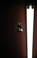
| 02/09/2006 01:35:19 PM |
Urban Ruins - Executive officeby notesinstonesComment: Very interesting study. The light being right there must have made the exposute levels tricky. Just making that work should get you a higher score. :) While pretty plain at first.... I really like this shot. Great job. |
| Photographer found comment helpful. |
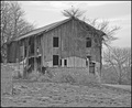
| 02/09/2006 01:34:02 PM |
Barnby bowhennComment: Try backing out a little more on the next shot like this and let the wintery background add to the desolate / broke look to the building. Good work. |
| Photographer found comment helpful. |
| 02/09/2006 01:32:56 PM |
FallenFishby dolphnz8Comment: I think this composition could benefit from a reposition of the elements within it. Too crowded in the center. Good shot though. |
| Photographer found comment helpful. |
| 02/09/2006 01:31:45 PM |
broken timeby tcmartinComment: Color tone looks good but the depth of field work is a little too much. This is borderline on abstract or just plain out of focus. Cant tell enough from the picture to see what that is without long study. |
| Photographer found comment helpful. |
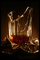
| 02/09/2006 01:30:35 PM |
Whiskey Lullabyeby sacredspiritComment: Nice lighting! The coloring is awesome. Variations in the positions of the broken peices would be neat to see. Great job. |
| Photographer found comment helpful. |
Home -
Challenges -
Community -
League -
Photos -
Cameras -
Lenses -
Learn -
Help -
Terms of Use -
Privacy -
Top ^
DPChallenge, and website content and design, Copyright © 2001-2025 Challenging Technologies, LLC.
All digital photo copyrights belong to the photographers and may not be used without permission.
Current Server Time: 08/01/2025 05:06:34 PM EDT.