| Image |
Comment |
| 02/22/2006 08:37:25 PM |
Warehouseby fadedbeautyComment: This is a pretty good shot. My only complaint is that the crop at the top of the pic is waayyy too tight. |
 Photographer found comment helpful. Photographer found comment helpful. |
| 02/22/2006 08:36:08 PM |
waningby thegrandwazooComment: An 80's challenge outtake, perhaps? :) Love the lighting and colors on this. The expression is very jaded, though. not sure if it bothers me or not... |
| Photographer found comment helpful. |
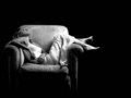
| 02/22/2006 08:33:50 PM |
relaxingby renefunkComment: I love this - except for the background. She seems to be hovering in nothingness, like she was hanging in the void of space... I would far rather see her with a background...the front porch of a small farmhouse...in a large living room with a fireplace... in front of a window with a view, perhaps. Otherwise, this is a beautiful shot. The lighting is really great, her pose seems natural and comfortable, I like the B&W treatment. It's just the lack of a background (or perhaps it's a lack of context) is off-putting to me. |
| Photographer found comment helpful. |
| 02/22/2006 08:30:28 PM |
Red Gloss..by CantaloopComment: I like everything about this picture except for the hand placement. It looks as though she's trying to hold a wig on her head in a high wind! Having the hand placed more toward the back of her head would alleviate this look a bit. |
| Photographer found comment helpful. |
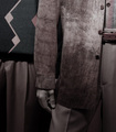
| 02/22/2006 08:27:28 PM |
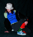
Black & Whiteby DrKDBComment: Your whites seem overly bright, and there appears to be a little bleeding from the white shirt onto the black background. The pose isn't really flattering, and he looks really bored. |
| Photographer found comment helpful. |
| 02/22/2006 08:26:11 PM |
Daphneyby bravo sixComment: This image fits quite well with the challenge. I like the pose, good choice of outfit for this type of shot (even if she is popping out of it a bit!), and she seems very comfortable with the shot. The only thing I might think of to improve the shot would be to add a hair light or a high fill light to give some definition and detail to her hair and face. |
| Photographer found comment helpful. |
| 02/22/2006 08:24:11 PM |
Men with styleby floydroweComment: The main detractors for me on this photo are the washed out color and the extremely awkward crop. |
| Photographer found comment helpful. |
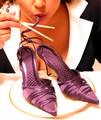
| 02/22/2006 03:51:30 PM |
|
| Photographer found comment helpful. |
| 02/22/2006 03:50:12 PM |
Blueby KivetComment: The models is nice, subject placement is good, pose is good, lighting is good. However, this being a basic challenge where you knew you could not do spot editing, you could have taken 5 minutes and ironed the sheet. Or at least draped it to minimize or hide unintentional creases. Also, the crop is just a wee bit close at the top of the pic. About another quarter or half-inch of photo would have felt more natural. Because of the creases and the crop, this gets a 6 rather than an 8. |
| Photographer found comment helpful. |
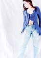
| 02/22/2006 03:39:30 PM |
My Own Styleby angela_packardComment: Even with all the colors on, the model is blending into the background. A lighter or more neutral colored background would have worked better to 'bring out' the model and separate her from the background. |
| Photographer found comment helpful. |
Home -
Challenges -
Community -
League -
Photos -
Cameras -
Lenses -
Learn -
Help -
Terms of Use -
Privacy -
Top ^
DPChallenge, and website content and design, Copyright © 2001-2025 Challenging Technologies, LLC.
All digital photo copyrights belong to the photographers and may not be used without permission.
Current Server Time: 08/05/2025 10:57:51 AM EDT.