| Image |
Comment |
| 11/01/2003 08:48:40 AM |
|
 Photographer found comment helpful. Photographer found comment helpful. |
| 11/01/2003 08:43:26 AM |
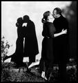
Waitingby heidaComment: you might have pursued a black and white or sepia for this one. I think it would've enhanced the mood of the shot. I don't feel the color is an integral part of this shot and I wouldn't miss it if it was gone. |
| Photographer found comment helpful. |
| 11/01/2003 08:35:11 AM |
|
| Photographer found comment helpful. |
| 11/01/2003 08:34:01 AM |
Copy Catsby Firstrich1Comment: This seems just a little soft. Great execution other than that and a very nice idea 8 |
| Photographer found comment helpful. |
| 11/01/2003 08:29:40 AM |
Shadows Through Winesby jonpinkComment: I love the colors of this. I'm looking for the place where this is focused, but it seems its just a fuzz off. Great concept and I love the warmth of the colors here. |
| Photographer found comment helpful. |
| 11/01/2003 08:27:24 AM |
Love by KonadorComment: not that it matters, I don't get the connection to the book, or if its just the right kind of book for the shot. Maybe I'm looking too deep here. Excellent idea, the book thing isn't taking anything from your score, just curious |
| Photographer found comment helpful. |
| 10/29/2003 10:06:42 AM |
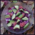
Avocado-saladby MonaComment: Greetings from the Critique Club
By Inspzil
Composition - Nice colorful array of stuff in a bowl. Not particularly compelling as a subject. But there are many great photographs of very boring things that do particularly well here. First I just wanna say that I really don't find anything "wrong" here. The only thing that bugged me even mildly was that the bowl wasn't centered perfectly vertically, but that's not much to complain about. I guess for my money, it isn't what you did with this photo, but what you didn't do with it that bothers me the most. With not-so-compelling subjects, It is necessary as photographers to do our best to MAKE them interesting. The dead above straight on angle is probably not the answer the large majority of the time. The angle and the lighting are just really flat and totally predictable. That can be good in some applications. I don't find it useful here.
Technical - Not quite as sharp as it could be most likely due to the very long shutter speed at 1/15sec. If you didn't take this from a tripod you probably should have. Besides that, maybe the color could've used a little adjustment but I think that's all up to you and how everything looked for real. Everything looks a little magenta to me.
Overall - Not a bad image, but lacking the pop that accompanies a good one. To me, it needs a new fresh interesting perspective. It may be something that is very easy to do. It might just be taking some extra shots, everytime you shoot, from an unusual perspective just to make sure you didn't miss anything. What the hell right? it doesn't cost you anything. I'm not an expert by any means, but I've found that you can use ordinary around the house stuff and make interesting photos. Best of luck on the challenges ahead - Bob |
| Photographer found comment helpful. |
| 10/29/2003 09:51:10 AM |
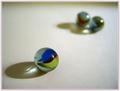
Two's Company Three's A Crowdby karmatComment: Greetings from the Critique Club
By Inspzil
Composition - I think your idea is good. I would've like to have seen the back 2 marble a little more on an even horizon (for lack of a better word). The framing of the image makes me uncomfortable (again for lack of a better word) in that I don't feel that its balanced. Of course the front marble is the big focus point, so it should be closer and nicely focused, just maybe not quite so close and/or the back marbles could've been just a little closer. I think it would have been just as effective if they were a little more in focus.
Technical - I think you pretty much have it. Very very well taken.
Overall - The personification of marbles is a little difficult to deal with and stir any strong emotions in people to compel them to give you a great score. I think everyone who voted probably was capable of seeing what the point of this photo was. It just doesn't translate well from people to glass. There is one thought I had about the lighting in this photo, not to say that it's done poorly by any means. But that was to shorten the exposure somewhat and adding a little light to the 2 marbles only, to give a little more lighting induced mood. That might be completely preposterous, but it's just a thought I figured I could wing it out here and you can laugh at it or just ignore it as needed. Best of luck in the challenges ahead - Bob |
| Photographer found comment helpful. |
| 10/26/2003 09:32:16 AM |
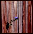
Wall Flowerby EnzoComment: This is pretty good but just perhaps a little bit too dark. The wood grain is good and flower is okay, but the overall picture just seems like its inside an old outhouse or something. I guess in an outhouse though, you're pretty alone :) |
| Photographer found comment helpful. |
| 10/26/2003 08:34:13 AM |
Getting Away From It Allby MrsFuzzButtComment: Great idea. Small photos have a hard time. This also looks a little tilted, running downhill from L to R. Your idea is good, just need a little bigger and straighter picture. 6 |
| Photographer found comment helpful. |
Home -
Challenges -
Community -
League -
Photos -
Cameras -
Lenses -
Learn -
Help -
Terms of Use -
Privacy -
Top ^
DPChallenge, and website content and design, Copyright © 2001-2025 Challenging Technologies, LLC.
All digital photo copyrights belong to the photographers and may not be used without permission.
Current Server Time: 12/15/2025 12:41:09 AM EST.