| Image |
Comment |
| 12/03/2002 12:45:00 PM |
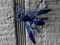
Polistes Azureus Fallacia (Southwestern Blue Wasp)by AnachroniteComment: The first impression I get from this pic is that it is very unnatural looking. Desat of all the colors but blue was probably not the best idea. The blue is way too bright. It looks like the subject was taken from something else and put here with PS. Oversaturation of blue makes the DOF look bad. The shot is pretty blurry for a macro or overprocessed. This is an excellent subject and I think there is a lot of room for improvement on this shot, but the potential is definitely there. - Inspzil |
 Photographer found comment helpful. Photographer found comment helpful. |
| 12/02/2002 05:09:00 AM |
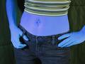
Blue Genesby DougPazComment: Smurfette? I think backing off a little for this pic to show more of the model would've been better. Without a really strong focal point I don't think there is a lot of purpose to shoot this so close. Well taken pic though and pretty good idea. - Inspzil |
| Photographer found comment helpful. |
| 12/03/2002 01:12:00 PM |
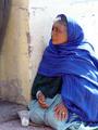
Blue Ladyby JEMComment: Well done emotive pic. The colors are vivid, the framing is good. The background above her head though is really washed out. Still a good pic though. - Inspzil |
| Photographer found comment helpful. |
| 12/03/2002 01:21:00 PM |
INK by marboComment: You really made the most of this subject! Its an interesting, but at the same time disgusting pic. Love the 10pt star filter. Wish I had one. Color is great and the highlights as well. Well done - Inspzil |
| Photographer found comment helpful. |
| 11/29/2002 05:05:00 AM |
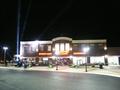
Grand Openingby ClubJuggleComment: This photo needs something, like a thousand people on the outside waiting to get in. As far as grand openings go, this looks more like a regular day. The people being there would make it a whole lot more newspaper worthy - Inspzil |
| Photographer found comment helpful. |
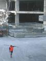
| 11/29/2002 05:08:00 AM |
Lonesome Urban Cowboyby 'PongComment: This whole pic looks a bit fuzzy. I'm not exactly sure what this pic would be representing if put in the paper. I would've concentrating on the demolition work being done on the site and left this guy right out of the pic. I guess I'm not seeing his significance in this picture and if he is significant, then focus on him as the prominent subject - Just my thoughts - Inspzil |
| Photographer found comment helpful. |
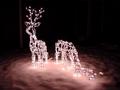
| 11/29/2002 05:28:00 AM |
Christmas Season is Upon Us ( small town news)by SonifoComment: The angle of this shot is not helping the right deer at all. Taken from a lower perspective would've helped show the deer better as well as given this a childs perspective on the shot. The way the lighting is on the snow is great though. I love the way it looks like its glowing. Pic is well framed too with nice use of negative space. |
| Photographer found comment helpful. |
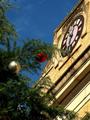
| 12/03/2002 11:50:00 PM |
Christmas Time - Town Square Gets Festiveby crabappl3Comment: Composition - My first impression of this pic was that the building was looking a little rough. I didn't like the contrast that provided between it and the bulbs in the tree. The top of the building looks singed. The second thing I noticed was that the bulbs are a little underexposed. Nothing major though there. The third thing I noticed was that this is a great great camera angle to take this picture. It includes a nice balance of tree on one side and building on the other. The building does offer some nice contrasts itself in the forms of circles and straight lines. Christmas bulbs look odd to me without any snow. Background - Very nice rich color in the sky. Its a little too blue though to the point of looking fake. I personally don't mind that at all. There really isn't much else to consider for background, so lets move on. Camera work - The strongest thing here is the angle the picture was shot. The DOF is really good for the composition of this shot. The bulbs being a little dark might be tough to fix and maybe just as tough to process within the limits of the rules. Strong camera work! (I've been considering buying the model of camera you have) Post processing - I can't see anything too out of the ordinary, so that's a good sign. Overall - I generally like the shot. I think it would be found in a newspaper somewhere, although maybe not the front page. I would've liked to see a newer building but this older one will work. - Bob (Inspzil) |
| Photographer found comment helpful. |
| 11/29/2002 04:39:00 AM |
Christmas Time - Town Square Gets Festiveby crabappl3Comment: Wonderful color in the sky. The bulbs are too dark and hidden. They should really stand out for this shot. This building isn't the greatest subject either. It looks a little run down to be a cheery xmas shot. - Inspzil |
| Photographer found comment helpful. |
| 11/29/2002 05:12:00 AM |
Soon To Become U.S. Homeland Securityby MustbelostComment: This is a pretty good idea. I wasn't sold on it by the thumbnail, but here it looks ok. I'm not overly wild about it either. The light seems a little harsh at the top and a little lacking on the rest of the pic. Aside from that, I think it looks pretty well focused and framed. It might be going a bit uphill from L to R but I don't think its that significant. - Inspzil |
| Photographer found comment helpful. |
Home -
Challenges -
Community -
League -
Photos -
Cameras -
Lenses -
Learn -
Help -
Terms of Use -
Privacy -
Top ^
DPChallenge, and website content and design, Copyright © 2001-2025 Challenging Technologies, LLC.
All digital photo copyrights belong to the photographers and may not be used without permission.
Current Server Time: 12/15/2025 01:00:28 AM EST.