| Image |
Comment |
| 03/01/2003 08:33:39 AM |
Think Globallyby alanfreedComment: Nice lighting and color tone choice. Not so sure I would've cropped this quite so tightly unless I was trying to illustrate one specific region. |
 Photographer found comment helpful. Photographer found comment helpful. |
| 03/01/2003 12:01:15 AM |
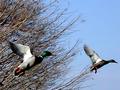
Flightby Frank BeckmanComment: Greetings from the Critique Club
By Inspzil
Composition - This is a really neat capture. I like the colors on the left duck. They seem a little underexposed but I don't think that's the case. I think they are just slightly out of focus due to their movement. They are really well framed. Both being in roughly the same position is a great touch and the biggest selling point of this photo IMO. The downside to this pic is the branches being out of focus. I think you probably would've been better off if the branches were moving a lot, then it would convey their motion better. You kinda got stuck in the in between, between a panning motion shot and a stop action motion shot where the background has to be a blur or crystal clear. Personally I think its pretty good as is, but could definitely improve if the background fit into one of the "approved" techniques on DPC. The panning shot is still under review (according to my shots anyway :) ).
Technical - This image lacks a little of the crispness that it needs. I don't feel it needs to be the clearest image we've ever seen on DPC but for the most part, voters in these parts generally frown on any less than crystal clear. The slight "underexposure" of the birds heads is probably not correctable within DPC rules. Some of the function might be a little bit due to the DOF if the camera is close to the subjects. I don't believe this to be true in this case.
Overall - I think this picture is pretty underrated. It's not a bad picture and I think it deserves a little better score. I think you took a lot of hits for the background not being totally focused which I don't think is totally justified. Unfortunately I can't change your score but I hope you found at least one thing in here that will help you on a future picture. Good Luck with your photos - Inspzil |
| Photographer found comment helpful. |
| 02/27/2003 05:09:57 AM |
At Last Springby redfigComment: I think the crop is too tight on this and/or the picture was taken from too close. Losing focus at the bottom right part of the pic. |
| Photographer found comment helpful. |
| 02/27/2003 05:05:01 AM |
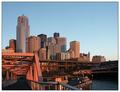
Emerald Cityby joannsComment: Nice cityscape photo. Great DOF on this shot. Could've used a bit more exposure I think, or a little more sun. I like the stuff right down on the water, but it could use a little more detail. Overall a pretty nice pic though. |
| Photographer found comment helpful. |
| 02/27/2003 05:00:10 AM |
Berryliciousby SonifoComment: Cool photo. I'm sort of on the fence here whether or not this photo is a little underexposed or not, but I'll give you the benefit of the doubt. The reds are good but the blackberries and blueberries are a pinch dark. Overall it's pretty darn good though. Nice shot! |
| Photographer found comment helpful. |
| 02/26/2003 11:05:09 PM |
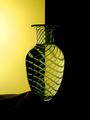
Pineappleby crabappl3Comment: Greetings from the Critique Club
By Inspzil
Composition - Meets the challenge. I think you chose a difficult subject with this vase due to the lines in it. I think that the distortion of some of the lines throws things a little out of whack. If it were a little more uniform distortion (write that one down) then I think it would've been more accepted by the voters (myself included). The concept is one I've seen many times, but I think you are the first one to do a patterned vase. Most of them I've seen are done with champagne glasses or something with minimal curves. Another flaw I see with this is the highlights on your dropcloth. I think the backdrop should've run on one level across the bottom. The flash of light on the left side could've been eliminated too.
Technical - The exposure looks excellent. Good colors and a nice sharp pic. Very nicely done.
Overall - A solid shot with a couple minor things that could be fixed to make it a real contender. I think you've gotten the concept right and just need a little refining on the setup end with the light and the drop cloth to take this to the next level. A well taken photo no doubt, but I am pretty sure that losing the light and fixing the background would've done a world of good. Nice pic and good luck in the future - Bob |
| Photographer found comment helpful. |
| 02/26/2003 10:53:20 PM |
Up in The Airby BAMartinComment: Greeting from the Critique Club
By InSpZiL
Composition - Wow!! That's a great sky color. I'm a little in the dark about what it is exactly, but the color representation is absolutely astonishing. I wish the flag was there in its entirety. Aside from that, I'm a little hesitant to give much for advice since I'm not really sure what it is. Maybe that should be the advice... The photo is clear enough, but the angle doesn't reveal what we need it to reveal for the viewers to know what it is. Or maybe I'm dumb.
Photography - Wow, this is well taken. The photo is sharp and crisp and the colors are brilliant. Well done
Processing - If you did manipulate the colors a little, bravo, you did a great job.
Overall - Holy Acrophobia Batman!! Well taken, but I'm curious to know what it is. I'm guessing a control deck for a crane or some other heavy machinery. It is however interesting, but not much for inspiring I don't think. Keep taking photos like this, and you will find yourself in the ribbons if you can find the right subject. Good photo - Bob |
| Photographer found comment helpful. |
| 02/25/2003 05:32:26 AM |
|
| Photographer found comment helpful. |
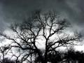
| 02/25/2003 05:14:13 AM |
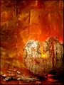
Before the Stormby xertionComment: Awesome image. Really breathtaking. Great capture of the sky and behind this tree makes it a 10 in my book. Awesome!! |
| Photographer found comment helpful. |
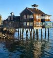
| 02/25/2003 05:12:02 AM |
The Dock Houseby GotchaComment: Cool building. unbelievable that they'd build something like this on a dock. Hope it never freezes there:) Nice rich colors of the wood. I think it would be a little better if it were just a pinch sharper and clearer. |
| Photographer found comment helpful. |
Home -
Challenges -
Community -
League -
Photos -
Cameras -
Lenses -
Learn -
Help -
Terms of Use -
Privacy -
Top ^
DPChallenge, and website content and design, Copyright © 2001-2025 Challenging Technologies, LLC.
All digital photo copyrights belong to the photographers and may not be used without permission.
Current Server Time: 08/15/2025 06:24:58 PM EDT.