| Image |
Comment |
| 03/31/2003 05:27:20 AM |
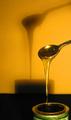
Golden Syrupby GussiComment: Good idea, but I don't see this being a macro. Nice shot though |
 Photographer found comment helpful. Photographer found comment helpful. |
| 03/31/2003 05:10:31 AM |
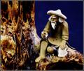
Aloneby AnnidaComment: This has a very oil painting look to it. Unusual colors but nice earthy tones. |
| Photographer found comment helpful. |
| 03/31/2003 05:01:23 AM |
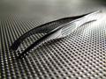
Metalworksby GeocideComment: Very shallow DOF. Can't make up my mind if I like it that way or not. The very center of the photo is focused. I think it'd have been more successful with a bigger f number and a greater DOF so at least the point of the instrument were focused. I like the framing however I think the subject is a little overexposed. |
| Photographer found comment helpful. |
| 03/31/2003 04:58:17 AM |
Redstarby EJComment: There is some distortion going on with this pic that may be on purpose but I'm guessing its from oversaturating the reds in this photo. Stunning image looking at the subject but the background is really grainy. The grain however makes it look like a photo from the 70s. Interesting pic. Good luck |
| Photographer found comment helpful. |
| 03/31/2003 04:51:48 AM |
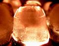
Alien eggsby p_johnsComment: I don't know what this is, but its pretty cool. Looks like something leftover from 3 mile island though. Great exposure and color. For some stupid reason it reminds me of S'mores. |
| Photographer found comment helpful. |
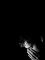
| 03/31/2003 04:24:42 AM |
Almost Holy by KonadorComment: Many congratulations Konador. Exceptional pic. And I remain without a ribbon.... - Bob
|
| Photographer found comment helpful. |
| 03/30/2003 01:15:48 PM |
Macedonian Saladby pitsamanComment: Greetings from the Critique Club
And from your favorite critic too!
By Inspzil :)
Firstly, if you don't like my opinion, don't take it personally. I'll assure you that I'm not overpaid to do this. And because I take this to be somewhat professional, I will do this critique.
Composition - Excellent colors. The arrangement is very good. The bit of water on the olives is a nice touch. The only thing I think that takes away from the overall composition of this photo is the bowl showing on the side and thru the tomatoes and peppers. Otherwise, very well conceived.
Technical - Very well lit and framed. This is a nice crisp image that portrays these vegetables to be very tasty. I think this could be a little crisper, but not much. Very well taken photo.
Overall - Well conceived and executed photo. My only suggestion would have been to push the green pepper in a little tighter toward the center of the frame to show the whole thing. This would in turn cover up some of the bowl that shows between the tomatoes. Aside from that, I think you did well to get the most out of this shot. Good job with this shot and good luck in future challenges. - Inspzil
|
| Photographer found comment helpful. |
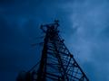
| 03/30/2003 08:46:10 AM |
Aboveby kjarriComment: Greetings from the Critique Club
By Inspzil
Composition - 180 degrees from the challenge topic. I'm sure that's most of the reason for the very low score. I don't know if you didn't understand it or just dared to be different. Whatever the case, this is way, way off. But lets overlook that for now. The composition of this photo is not bad. It looks like its a really cloudy morning or evening. The tower silhouette is pretty good, but maybe a little dark. The ominous clouds are pretty scary looking. Looks sort of like a weather tower but I'm not sure. Great perspective.
Technical - A little underexposed and a little soft. Subjects like this rarely do very well if not really crisp. I think the overall bluish tone to the picture is good. This might be fixable to some degree in Photoshop or other program to lighten the colors and sharpen it a little. The photo may be slightly off vertical too. From this perspective its always hard to tell.
Overall - This is probably a little below average pic that is totally opposite of the challenge topic. I'm sure that's the biggest reason for the score being a little "sub-par". Definite could use some improvement on the photography part but its not real bad as is. Good luck with your future challenges - Inspzil
|
| Photographer found comment helpful. |
| 03/30/2003 08:23:28 AM |
Oil in cupby zerocusaComment: Greetings from the Critique Club
By Inspzil
Composition - This is a very simple composition. Probably a good one to start out with to get your feet wet in DPC. There isn't a lot to it, hence I don't have a lot to say about it. The background under the cup would've been better if it were something non-reflective. This could've had a lot of visual impact if you would've put something in the bottom of the cup. The oil may have magnified it or reduced it thru the water.
Technical - Not a bad little photo at all. Good exposure and framing. No harsh reflections in the water or oil and also a very sound choice to use black and white.
Overall - Very simple well taken photo. But realistically for DPC, a little too simple. In future weeks, I'd encourage you to work on creative composing a little more. Good to get this one under your belt, but you really could've done some fun stuff with this one to make it a little more visually impacting. Put a coin in the bottom or something more colorful, just to see how it will look. Always explore the possibilities and dare to try something new and different. It doesn't always work out, but you'd be surprised how many do work out pretty well. Good Luck with your future challenges. - Inspzil |
| Photographer found comment helpful. |
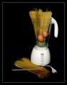
| 03/30/2003 02:02:17 AM |
Mama mia! She said she could cook before we got married!by AnastasiaComment: Greetings from the Critique Club
By Inspzil
Composition - Cute theme. Definitely nice aspects in terms of color happening with this photo. First is contrast in blender and background. Second is the rest of the earthy tones in the eggs, utensils and noodles to offset the more sterile white blender and black background. Couple minor things I don't like - First is the cord of the blender does not need to be in the picture. Second is the lack of light on the wooden spoons. I think I'd have removed the cord and put it out of sight, spread out the pasta lying down diagonally from top L to bottom R to eat up a little more room in the frame. Composition is pretty good.
Technical - Well taken photo. For some reason, about every other time I look at it I think it needs to be rotated to the left a little. It needs some more light on the wooden spoons too. Besides that, exposure, DOF, focus is all very good.
Overall - Not a terribly dynamic picture but portrays your theme very well. It was a very good idea very well executed. I think it was a good image that met the challenge aptly and was rated fairly. Nice work and good luck in your future challenges - Inspzil |
| Photographer found comment helpful. |
Home -
Challenges -
Community -
League -
Photos -
Cameras -
Lenses -
Learn -
Help -
Terms of Use -
Privacy -
Top ^
DPChallenge, and website content and design, Copyright © 2001-2025 Challenging Technologies, LLC.
All digital photo copyrights belong to the photographers and may not be used without permission.
Current Server Time: 08/17/2025 05:18:33 AM EDT.