| Author | Thread |
|
|
12/17/2007 01:06:39 PM |
|
I think that sometimes we get a little carried away with what we think the challenge is. I like the photo and If I were a member when it came up to vote, I would have rated it high. Don't listen to the nay sayers and lecturers, do what moves you! |
|
|
|
05/11/2004 02:15:40 PM |
Being an owner of that particularly limited digital camera, I have to say I am quite impressed with the photo that you were able to get out of it.
Personally, the best shots I have been able to get out of that camera is at the North American International Autoshow this past year at Cobo Hall in Detroit, Michigan. Of course, you have to practically fall over yourself to get crappy pictures at the Autoshow...
Again, I am impressed with the shot. |
|
|
|
03/30/2003 08:46:10 AM |
Greetings from the Critique Club
By Inspzil
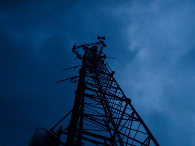
Composition - 180 degrees from the challenge topic. I'm sure that's most of the reason for the very low score. I don't know if you didn't understand it or just dared to be different. Whatever the case, this is way, way off. But lets overlook that for now. The composition of this photo is not bad. It looks like its a really cloudy morning or evening. The tower silhouette is pretty good, but maybe a little dark. The ominous clouds are pretty scary looking. Looks sort of like a weather tower but I'm not sure. Great perspective.
Technical - A little underexposed and a little soft. Subjects like this rarely do very well if not really crisp. I think the overall bluish tone to the picture is good. This might be fixable to some degree in Photoshop or other program to lighten the colors and sharpen it a little. The photo may be slightly off vertical too. From this perspective its always hard to tell.
Overall - This is probably a little below average pic that is totally opposite of the challenge topic. I'm sure that's the biggest reason for the score being a little "sub-par". Definite could use some improvement on the photography part but its not real bad as is. Good luck with your future challenges - Inspzil
|
|
 Photographer found comment helpful. Photographer found comment helpful. |
Comments Made During the Challenge  |
|
|
03/22/2003 06:26:56 PM |
|
hmmm....a bit blue for my taste, sad but maybe that´s the intent? |
|
| Photographer found comment helpful. |
|
|
03/21/2003 03:11:58 PM |
|
Nice shot of the towers from down HERE including the night clouds, but you were supposed to shoot something from UP there looking DOWN here. I don't think you're going get accepted into the Challenge. |
|
| Photographer found comment helpful. |
|
|
03/20/2003 04:45:51 PM |
|
| Photographer found comment helpful. |
|
|
03/20/2003 11:05:59 AM |
|
does not meet the challenge, too dark |
|
| Photographer found comment helpful. |
|
|
03/19/2003 05:42:38 PM |
|
Looking up? Otherwise, a great shot! I like the use of the deeply saturated blues-- kind of adds a certain mystique to an otherwise boring object. |
|
| Photographer found comment helpful. |
|
|
03/19/2003 04:21:08 PM |
|
I really like the range of color and patterns in the sky. I also like the angle from which you chose to take the photo. Good job. |
|
| Photographer found comment helpful. |
|
|
03/18/2003 09:21:55 PM |
|
I like the color of the sky and cloud texture but the perspective is looking up rather than down. |
|
| Photographer found comment helpful. |
|
|
03/17/2003 10:21:00 PM |
|
Ooops, I think you're going in the wrong direction. Nice colors, though. |
|
| Photographer found comment helpful. |
|
|
03/17/2003 07:11:08 PM |
|
First, it's the wrong direction, up not down. Very dark picture. Next, the focus seems to be close to the bottom. 4 Swash |
|
| Photographer found comment helpful. |
|
|
03/17/2003 04:21:21 PM |
|
You may have gone a little overboard on the polarizer (or it just otherwise seems a bit too dark)... and in my opinion the challenge was meant to shoot down rather than up...? |
|
| Photographer found comment helpful. |
|
|
03/17/2003 11:10:40 AM |
Sorry you misunderstood the topic, otherwise a nice photo with unique color.
You were suppose to be above the subject of the photo. |
|
| Photographer found comment helpful. |
|
|
03/17/2003 09:03:19 AM |
|
It's from the ground up... but I do love the sky! |
|
| Photographer found comment helpful. |
|
|
03/17/2003 04:15:18 AM |
|
Um, isn't the theme 'FROM ABOVE'? |
|
| Photographer found comment helpful. |
Home -
Challenges -
Community -
League -
Photos -
Cameras -
Lenses -
Learn -
Help -
Terms of Use -
Privacy -
Top ^
DPChallenge, and website content and design, Copyright © 2001-2026 Challenging Technologies, LLC.
All digital photo copyrights belong to the photographers and may not be used without permission.
Current Server Time: 06/28/2026 10:25:16 AM EDT.