| Image |
Comment |
| 04/01/2003 05:06:21 AM |
This one for you!by pitsamanComment: Great colors and framing. The lighting is pretty good but I think you could've used just a little more. Nice job |
 Photographer found comment helpful. Photographer found comment helpful. |
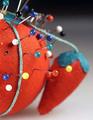
| 04/01/2003 05:01:03 AM |
Pincushionby BigSmilesComment: Great color. I'd have closed the distance on this subject though. Its just not taken from close enough.
|
| Photographer found comment helpful. |
| 04/01/2003 04:57:39 AM |
Rollin in the Money!!by YomiComment: White balance needs adjusting on this photo. The little bart is cute, but doesn't do it for me as a subject for a photo. Neat little figure though. |
| Photographer found comment helpful. |
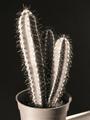
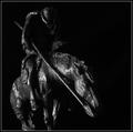
| 04/01/2003 04:55:48 AM |
Small, but fierce!by rooComment: I'd have drawn a lot tighter to the subject on this shot. I don't know if I'd really call this a macro. The B&W was a good choice for this photo. THe lighting is also really well done. I think my biggest issue is that this isn't relaly a close enough shot. |
| Photographer found comment helpful. |
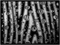
| 04/01/2003 04:51:51 AM |
When Life Gets You Down, Think BUBBLES!!by karmatComment: I think the framing works for this, but the focus doesn't. I think it would've been better to make the DOF greater so that some of the bubbles were in focus. Nice idea. The wand looks slightly out of focus too. |
| Photographer found comment helpful. |
| 04/01/2003 04:43:43 AM |
Flame On! by joebarComment: The background is good. The framing is great. The sparks are a very dynamic addition. Just a little washed out on the left side of the flame. Solid 9
|
| Photographer found comment helpful. |
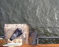
| 03/31/2003 12:44:35 PM |
Hangin' At The Pierby ScottKComment: Greetings from the Critique Club
**Special Edition** by Inspzil
Composition - I had a heck of a time telling what this was. I know when I voted, I had no idea what it was. I think the idea is pretty good, but maybe the angle the picture was taken at shouldn't have been quite so straight down so it would be a little easier to tell what we're looking at. (Clarity of subject on DPC is really important IMO). There isn't a lot of color to this photo. It may be the kind of photo where you don't really lose a lot greyscaled. But you'd have to actually do it to find out. Sometimes black and white works instead of having little color or sort of bland colors.
Technical - I'm surprised you got this great a depth of field (DOF) with f/2.8. I would've expected the bird to be focused but not the water. The lighting seems pretty good with this photo too. The water does not have any blinding reflections in it which is good. Shooting on water can be tough. Not as tough as snow, but I've done my share of sunrise stuff and the exposure has to be just the right balance or something is really lost. The most advice I have here is pretty much the same as the composition - Give yourself another angle to work from. Pigeons were not made to be 2 dimensional, especially not from the top.
Overall - Pretty good start. I'd have been overjoyed to have 5.2 right off the bat. I started around 4.9 so I think you're off to a good start. Keep your photos generally crisp. There are more emotive pics where lack of clarity of subject does not affect the image or affects it in a positive way. These are pretty special images and it has to be just the right picture, or else it will earn the blurry tag. You've done pretty well with the sharpness of this photo. The other thing I'm seeing is that there might be a little more water than you need in this photo, and that is easily corrected with a little tighter crop. I always ask myself why I do things or why I am keeping them the way they are. Sometimes there are specific reasons, and sometimes it just looks better that way. Depends on the situation of course, but over time you'll figure out what DPC voters like and don't like. And once you figure that out, it will all change and you won't have a clue, again. This isn't bad, but there are a couple things that I'd consider looking at again. Try desaturating it, then adding back a little color. You may find it works for you. You may find it looks like poop. Well I hope this could be a little helpful for you. If you have any questions, email me at inspzil@yahoo.com and that doesn't just apply to this photo either. I'm no expert, but I'm making strides to being a better photographer. It shows on my profile page too I think. Good luck and welcome to DPC - Bob |
| Photographer found comment helpful. |
| 03/31/2003 05:32:55 AM |
zebra dropsby shutterflyComment: I've been meaning to try this out. I hope I can do as well as this one. A little bit underexposed but very sharp and very crisp |
| Photographer found comment helpful. |
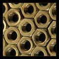
| 03/31/2003 05:31:14 AM |
Hexagonalby FranziskaLangComment: Nice image. Well conceived, well setup, nicely captured. I don't like how the nuts look a little dull, like they were tarnished, but a great shot. - 9
|
| Photographer found comment helpful. |
| 03/31/2003 05:29:10 AM |
Tabletop Warriorby autoolComment: I think this one needs quite a bit more exposure. Good clarity of photo, just not quite bright enough. |
| Photographer found comment helpful. |
Home -
Challenges -
Community -
League -
Photos -
Cameras -
Lenses -
Learn -
Help -
Terms of Use -
Privacy -
Top ^
DPChallenge, and website content and design, Copyright © 2001-2025 Challenging Technologies, LLC.
All digital photo copyrights belong to the photographers and may not be used without permission.
Current Server Time: 08/17/2025 03:46:36 PM EDT.