| Image |
Comment |
| 04/03/2003 05:22:00 AM |
A Chorus Lineby daysezComment: Wonderful color. Good symmetry. I knew there'd be a couple of these. This one is particularly well done. Nice job |
 Photographer found comment helpful. Photographer found comment helpful. |
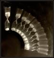
| 04/02/2003 09:08:41 AM |
Time Keeps on Slipping, Slipping, Slippingby karmatComment: Greetings Fellow Critic
From Inspzil
Composition - I love doing shots like this, so critiquing this one is very cool. High marks for creativity. I think more linear, so I'm sure if I did a shot like this it would be a straight line. This is a good idea though and I think if it were to be a little clearer, it would've done much better. The picture is a little muddy from the long long exposure. Another possibility to do this is with a strobe, panning the camera between flashes. I don't like the lighter area at the bottom right. It makes the little black stands on the end of the timer show up too much. They're not so noticeable where its very black, but in that greyer area they are sort of a sore spot. The reflection on the leftmost one is a bit distracting too. I also don't like how the last couple are very white where the sand overlaps. That really is unavoidable unless none of them overlapped.
Technical - A great study in a different technique. I know I've done a few pics with long "simulated multiple" exposures with some decent results but I think this might inspire a few folks to delve into a little different aspect of their photography. The lack of focus is the major problem with this. I'm not sure if you had a little camera shake or if its just that they didn't expose quite enough but they are definitely fuzzy. I know my first long exp. pic took about 45-50 takes to get it right. Good thing my wife was patient. Setting the aperture to F8 seems kind of high to me. Mostly due to the fact that you need even more light than if it were set to 3.6 or something substantially lower. The actual exposures look just about right though so you must know something about that more than I :) The framing is very good, filling up enough of the frame but not too much.
Overall - I like the creativity and technique of this picture a lot. I think it could use a little honing to solidify it though and it wouldn't have to be anything drastic. I would recommend trying a strobe, you could control it by hand to flash a couple times fast, the slow it down, move the cam, and turn it up again, so on and so forth. I keeps you from having to keep covering the shutter every time. If this could've been sharper I think it would've done substantially better. It's still a good image. Good luck in your future challenges. I'll shut up now. - Bob
|
| Photographer found comment helpful. |
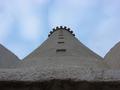
| 04/01/2003 06:39:44 PM |
My lighthouseby hilmarsigComment: Interesting perspective. I like the way the sky looks and I think you've done well with your symmetry. Well taken and I prefer the great DOF of this pic. |
| Photographer found comment helpful. |
| 04/01/2003 01:46:33 PM |
Zenby CoreyComment: I don't know about the head turn and symmetry, but regardless this is an absolutely phenomenal photo. The color of the water is sort of fake looking, but looks cool in its own right. Very well done - 10 |
| Photographer found comment helpful. |
| 04/01/2003 12:58:44 PM |
Symmetry Repeatedby LustreComment: This is a very nice image. I think intensifying the blue in the sky a little would really help to bring the colors out on the building |
| Photographer found comment helpful. |
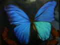
| 04/01/2003 12:56:29 PM |
South American Butterflyby rickhd13Comment: Not terribly symmetrical. I think showing the butterfly true to vertical would improve the appearance. The image is not very clean either... there seems to be some noise on the window. The right wing is also quite a bit lighter at the bottom than the left one (I'm sure you've heard that a million times). The colors are beautiful, but the general image needs to be honed a bit to look a little more finished. |
| Photographer found comment helpful. |
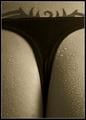
| 04/01/2003 11:43:28 AM |
Seductive Symmetryby AnastasiaComment: <----------Male. 10
No really its a good concept and very well taken. I'm not giving it a 10, but I will give it a 7. The tattoo brings asymmetry with it. Very very nice. |
| Photographer found comment helpful. |
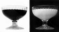
| 04/01/2003 11:40:26 AM |
Green Green Glass Of Homeby MonaComment: Good title! The lighting is a bit too bright. I think the crop could've shaved off the top of the glasses at the bottom. |
| Photographer found comment helpful. |
| 04/01/2003 11:38:38 AM |
Black & Whiteby WILDBLUEComment: This looks like the negative vs. the symmetrical. a nice concept still and I like the style that this was taken. It looks like its from the '20s or something. Good image but not really symmetrical |
| Photographer found comment helpful. |
| 04/01/2003 11:34:04 AM |
Front Doorby Pep VentosaComment: Great perspective. Love the color of the doors. Symmetry is good as well. |
| Photographer found comment helpful. |
Home -
Challenges -
Community -
League -
Photos -
Cameras -
Lenses -
Learn -
Help -
Terms of Use -
Privacy -
Top ^
DPChallenge, and website content and design, Copyright © 2001-2025 Challenging Technologies, LLC.
All digital photo copyrights belong to the photographers and may not be used without permission.
Current Server Time: 08/17/2025 09:23:46 AM EDT.