| Image |
Comment |
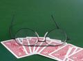
| 11/23/2005 11:27:48 PM |
A little too lucky in Pokerby nico_blueComment: My favorite of the cards shots, extremely well done. Probably wouldn't want to wear such reflective glasses when playing cards, though. ;-) |
 Photographer found comment helpful. Photographer found comment helpful. |
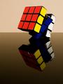
| 11/23/2005 11:23:07 PM |
Oooooh!!! Stickers!!!by JRalstonComment: Good idea and great composition! Am interested in what type of surface this was shot on--I really like the reflection. |
| Photographer found comment helpful. |
| 11/23/2005 11:16:47 PM |
Xray Visionby donnievComment: I love the basic idea, but the realization is a bit weak. Could possibly benefit from post-processing levels for a richer color tone and a bit of sharpening, for example. |
| Photographer found comment helpful. |
| 11/23/2005 10:53:48 PM |
Bored of Education by scalvertComment: Great idea, wonderful composition, and delightful title! Only minor nitpick is with the pictures of the eyes on the glasses, which look like they were shot from below. Would be surprised and dismayed if this doesn't ribbon. |
| Photographer found comment helpful. |
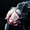
| 11/23/2005 10:47:01 PM |
Winter Roseby frogletComment: This is by far my favorite entry in the challenge. Bumping up.
Edit: Very underscored, IMHO. Adding to favorites. Message edited by author 2005-11-28 00:28:08. |
| Photographer found comment helpful. |
| 11/19/2005 08:32:02 PM |
Canadian Slideshowby KatmystiryComment: Gooses! All three goose shots face the right, which tends to lead me to the right rather than bring me into the center. The left two shots are fairly similar to each other but the third is a bit different, so maybe moving the third to the center and mirror-imaging the second and moving it to the right(?) Each shot is really nice on its own though, especially the left two, and you did a great job of maintaining the image quality in the reduced size. |
| Photographer found comment helpful. |
| 11/19/2005 08:17:55 PM |
Practice Practice Practiceby totaldisComment: I like the high contrast, though I'm not sure if that feeling is universal. I think I might like it better without the harsh shadows, with a bit more empty space on top, and maybe with the tees more precisely vertical. Nice concept though, and overall a great job! |
| Photographer found comment helpful. |
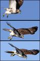
| 11/19/2005 08:05:22 PM |
The Diveby scrum8Comment: Beautiful series of captures! I think it would be even more dramatic if there was more variation between the second and third panels. Also the background on the third is a *little* lighter than the previous two. Great job though--each shot could easily stand on its own. :-) |
| Photographer found comment helpful. |
| 11/19/2005 03:09:25 AM |
|
| Photographer found comment helpful. |
| 11/17/2005 12:48:43 AM |
|
| Photographer found comment helpful. |
Home -
Challenges -
Community -
League -
Photos -
Cameras -
Lenses -
Learn -
Help -
Terms of Use -
Privacy -
Top ^
DPChallenge, and website content and design, Copyright © 2001-2025 Challenging Technologies, LLC.
All digital photo copyrights belong to the photographers and may not be used without permission.
Current Server Time: 08/19/2025 11:20:43 AM EDT.