| Image |
Comment |
| 05/29/2005 06:00:54 PM |
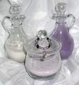
Wedding Ceremony Memoriesby TheStickComment: This had great potential. If you could have brought out the colors just a little bit more, I think it would have helped. I like the composition though. Great shapes. |
 Photographer found comment helpful. Photographer found comment helpful. |
| 04/25/2005 09:42:34 PM |
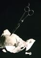
It's an awful photo, I know, but it's creative, right?by taceComment: Adjusting the curves or levels during processing might have been able to turn the background a little blacker. The harsh lighting on the scissors detracts from the photo. Good composition though, and yes, this is creative. |
| Photographer found comment helpful. |
| 04/25/2005 09:33:53 PM |
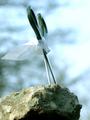
Paper Clichéby strangeghostComment: Colorful, simple, and meets the challenge well. I might have tried a little different composition. The rock kind of breaks up the flow of the lines and probably would have done better in a different position. |
| Photographer found comment helpful. |
| 04/25/2005 09:31:14 PM |
Champby cabaComment: Great shot. Very creative and well done. I'm not sure how big the rock was, but if you could have zoomed out a little more, it would have given the photo a better sense of height. I still think this is a winner. |
| Photographer found comment helpful. |
| 04/25/2005 09:22:32 PM |
To the Rescue!by ChinabunComment: A bigger cape would have helped. But I'm glad to see you incorporate all three elements in a unique way. |
| Photographer found comment helpful. |
| 04/25/2005 09:21:05 PM |
|
| Photographer found comment helpful. |
| 04/25/2005 09:20:05 PM |
Metallic texturesby greslizzzComment: This almost worked. I think if the grain at the bottom of the scissors showed, it would give the photo the feeling of more detail. The paper turned out the best, but I almost missed the rocks. Just a little too much detail was removed from them, and I think a few more showing would have worked a little better. |
| Photographer found comment helpful. |
| 04/25/2005 09:15:59 PM |
|
| Photographer found comment helpful. |
| 04/23/2005 07:48:05 AM |
In the middle..by babymaderoComment: Great photo composition. Glad to see all three elements. The string shows on top and the paper is washed out. I think B&W hurt this a little because the scissors are lost in the black background. I couldn't give you a great score because of this, but I still think it's a good photo. |
| Photographer found comment helpful. |
| 04/19/2005 12:16:40 PM |
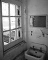
Not Even Suitable For The Homelessby notonlineComment: One of the better window shots I've seen. You balanced it well with the sink and broken mirror image on the right. The washout in the upper left keeps taking my attention away from the rest of the photo. Don't know if that could have been changed other than by shooting at a different time of the day, but I think it might have hindered you a little. For instance, if you could have lighten up the shot some, I think more detail in the rubble and paint chips would have been brought out. |
| Photographer found comment helpful. |
Home -
Challenges -
Community -
League -
Photos -
Cameras -
Lenses -
Learn -
Help -
Terms of Use -
Privacy -
Top ^
DPChallenge, and website content and design, Copyright © 2001-2025 Challenging Technologies, LLC.
All digital photo copyrights belong to the photographers and may not be used without permission.
Current Server Time: 08/20/2025 07:01:41 PM EDT.