| Image |
Comment |
| 04/15/2005 03:24:25 PM |
|
 Photographer found comment helpful. Photographer found comment helpful. |
| 04/15/2005 02:56:13 PM |
Once Upon a Dogby gotrondComment: Nice shot of moss on a tree, but I can't find any relationship with the challenge. |
| Photographer found comment helpful. |
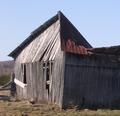
| 04/15/2005 02:53:59 PM |
Port of Portlandby MickComment: Very interesting and unique building. Sky seems a bit "blown out". Would have liked to see this one in color. |
| Photographer found comment helpful. |
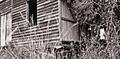
| 04/15/2005 02:52:03 PM |
House of Ghostsby AntonSComment: I don't think Sepia works very well here. Abandoned Building is almost completely obscurred by trees. Too much negative space, not enough subject. |
| Photographer found comment helpful. |
| 04/15/2005 02:48:52 PM |
my childhood homeby biggisComment: Why did you move??? I really like this shot, I just wish you had cut down that power pole before taking the photo! ;-) The sky seems a bit too bright, detracts from the overall effect of the scene. |
| Photographer found comment helpful. |
| 04/15/2005 02:47:07 PM |
|
| Photographer found comment helpful. |
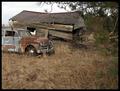
| 04/15/2005 02:46:23 PM |
Abandoned Togetherby JEFFJSBComment: Nice composition. I like that you left the tree in the right hand side of the shot. The photo really benefits from the greenery. |
| Photographer found comment helpful. |
| 04/15/2005 02:44:25 PM |
cave inby clictacameraComment: Focus seems a bit off and colors washed out. Nice subject, would have done well with better lighting. |
| Photographer found comment helpful. |
| 04/15/2005 02:36:26 PM |
|
| Photographer found comment helpful. |
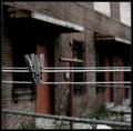
| 04/15/2005 02:28:33 PM |
The Forgottenby instepsComment: Nice use of DOF. I like the photo, but the edges of the clothespins look too sharp. They look like they have been cut and pasted in. I don't know if it is due to using unsharp mask, but it just doesn't look quite right. |
| Photographer found comment helpful. |
Home -
Challenges -
Community -
League -
Photos -
Cameras -
Lenses -
Learn -
Help -
Terms of Use -
Privacy -
Top ^
DPChallenge, and website content and design, Copyright © 2001-2025 Challenging Technologies, LLC.
All digital photo copyrights belong to the photographers and may not be used without permission.
Current Server Time: 08/05/2025 10:29:06 AM EDT.