| Author | Thread |
Comments Made During the Challenge  |
|
|
04/19/2005 10:18:43 PM |
|
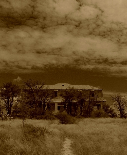
Very good job on making this spooky. |
|
 Photographer found comment helpful. Photographer found comment helpful. |
|
|
04/19/2005 06:45:12 PM |
|
Dreamy, woulda been real cool if that path led right up to the building, good job |
|
| Photographer found comment helpful. |
|
|
04/19/2005 05:27:00 PM |
|
I like the graininess of your shot - it adds to the feel. Also, the way the sky reflects the overgrown grass is amazing. This is a wonderful shot. |
|
| Photographer found comment helpful. |
|
|
04/18/2005 04:44:19 PM |
|
sorry doesn't work for me |
|
| Photographer found comment helpful. |
|
|
04/18/2005 04:43:04 PM |
|
I like the color, it looks very spooky, but it seems a little dark overall |
|
| Photographer found comment helpful. |
|
|
04/18/2005 11:36:45 AM |
|
After seeing so much BW and sepia shot, maybe it's just me, but I think it doesn't work here. Too much sky and cloud wich are uninteresting in sepia IMO. Building too much blocked up by trees. |
|
| Photographer found comment helpful. |
|
|
04/18/2005 10:15:44 AM |
|
soft. too much work in post. too many distractions |
|
| Photographer found comment helpful. |
|
|
04/18/2005 03:07:35 AM |
|
Though this image I suspect could have been very strong, the toning killed it. |
|
| Photographer found comment helpful. |
|
|
04/17/2005 11:00:36 PM |
|
not bad in composition, but i don't care for the sepia... |
|
| Photographer found comment helpful. |
|
|
04/17/2005 03:36:41 AM |
|
| Photographer found comment helpful. |
|
|
04/16/2005 10:14:09 PM |
I wanna see how this is processed. I'm not sure I like, but am intrigued by the effect.
TC |
|
| Photographer found comment helpful. |
|
|
04/16/2005 02:44:34 PM |
|
The deep sepia tones obsure the detail and detract from the overall image. That's just my opinion and here is the only place it counts. It makes me work to determine the subject and feel of the image and that gives a veiwer an inclination to make a snap judgement and go onto the next image without rating it on its other merits, which I have resisted. It is a beautiful sky, but too much of it. By cropping down to just above the house, so the image is then verticle, the veiwer is then drawn into the subject and it becomes the focus of attention. Tthen_even the deep sepia is not such a deterence. |
|
| Photographer found comment helpful. |
|
|
04/15/2005 02:52:03 PM |
|
I don't think Sepia works very well here. Abandoned Building is almost completely obscurred by trees. Too much negative space, not enough subject. |
|
| Photographer found comment helpful. |
|
|
04/15/2005 01:24:17 AM |
|
wooow awesome photo,I love the scary mood in it.9 |
|
| Photographer found comment helpful. |
|
|
04/14/2005 11:24:47 PM |
|
a little dark, but stil really great |
|
| Photographer found comment helpful. |
|
|
04/14/2005 09:46:46 PM |
|
Good idea, but the whole shot reads too dark. Great sky, but it dominates the house which is the main subject. |
|
| Photographer found comment helpful. |
|
|
04/14/2005 08:58:48 PM |
|
Very nice photo. It's too bad there is too much tree in the front. I think this would be a great shot if a little more of the house could be seen. I like your choice of color for this. |
|
| Photographer found comment helpful. |
|
|
04/14/2005 11:32:15 AM |
|
Would like to see this shot a tad bit lighter, but all around I think it's a magnificent photo, nice subject matter |
|
| Photographer found comment helpful. |
|
|
04/14/2005 11:20:57 AM |
|
very spooky looking, I would expect to see ghosts here |
|
| Photographer found comment helpful. |
|
|
04/14/2005 11:06:27 AM |
|
i like the effect of this photo, but hmm..not sure what i'm missing..yeh i dont like the sky. but overall i'd love it if it were cropped! 7 |
|
| Photographer found comment helpful. |
|
|
04/14/2005 09:50:37 AM |
|
very good image, i love the way the clouds look in this, very nice angle also to get the grass, house, and clouds in it |
|
| Photographer found comment helpful. |
|
|
04/14/2005 01:23:50 AM |
|
I think maybe a little less sky and a closer shot of the building would score slightly better. |
|
| Photographer found comment helpful. |
|
|
04/13/2005 11:15:56 PM |
|
Haunting image, but a bit too yellow for my taste. |
|
| Photographer found comment helpful. |
|
|
04/13/2005 03:52:38 PM |
|
It's a great shot, but its a bit noisy and trees are disturbing too much:( |
|
| Photographer found comment helpful. |
|
|
04/13/2005 03:28:11 PM |
|
A closer crop would work well. Great subject. |
|
| Photographer found comment helpful. |
|
|
04/13/2005 11:46:57 AM |
|
Very spooky, but the color is what I don't like. Not sharp enough. Good use of the sky as well. |
|
| Photographer found comment helpful. |
|
|
04/13/2005 11:42:37 AM |
|
Love the spooky feeling of this photo. |
|
| Photographer found comment helpful. |
|
|
04/13/2005 01:50:57 AM |
|
is that noise right above the house, in the sky, ? |
|
| Photographer found comment helpful. |
|
|
04/13/2005 01:00:59 AM |
|
nice tones and the graininess works pretty well. |
|
| Photographer found comment helpful. |
Home -
Challenges -
Community -
League -
Photos -
Cameras -
Lenses -
Learn -
Help -
Terms of Use -
Privacy -
Top ^
DPChallenge, and website content and design, Copyright © 2001-2026 Challenging Technologies, LLC.
All digital photo copyrights belong to the photographers and may not be used without permission.
Current Server Time: 06/30/2026 06:15:07 AM EDT.