| Image |
Comment |
| 04/28/2005 05:40:16 AM |
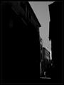
Brief encounterby jjbeguinComment: I think this is one of the best in the challange but I am partial to B&W. Most voters seem not to be. Good luck with this excellent capture. 10 from me! |
 Photographer found comment helpful. Photographer found comment helpful. |
| 04/28/2005 05:38:52 AM |
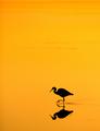
Sunset Feeding by StagoleeComment: Honestly, I think the orange could be toned down just a little bit. But, I think this is the best of what I have seen in the challenge so I am bumping this to a 10. The simplicity works and I think it captures the spirit of the challenge. Good luck! |
| Photographer found comment helpful. |
| 04/23/2005 12:41:55 AM |
Orangeby bucketComment: Wow. I can't believe all the negative comments about the background. Maybe I'm weird but I thought that made the image. Imagine it on plain white like so many other images here at DPC. You would have ended up last or close to it. Excellent job and excellent choices! |
| Photographer found comment helpful. |
| 04/22/2005 04:48:09 PM |
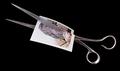
Paper curlsby frogletComment: I like the use of color and shape to add texture to this image. Well lit scissors, the white background bothers me a bit. I have no clue what could replace it, I just noticed it so I found it distracting. Overall and excellent job with a limited subject. 8 ! |
| Photographer found comment helpful. |
| 04/22/2005 04:46:35 PM |
Scissors!by wheeleddComment: I've seen about 50 of these, but yours is the best. Crisp, detailed, well composed. 8 from me. |
| Photographer found comment helpful. |
| 04/22/2005 04:45:51 PM |
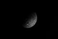
Moon Rockby Tom_RobbrechtComment: hmmm doesn't look like the moon. Looks close enough to a rock. I really like this because of the simplicity. However, some people may say you need to work on your whites, regardless of the lack of white in the image. 8 for the simplicity and well focused image. |
| Photographer found comment helpful. |
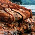
| 04/22/2005 04:43:52 PM |
Tortured Developmentby grahampComment: really cool rock. Background a little distracting because of color difference. good comp,/crop, good DOF and POV. 8 |
| Photographer found comment helpful. |
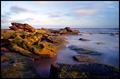
| 04/22/2005 04:42:45 PM |
Ragged by TychoComment: beautiful location, well composed, colors good. Seems like its stuck in this moment - no movement. Can't even think of how you would change that or if you'd even want to. 9 from me. |
| Photographer found comment helpful. |
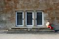
| 04/22/2005 04:40:55 PM |
The Newsby H R VerryComment: love the simplicity. Seems a little off but I am not sure if the image is tilted or if the sidewalk just makes it look that way. Love the color range and the crop and the comp. 9 from me. |
| Photographer found comment helpful. |
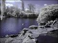
| 04/22/2005 04:39:32 PM |
Infrared Rocks!by marboComment: I like it I don't like it I like it I dont like it. You know, I am thrown by the colors but at the same time, this works for me as it is - I like the tritone (is that what you used?) Very pleasing even if it throws me off. 9 from me. |
| Photographer found comment helpful. |
Home -
Challenges -
Community -
League -
Photos -
Cameras -
Lenses -
Learn -
Help -
Terms of Use -
Privacy -
Top ^
DPChallenge, and website content and design, Copyright © 2001-2025 Challenging Technologies, LLC.
All digital photo copyrights belong to the photographers and may not be used without permission.
Current Server Time: 06/28/2025 08:52:53 AM EDT.