| Image |
Comment |
| 09/23/2009 08:11:07 PM |
Losing Focusby ineedauniquenameComment: Looks like a whiskey ad. Well taken image, but I'm not sure it works well for the challenge as the subject seems to be the whiskey. 6 |
 Photographer found comment helpful. Photographer found comment helpful. |
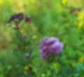
| 09/23/2009 08:09:42 PM |
Monet's Gardenby vawendyComment: Pretty hues. I can't decide if I would like the image better closer or further away. In other words, the image is nice but it really only makes me think of how to improve it, rather than just to enjoy it as it is. I think you met the challenge, but I don't think the image is memorable. 6 |
| Photographer found comment helpful. |
| 09/23/2009 08:05:21 PM |
Flypastby mitalapoComment: Interesting minimalistic image. I would have cropped/cloned out the black in the upper left if only to improve the simplicity. Might have also played a little more with color - this one doesn't have much impact. think oyu met the challenge but not much more than that. |
| Photographer found comment helpful. |
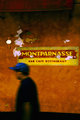
| 09/23/2009 08:03:52 PM |
Closedby PennyStreetComment: For me, I think this image would be more interesting if the photographer was further away and a little more of the background was included. Its a lovely wall, one I would return to again and again, but the composition is so tight and I'm not sure the man moving out of the frame works in this instance - it is not telling me anything. Interesting non-the-less. |
| Photographer found comment helpful. |
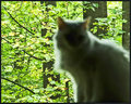
| 09/23/2009 08:01:55 PM |
The Catby NikonJebComment: The focus is definitely missed, but I don't think it makes the subject compelling. I think changing the lighting would be better, maybe snap the picture later in the day so that the cat is lighter, the background darker. At this point, the trees are more interesting than the cat and it just seems the cat got in the way. |
| Photographer found comment helpful. |
| 09/22/2009 08:20:53 PM |
Le Chevalby Ecce_SignumComment: Interesting. I like the colors and the use of light and dark but I also think your image is completely overwhelmed by the 'stuff' surrounding the horse - there is too much clutter and its not interesting clutter. meet challenge topic though. |
| Photographer found comment helpful. |
| 09/22/2009 08:19:30 PM |
Rudbeckiaby banmornComment: With a larger tonal range, this image could be more interesting. Right now, it is just kind of dark and dreary. I like the color palette though. |
| Photographer found comment helpful. |
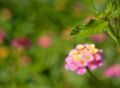
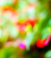
| 09/22/2009 07:43:34 PM |
Abstract gardenby Rino63Comment: I love the colors but I feel the image isn't balanced - there is too much light with only a touch of dark. Alternatively, you could go with light only and remove the black splotch altogether but as it is, it feel unsettled, and not in a good way. I do think the blur works really well though. 6 |
| Photographer found comment helpful. |
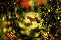
| 09/22/2009 07:41:53 PM |
Late Summer Huesby wildirisComment: Late summer hues but you really only have 2 (barely a third). Think this would work much better with more color and more blur. |
| Photographer found comment helpful. |
| 09/22/2009 07:40:14 PM |
A Bright Futureby XMountaineerComment: The image holds no blacks or whites. Could use a stiff curves adjustment - it just looks washed out. I think the out of focus works here. 6 |
| Photographer found comment helpful. |
Home -
Challenges -
Community -
League -
Photos -
Cameras -
Lenses -
Learn -
Help -
Terms of Use -
Privacy -
Top ^
DPChallenge, and website content and design, Copyright © 2001-2025 Challenging Technologies, LLC.
All digital photo copyrights belong to the photographers and may not be used without permission.
Current Server Time: 06/26/2025 11:28:39 AM EDT.