| Image |
Comment |
| 04/25/2005 09:12:26 AM |
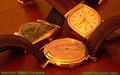
Hamilton Watch Company circa 1958by bcobleComment: the text color was not a great choice for this image. White or black would have been better I think. A slightly deeper DoF to get the right hand watch in sharp focus would also have helped. Very nice, though.- 7 |
 Photographer found comment helpful. Photographer found comment helpful. |
| 04/25/2005 09:06:54 AM |
|
| Photographer found comment helpful. |
| 04/25/2005 09:05:48 AM |
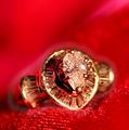
Beauty Jewel...by sfarrell23Comment: IMO, the font distracts from this image, it does not looks "classy" enough I think. Also, I would have tried to get more life and shine into the gems, they look rather dead. perhaps a slightly more "head on" angle to the gems would have helped, instead of looking down on them. |
| Photographer found comment helpful. |
| 04/25/2005 08:58:37 AM |
Glamor girlby sissiComment: focus seems to be on the sunglasses, not the jewelry |
| Photographer found comment helpful. |
| 04/25/2005 08:57:43 AM |
|
| Photographer found comment helpful. |
| 04/25/2005 08:54:49 AM |
Native American jewelryby dragonladyComment: I find that the text gets lost in the image. Perhaps using a different colour, or maybe moving to be along the bottom, with bit looser crop would help. Otherwise an excellent image - 8 |
| Photographer found comment helpful. |
| 04/25/2005 08:52:48 AM |
|
| Photographer found comment helpful. |
| 04/25/2005 08:51:20 AM |
9 ct Gold Braceletby kirtiebuComment: I like this, but I think the safety chain really distracts from the image, and draws your eye awy and out the bottom of the image. |
| Photographer found comment helpful. |
| 04/19/2005 10:15:42 AM |
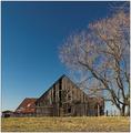
This Old Barnby fplouffeComment: your sky really got pixelated, too bad.
Returning to review - bumped after looking on a different monitor. Thanks for the tip. |
| Photographer found comment helpful. |
| 04/16/2005 03:22:30 AM |
|
| Photographer found comment helpful. |
Home -
Challenges -
Community -
League -
Photos -
Cameras -
Lenses -
Learn -
Help -
Terms of Use -
Privacy -
Top ^
DPChallenge, and website content and design, Copyright © 2001-2025 Challenging Technologies, LLC.
All digital photo copyrights belong to the photographers and may not be used without permission.
Current Server Time: 08/26/2025 10:32:21 PM EDT.