| Image |
Comment |
| 11/05/2009 10:19:37 PM |
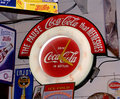
Drink Coca-Colaby eqsiteComment: Interesting. Almost An abtract with a recognizable logo. Nice comp that allow for text. I like it. A viable. My only preference would be to include the entire cola logo. |
 Photographer found comment helpful. Photographer found comment helpful. |
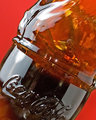
| 11/05/2009 10:13:55 PM |
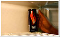
Refreshing Year After Yearby dtremainComment: I don't know if coke would want a pepsi ad in the background. Nice collage of colors. Unless your selling soda, I'm not sure what the product is in this ad. |
| Photographer found comment helpful. |
| 11/05/2009 10:11:15 PM |
Simple Choiceby Trumpeteer4Comment: The best ads don't need text or maybe one or two words. This is one of them. The only suggestion (as an ad) I'd offer would be to get the product a bit closer to make it more promenant. |
| Photographer found comment helpful. |
| 11/05/2009 06:49:41 PM |
Slake Your Towering Thirstby hesitantComment: Great ad in all respects. Great tag line. Tower draws me in. Great space for possible text. Interesting POV gets my interest. Great presentation of product. This is pro work. 10 |
| Photographer found comment helpful. |
| 11/05/2009 06:48:47 PM |
Refreshingby DaleFrazierPhotographyComment: Great stop action that presents the product very well. I like comp that allows the space for text on the bottom. I think you'd could get away with a tighter crop to more emphasis on the soda. |
| Photographer found comment helpful. |
| 11/05/2009 06:43:26 PM |
|
| Photographer found comment helpful. |
| 11/05/2009 06:42:44 PM |
|
| Photographer found comment helpful. |
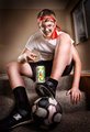
| 11/05/2009 06:41:48 PM |
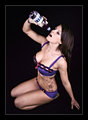
DRENCH - Hydrating Body And Mind!by kingskingdomComment: It still sells... Nice work and idea. If I had a suggestion, I'd ask for a POV ( maybe from more directly above her)that put more attention on the actual product. I should say that the POV you've used makes this a very interesting photo. It just doesn't make it clear exactly what's for sale. |
| Photographer found comment helpful. |
| 11/05/2009 06:38:35 PM |
|
| Photographer found comment helpful. |
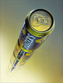
| 11/05/2009 06:36:39 PM |
Burn!by mqnaufalComment: I like the concept and the space for text on the left. Needs more of a "studio look" to it though. |
| Photographer found comment helpful. |
Home -
Challenges -
Community -
League -
Photos -
Cameras -
Lenses -
Learn -
Help -
Terms of Use -
Privacy -
Top ^
DPChallenge, and website content and design, Copyright © 2001-2025 Challenging Technologies, LLC.
All digital photo copyrights belong to the photographers and may not be used without permission.
Current Server Time: 08/08/2025 01:42:29 PM EDT.