| Image |
Comment |
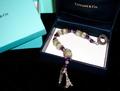
| 04/26/2005 08:32:57 PM |
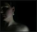
The Earringby saiphfireComment: alot of potential here. Great comp that would lend itself well to text. However, It needs a larger piece or more emphasis on it as I'm really not sure what you're trying to sell. Great photo and lighting. |
 Photographer found comment helpful. Photographer found comment helpful. |
| 04/26/2005 08:29:21 PM |
*by Moose101Comment: I don't get it The shadows are great but the DOF and focus are not effective. comp is good. |
| Photographer found comment helpful. |
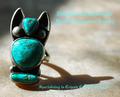
| 04/26/2005 08:23:50 PM |
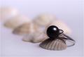
The Black Pearlby vasilkovayaComment: So crisp and well defined! The comp is lacking and I see so much potential if only the shell were larger and flipped so the ring were inside the shell. the angle would show more of the ring. Your skills as a photographer would keep you in our palm pilot. |
| Photographer found comment helpful. |
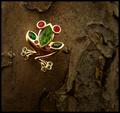
| 04/26/2005 08:19:35 PM |
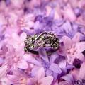
Entwined with Natureby cheekymunkyComment: This is a great photo of jewelry, The DOF works for me but the background color may be tough to find a font color that stands out enough to deliver the message. |
| Photographer found comment helpful. |
| 04/26/2005 08:15:06 PM |
Suggestiveby mrmorrisComment: Very,very clever. However, You'll need a much crisper shot with enough contrast to really show the tiffany name to pull this off. very creative. Fonts need to be little looser (most don't know how to do this) but overall excellent job! |
| Photographer found comment helpful. |
| 04/26/2005 08:11:03 PM |
|
| Photographer found comment helpful. |
| 04/26/2005 08:09:06 PM |
Breakfast at Tiffany'sby OFreasierComment: Having the piece go from the black to the white makes it difficult to show the details. The ad itself is original and well centered. |
| Photographer found comment helpful. |
| 04/26/2005 08:08:37 PM |
Southwesternby vtruanComment: Text gets lost. It could of used a black stroke of .5 point to really stand out. I like the font and the piece. The Dof and text mix wonderfully (putting the text in the out of focus area). Edit: I didn't know you can't use a stroke because its against DPC rules. You'd need a diffrent color font or background to get it to stand out. I really like the comp here. |
| Photographer found comment helpful. |
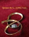
| 04/26/2005 08:06:34 PM |
Because You LOVE herby RayEthierComment: I like what you did here with DOF and placing the text in the out of focus area, i wish more of the necklace was in focus. You probably didn't need to get the whole necklace in but With the comp you used, you'd need a deeper field. The ring makes it crowded and seems out of place. Seperate the two or exclude the ring. I love the text and the font. It really jumps out at you. |
| Photographer found comment helpful. |
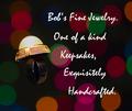
| 04/26/2005 08:01:02 PM |
Bob's Fine Jewelryby strangeghostComment: The comp here is fantastic, A different font, consistancy with punctuation (Artist license doesn't extend that far) and more contrast with the ring would be needed to make this a proffesional Ad. Great background and font. |
| Photographer found comment helpful. |
Home -
Challenges -
Community -
League -
Photos -
Cameras -
Lenses -
Learn -
Help -
Terms of Use -
Privacy -
Top ^
DPChallenge, and website content and design, Copyright © 2001-2025 Challenging Technologies, LLC.
All digital photo copyrights belong to the photographers and may not be used without permission.
Current Server Time: 08/05/2025 04:10:46 AM EDT.