| Image |
Comment |
| 10/06/2006 06:29:12 PM |
|
 Photographer found comment helpful. Photographer found comment helpful. |
| 10/06/2006 06:24:41 PM |
At a pub near youby bmartuchComment: Great job. Nice dof, lighting and sharpness. Comp serves well but could be improved if it were a bit less centered. (Would allow more creativity with text placement.) |
| Photographer found comment helpful. |
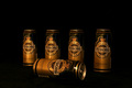
| 10/06/2006 06:22:32 PM |
Gone Drinkin' - Millerby angela_packardComment: A tighter crop may have serve this better to display the miller logo more Prominently. If they could've turned it on it would've been much better. Nice comp and colors. |
| Photographer found comment helpful. |
| 10/06/2006 06:18:30 PM |
Guys, Where's the Gatorade?by madcrabberComment: Nice comp and all but......Usually they want to see the product in the ad. Perhaps there was a cooler filled with it nearby? Original take but not effective. |
| Photographer found comment helpful. |
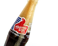
| 10/06/2006 10:37:21 AM |
Tuborg Goldby saevarjoComment: Classic job. I could easily place text above this and make a pretty nice ad.The lighting seems a bit dull but could probably be adjusted with the shadows/highlights adj in PS. |
| Photographer found comment helpful. |
| 10/06/2006 10:30:56 AM |
Spriteby russiComment: Interesting idea that could work nicely as an ad. Maybe a "capture the taste" or "don't let taste escape"Lighting seems a bit bright and the product could be displayed more prevelantly with a tighter crop. Still very, very nice. |
| Photographer found comment helpful. |
| 10/06/2006 12:37:11 AM |
|
| Photographer found comment helpful. |
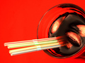
| 10/05/2006 08:45:24 PM |
Sometimes One Just Isn't Enoughby nards656Comment: This could make a great ad. nice bright colors, great comp that's interesting. Only piks: I wish all of the straws were sharp and more cubes needed. |
| Photographer found comment helpful. |
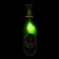
| 10/05/2006 08:40:09 PM |
There's Something Magical Insideby tryals15Comment: Great, great idea and execution. Excellent title and idea for a complete campaign. Would like a bit more light on the label for brand identification and a less centered comp to help with text placement. Still this is the type of professional quality I like to see come across my desk |
| Photographer found comment helpful. |
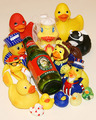
| 10/05/2006 08:34:46 PM |
How much Woodchuck do your Ducks chuck?by theSajComment: Funny idea and title.A good start and comp is nice. However, its a bit cluttered and needs a different more interesting angle. (Maybe you could shoot it from below)Great concept with a lot of potential. |
| Photographer found comment helpful. |
Home -
Challenges -
Community -
League -
Photos -
Cameras -
Lenses -
Learn -
Help -
Terms of Use -
Privacy -
Top ^
DPChallenge, and website content and design, Copyright © 2001-2025 Challenging Technologies, LLC.
All digital photo copyrights belong to the photographers and may not be used without permission.
Current Server Time: 08/24/2025 11:23:18 PM EDT.