| Image |
Comment |
| 10/06/2006 09:06:34 PM |
bottoms up!by crayonComment: Classic job and original thinking. Condensation is a nice touch. Catch line is excellent. Comp is perfect for text placement. Very, very nice. |
 Photographer found comment helpful. Photographer found comment helpful. |
| 10/06/2006 08:49:09 PM |
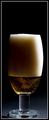
Beerby srdanzComment: Lighitng is interesting but I wonder if it highlights the product enough. I'd definitely use a beer with less foam. Background color would work well with text. |
| Photographer found comment helpful. |
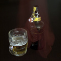
| 10/06/2006 08:47:23 PM |
Coorsby -kipComment: Nice lighting and you're on the right track as far comp goes. The comp here lends itself well to creative text placement. I'd use either a tighter or wider crop. One that would show the whole bottle or one that focuses more on the label. I like the bronze shadow.8 |
| Photographer found comment helpful. |
| 10/06/2006 08:24:40 PM |
Cool night drinkby craigesterComment: This id one of the set up photos that doesn't really need text to be a great ad. I'm sure of whats being sold and it's very well displayed. Only distraction is the bottle should really be alot sharper so it stands out more. |
| Photographer found comment helpful. |
| 10/06/2006 08:22:24 PM |
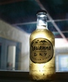
That misty freshnessby Trumpeteer4Comment: Cool effects. I'd like to see a levels adjustment to give it more "pop". Comp is perfect and displays product well. Very nice concept and overall presentation. |
| Photographer found comment helpful. |
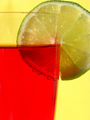
| 10/06/2006 08:19:35 PM |
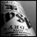
Red-dy for THE taste ?by KatheComment: I really like this albiet I'd like to see it sharper The divisions between the sections and interesting comp lends itself to creative text placement. Very nice overall concept. |
| Photographer found comment helpful. |
| 10/06/2006 08:16:04 PM |
La sciarpa rossaby Rino63Comment: Nice comp and idea. This would work well with added text and for the purpose of brand reinforcement. The label should be more prominent. The added effect isn't exactly clear. |
| Photographer found comment helpful. |
| 10/06/2006 08:13:34 PM |
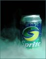
Save the Dr. Pepper!by theyetifanclubComment: Great concept and Idea of the importance of the product. Funny too. The lighting is a bit dark but the comp would work well with text placement. |
| Photographer found comment helpful. |
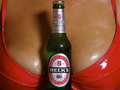
| 10/06/2006 06:40:25 PM |
How to get a manby tjmuellerComment: Great, great idea. (Makes me want to go out and buy a becks right now) Great attention to detail. Fill flash might've taken away the only distraction I see: the bottle's shadow and a coulple of blown highlights on the foil and cap. Otherwise my favorite example so far in this theme:) |
| Photographer found comment helpful. |
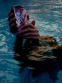
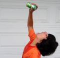
| 10/06/2006 06:32:41 PM |
Ahhhhhhhhhh!by meganoComment: The wet shirt detracts as he's definitely missing his target. A tighter crop would display product more prominently. Not a bad idea and probabaly fun to shoot. |
| Photographer found comment helpful. |
Home -
Challenges -
Community -
League -
Photos -
Cameras -
Lenses -
Learn -
Help -
Terms of Use -
Privacy -
Top ^
DPChallenge, and website content and design, Copyright © 2001-2025 Challenging Technologies, LLC.
All digital photo copyrights belong to the photographers and may not be used without permission.
Current Server Time: 08/24/2025 11:20:45 PM EDT.