| Image |
Comment |
| 02/11/2008 09:40:39 PM |
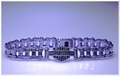
For Him or Her..Let's Ride Togetherby apashackComment: This is really nice. Product is prominanty and attractively displayed. You also left negative space for text placement. Relly nice work. I like the tones they really fit the product. |
 Photographer found comment helpful. Photographer found comment helpful. |
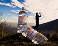
| 02/11/2008 09:39:17 PM |
|
| Photographer found comment helpful. |
| 02/11/2008 09:38:28 PM |
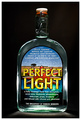
With A Splash Of Lime!by todbedyComment: Nice ad. The product is nicely presented and the lime splash adds a nice effect and the whole feel is "refreshing".Comp works for text addition. The only thing is that the bottle seems tilted. |
| Photographer found comment helpful. |
| 02/11/2008 06:17:09 PM |
The Breakfast of DPC Championsby QuasimojoComment: Wel. less is definitely more in this one. Product is prominantly displayed. This ad is the theme description's poster child and in a perfect world it would win. A little more negative space to the top or side would help if text placement was needed. |
| Photographer found comment helpful. |
| 02/11/2008 01:33:28 PM |
|
| Photographer found comment helpful. |
| 02/11/2008 01:31:06 PM |
|
| Photographer found comment helpful. |
| 02/11/2008 01:28:11 PM |
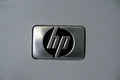
HP!by bspujariComment: I like these "less is more" approach ads. However,when you go for this everything has to be "tack" sharp. Logo seems a bit tilted too. |
| Photographer found comment helpful. |
| 02/11/2008 01:23:30 PM |
Tea - Best Drink of the Dayby TacTZillaComment: This is one of those ads that I can't really tell what the product is. The background is a bit distracting too. I'd use a tighter crop and maybe include the tag from the tea bag to present the product better. |
| Photographer found comment helpful. |
| 02/11/2008 01:20:58 PM |
A refreshing reward...by gpalosComment: This is really good. Product is well displayed and the background adds perfect ambience. The only thing I'd have issues with is the comp. Moving the bottles more to the left would give the ad more balance. |
| Photographer found comment helpful. |
| 02/11/2008 01:03:37 PM |
scent of appleby CamabsComment: I like the divided background. Nice comp allows for text and product is well displated. I think this needs a levels adjustment to really make the product pop out at me. |
| Photographer found comment helpful. |
Home -
Challenges -
Community -
League -
Photos -
Cameras -
Lenses -
Learn -
Help -
Terms of Use -
Privacy -
Top ^
DPChallenge, and website content and design, Copyright © 2001-2025 Challenging Technologies, LLC.
All digital photo copyrights belong to the photographers and may not be used without permission.
Current Server Time: 08/24/2025 08:26:08 AM EDT.