| Image |
Comment |
| 02/24/2005 09:12:51 AM |
|
 Photographer found comment helpful. Photographer found comment helpful. |
| 02/24/2005 09:11:33 AM |
|
| Photographer found comment helpful. |
| 02/24/2005 09:09:36 AM |
Tripping the Light Fantasticby rightsaidfredComment: This just does not look like a 'seventies guy.' Really, to evoke the seventies, facial hair on men is a must. Sideburns or a beard or an unstylish moustache are a minimum. I'm afraid I can't stand the colorful effects, no matter how much (or little) effort it might have taken to produce them. |
| Photographer found comment helpful. |
| 02/24/2005 09:05:15 AM |
1970 BCEby kyeboshComment: I'm afraid I suffer from a handicap in scoring this - never have seen a slasher movie. Although it needs to be dark and shadowy for effect, I found this to be too hard to see. |
| Photographer found comment helpful. |
| 02/24/2005 09:03:16 AM |
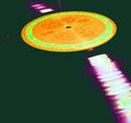
afternoon delightby oneredstarComment: I have to assume the oversaturation is purposeful. But not being able to see the rest of the grooves in the record is a problem, especially since this negative space is a wierd and ugly greenish color. |
| Photographer found comment helpful. |
| 02/24/2005 09:00:23 AM |
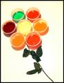
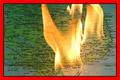
{Flower Power}by litboltiComment: It seems out of focus to me. And the color palette seems to wierd, even by seventies standards. I find the lighting harsh and strangely colored .Also not purposefully trippy. The wilted rose stem detracts much. |
| Photographer found comment helpful. |
| 02/24/2005 08:57:23 AM |
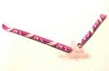
Stix of Broken Timeby DailyDayDreamerComment: What bothered me first about the photo was it's smudgy quality, and I rated it very low for that. But this photo makes a great use of negative space. And the lines created by the broken sticks are perfectly composed. Finally, I love the simple but compelling color palette. |
| Photographer found comment helpful. |
| 02/24/2005 08:52:37 AM |
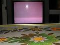
tv dinnerby art-ineptComment: This photo manages to capture so much that was ugly in the seventies and is ugly today: even though my reaction is strongly negative, I've got to nudge this up a bit. |
| Photographer found comment helpful. |
| 02/24/2005 08:41:30 AM |
Why ?by RUEDISCHMUTZComment: Great idea. Tell us, did you destroy this map to make the photo, or was there an intervening surface? |
| Photographer found comment helpful. |
| 02/24/2005 08:36:48 AM |
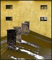
The Rust Zoneby mannjuditComment: A path not much travelled in this competition. I love the way the colors and textures of the roof, chimney, and walls play off each other. I love the rhythm created by all the repeated elements. The photo communicates age and speaks of an unadorned and utilitarian time. |
| Photographer found comment helpful. |
Home -
Challenges -
Community -
League -
Photos -
Cameras -
Lenses -
Learn -
Help -
Terms of Use -
Privacy -
Top ^
DPChallenge, and website content and design, Copyright © 2001-2025 Challenging Technologies, LLC.
All digital photo copyrights belong to the photographers and may not be used without permission.
Current Server Time: 06/03/2025 04:26:28 AM EDT.